Easy Ways To Make Personalized Posters
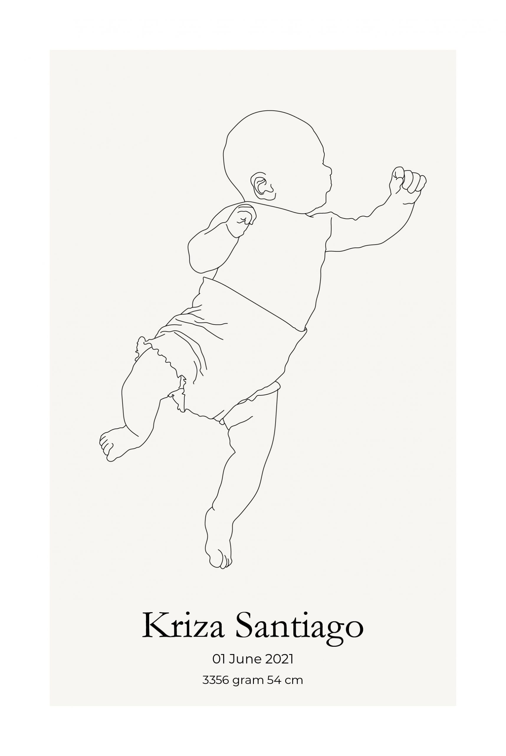
Posters are important as they are used for different functions. They need to be eye-catching and informative. Posters are also commonly used for promoting events, products, spreading information, and others. Posters these days are used for reproductions of famous artworks and in decorating any living space.
How it all began
Over the years, people have used posters for different reasons. Most of the posters created are visually appealing since they intend to catch the attention of the public. Posters have been displayed in public places to make people aware of political viewpoints, an invitation to certain events, or as a marketing strategy to purchase a product or service.
Posters these days are based on those that were created during the mid-19th century. During that period, the printing industry already has perfected color lithography and made mass production possible. Censorship of public spaces in certain countries like France has been lifted and advertisers began to market the mass-produced consumer goods to a growing population in urban areas.
Eventually, after more than a hundred years, posters evolved when it has already been recognized as a vital art form that attracted artists.
How to create posters
These days, posters come in many interesting and creative designs that serve their purpose. Not only that they are used the conventional way, but posters can also be a great accent to your walls.
Know the appropriate size
Posters may have their standard sizes. But you can still create the size that you need and it greatly depends on how you are going to use your poster.
Design the layout of the poster
Viewers must be able to easily grasp the message of the poster. Determine the right alignment and apply them to the headers, photos, text, and shapes. These must be unified and consolidated. With these, the poster and its elements will have coherence. It is also recommended to place the text at the center to create a sense of symmetry.
Pick your choice of graphics
The good thing about posters is that a simple image can convey a message. In creating the design of the poster, bear in mind that there should be a balance between text and images. The design should also complement and blend. Larger posters must have an image that has the highest resolution.
Make it colorful
The colors should be able to complement the photographs and the message. In color psychology, it has been documented that different colors can already convey a message. For instance, green can be translated to freshness and the natural environment. It is though recommended that the use of colors be limited. If the poster is bombarded with colors, it may be a distraction to the real message of the poster.
Add text
Maintain the simplicity of the headers and titles. The headers must have a larger font size to show the viewers which one to first look at. Do not forget the contrasts in the sizes of the fonts, style, and color. These elements are the ones that catch the attention of the viewers. Do remember that do not use more than two faces in a document. Keep the message straightforward so that your audience will immediately know what the poster is all about.
