Finding Your Perfect Hue: A Guide to Paint Color Selection

Pink Dusk Poster

Choosing the right paint color for your space can be exciting and overwhelming. With endless options, finding the perfect hue requires careful consideration of lighting, room function, and most importantly, your personal style. This guide will help you navigate the process and confidently select a paint color that not only enhances your space but also reflects your unique taste.

Consider the Mood

Each color evokes a specific emotion, making it essential to align your choice with the atmosphere you want to create. Soft blues and greens bring a sense of calm and relaxation, making them perfect for bedrooms and bathrooms. Warm colors like red, orange, and yellow promote energy and conversation, making them ideal for dining rooms and living spaces. Neutrals such as beige, gray, and white provide versatility and can serve as a timeless backdrop.

Assess Natural and Artificial Lighting

Lighting plays a crucial role in how a paint color appears. Natural light can make colors look brighter, while artificial lighting can alter their tone. North-facing rooms often have more extraordinary, dimmer light, making colors appear slightly muted, while south-facing rooms receive warm, bright light that enhances warm tones. Understanding these lighting dynamics is key before committing to a color, so be sure to observe how it looks in different lighting conditions throughout the day.

Test Paint Samples

What looks perfect in the store may appear entirely different in your home. Instead of relying on small swatches, buy sample-sized cans of your top choices and paint large wall sections. This lets you see how the color interacts with your furniture, flooring, and décor. Live with the samples for a few days to ensure you love the color before making a final decision.

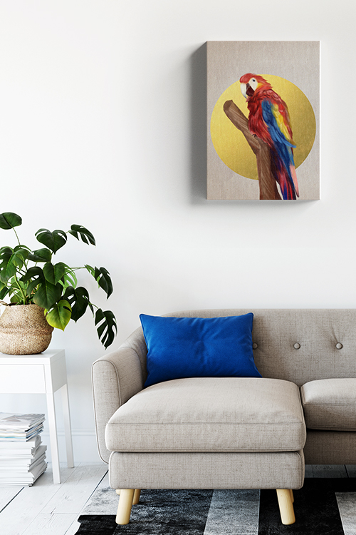
Take Inspiration from Existing Elements

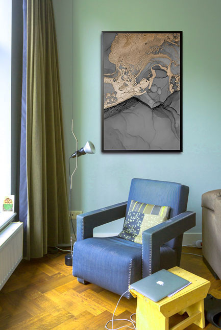
If you struggle to find a starting point, look at your furniture, artwork, or textiles for inspiration. A favorite rug or artwork can be a foundation for your color palette. Consider the undertones of these elements—warm or cool—and choose a paint color that complements them.

Understand Color Undertones

Even neutral colors have undertones that can influence a room’s overall look. For example, a gray with blue undertones will feel cooler, while a gray with brown undertones will feel warmer. To avoid surprises, compare your chosen paint color to pure white to better see its underlying tones.

Use the 60-30-10 Rule.

A well-balanced color scheme follows the 60-30-10 rule. For instance, in a living room, 60% of the room could feature a dominant color on the walls, 30% could be a secondary color in the form of furniture or textiles, and 10% could be an accent color in the decor or accessories. This method ensures harmony and prevents too many competing shades from overwhelming the space.

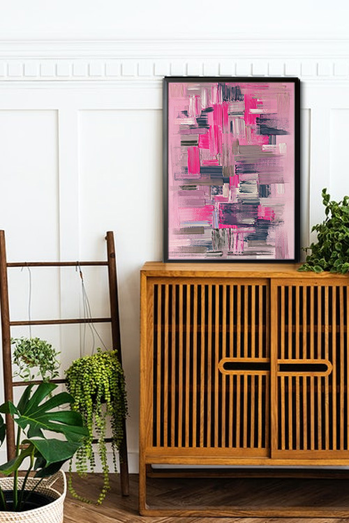
Don’t Be Afraid to Go Bold

While neutrals are safe, bold colors can add personality and drama to a space. Deep navy, emerald green, or rich terracotta can create a stunning focal point. If committing to a bold color on all walls feels daunting, consider an accent wall or use it in a smaller space, like a powder room or hallway.

In a Nutshell

Choosing the perfect paint color requires intuition, strategy, and experimentation. By considering mood, lighting, and existing elements, you can find a hue that enhances your space and reflects your personality. With thoughtful planning and testing, your chosen color will bring new life to your home.

Color Tetris No 1 Poster

Color Tetris No 1 Poster

This fun and playful design features a variety of rectangle shapes in different colors stacked together, creating a modern and eye-catching display for any room in your home. Whether you’re a fan of classic video games or simply love bold and bright aesthetics, this poster will make a statement. Color Tetris poster design is perfect for injecting fun and personality into your decor.

Color Tetris No 2 Poster

Color Tetris No 2 Poster

Looking to add a pop of color and a touch of nostalgia to your space? Look no further than our Color Tetris poster print! This eye-catching design features a medley of rectangle shapes in various vibrant hues stacked together to create a playful and dynamic visual. Perfect for those who appreciate a retro vibe with a modern twist, this poster will liven up any room with its fun and bold aesthetic.

Color Tetris No 3 Poster

Color Tetris No 3 Poster

This quirky design features a stack of rectangle shapes in various eye-catching colors reminiscent of the classic video game we all know and love. Whether you’re a fan of puzzles or just looking to inject a pop of fun into your decor, this poster will surely be a conversation starter. Get ready to level up your wall art game with this unique and colorful print!

Color Tetris No 1 Canvas

Color Tetris No 1 Canvas

This fun and playful design features a variety of rectangle shapes in different colors stacked together, creating a modern and eye-catching display for any room in your home. Whether you’re a fan of classic video games or simply love bold and bright aesthetics, this poster will make a statement. Color Tetris canvas print is perfect for injecting fun and personality into your decor.

Color Tetris No 2 Canvas

Color Tetris No 2 Canvas

Looking to add a pop of color and a touch of nostalgia to your space? Look no further than our Color Tetris canvas print! This eye-catching design features a medley of rectangle shapes in various vibrant hues stacked together to create a playful and dynamic visual. Perfect for those who appreciate a retro vibe with a modern twist, this poster will liven up any room with its fun and bold aesthetic.

Color Tetris No 3 Canvas

Color Tetris No 3 Canvas

This quirky design features a stack of rectangle shapes in various eye-catching colors reminiscent of the classic video game we all know and love. Whether you’re a fan of puzzles or just looking to inject a pop of fun into your decor, this canvas print will surely be a conversation starter. Get ready to level up your wall art game with this unique and colorful print!

What is the best color for the living room?

Birds collection Parrot Canvas

Choosing the best color for a living room is an artful balance between style, mood, and functionality. The living room is a central space in the home, used for relaxation, entertainment, and gatherings, so selecting a color that feels inviting, comfortable, and complements the overall decor is essential. Here are some of the top color choices for living rooms and the effects they bring to the space.

Neutral Tones: Beige, Grey, and White

Due to their versatility, neutral colors are often considered ideal for living rooms. Beige, soft greys and warm whites create a calm, welcoming ambiance and work well as a base for other accent colors. Neutrals provide a backdrop that can easily accommodate different furniture styles, artwork, and textures, allowing you to change accessories without a major overhaul. These colors make a room feel more spacious and allow natural light to play a prominent role, adding a touch of elegance and sophistication.

Earthy Hues: Olive, Terracotta, and Warm Browns

Earth tones are famous for creating a cozy and grounded feel in the living room. Colors like olive green, terracotta, and warm brown develop a sense of warmth and connection to nature, making the space feel comforting and serene. These hues work particularly well in living rooms, incorporating natural materials like wood or stone, and pair beautifully with neutral furnishings. Depending on the decor style, earthy colors can also lend a rustic or bohemian vibe.

Soft Blues and Greens

For a more refreshing atmosphere, consider light blue or green shades. Soft blues evoke tranquility and openness, while greens offer a fresh, revitalizing feel. These shades effectively create a calm, relaxing environment that promotes peace. They pair well with white trim and natural textures, adding a subtle elegance that can make the living room feel like a serene escape.

Bold Colors: Navy, Charcoal, and Deep Teal

For those who prefer a more dramatic look, deeper tones like navy, charcoal grey, or teal add sophistication and depth to the living room. These colors can make a statement and create a more intimate, luxurious atmosphere, especially when paired with metallic accents or rich textures. Darker shades work well in larger living rooms, making the space feel more inviting without appearing too overwhelming.

Ultimately, the best color for a living room depends on personal preference and how you use the space. Consider your decor style, lighting, and the atmosphere you want to create, and choose a color that enhances the room’s purpose and comfort.

Making Small Spaces Look Bigger: The Power of Color

Abstract gray shade with gold dust no. 2 poster

Many homeowners face the challenge of designing a small room to feel bigger, but one of the most effective and transformative tricks to achieve this is using color. The right colors can make a room feel more spacious, open, and airy. Here’s how color influences the perception of space and which hues are ideal for creating the illusion of a larger room.

Light and Neutral Colors

Light colors are universally known to make spaces feel more open. White is a classic choice, reflecting the most light and making walls recede, which can create a sense of depth. Pure white, off-white, or soft beige can make a small room feel less confined. The effect is further enhanced when the ceiling is painted white or a lighter shade than the walls, drawing the eye upwards and adding height.

Other neutral shades like light gray and cream also help enlarge a room. They provide a subtle backdrop that doesn’t overwhelm the senses and allows light to bounce around more freely. These tones create a serene, uncluttered look, ideal for small spaces. Light neutral tones work exceptionally well when paired with similar tones in furniture, creating a seamless, continuous flow of color.

Cool Colors

Cool colors, like soft blues, greens, and lavenders, are calming and recede into the background, creating the impression of a larger room. Light blue mimics the sky or the sea, giving a sense of openness and tranquility. Pale blue tones paired with white trim or soft grays create an airy, fresh environment that feels more expansive.

Light greens also work well, evoking nature and soothing, expansive energy to the room. Mint green, seafoam, or sage are excellent choices for adding depth while maintaining a calm and inviting atmosphere. Lavender and light purples can also give a small room an airy quality, making it feel less constrained.

Monochromatic Palettes

A monochromatic color scheme is another powerful way to make a small room appear larger. This technique involves using different shades of the same color throughout the room. For example, pairing a light gray wall with a darker gray accent or soft furnishings creates depth without overwhelming the space. The key is sticking to light tones that blend seamlessly, avoiding bold, contrasting colors that could make the room busy or enclosed.

High-Gloss Finishes

For small spaces, high-gloss finishes can be a secret weapon. Light reflects off glossy surfaces, amplifying the natural light in the room and making it feel bigger. Glossy paint on walls, ceilings, or furniture can make a small room look more open and brighter. However, using this sparingly is essential, as too much gloss can create an overwhelming effect.

Strategic Accent Colors

While light colors are vital to creating a spacious feel, accent colors can be used strategically to enhance the effect. For instance, a pop of a darker or more vibrant shade on one wall (an accent wall) can add depth without closing in the space. Darker colors like navy, charcoal, or forest green can provide a contrast that draws the eye, making the room feel more dynamic and layered. Consider a navy accent wall in a predominantly light blue room or a forest green feature wall in a room with light green walls.

In a Nutshell

In conclusion, remember that these color tricks are practical and easy to implement to make a small room look bigger. By using light, neutral, and cool tones, creating monochromatic palettes, and experimenting with glossy finishes to maximize light, you can transform a cramped room into a comfortable, airy space that feels much larger than its square footage suggests.

A Harmony of Hues: The Art of Color Combination

Alcohol variety poster

Color, a fundamental element of visual perception, can evoke emotions, convey messages, and create aesthetic appeal. The judicious selection and combination of colors can elevate a design, whether a piece of art, a fashion statement, or a simple room decor. Understanding the principles of color harmony is beneficial and essential for achieving visually pleasing and impactful results.

One of the most common color harmony schemes is analogous colors. These are hues adjacent to each other on the color wheel, such as blue, green, and yellow. Analogous color combinations create a sense of unity and continuity, often associated with nature and tranquility. For example, a bedroom decorated in shades of blue, green, and teal can evoke a calming and serene atmosphere.

Another effective color scheme is complementary colors. These colors sit opposite each other on the color wheel, like red and green or blue and orange. Complementary color combinations create a high level of contrast and visual interest. They can be used to create bold and attention-grabbing designs or to add a pop of color to a more neutral palette.

Triadic colors are three equally spaced colors on the color wheel: red, yellow, and blue. Triadic color combinations offer a vibrant and energetic aesthetic. They can be used to create visually stimulating designs, but it’s essential to balance the colors carefully to avoid overwhelming the eye.

Split-complementary colors, a variation of complementary colors, involve a base color and two colors that are adjacent to its complement. This combination balances contrast and harmony, making it versatile for various design applications. It’s a great tool in your design arsenal, empowering you to create unique and creative designs.

Beyond these basic schemes, numerous other color combinations can be explored. Monochromatic colors involve different shades, tints, and tones of the same color, creating a cohesive and elegant look. Neutral colors such as black, white, gray, beige, and brown provide a timeless and versatile base for other colors, adding a touch of sophistication and refinement to your design.

When selecting colors for a design, it’s crucial to consider the overall mood and message that you want to convey. This thoughtful consideration can significantly influence the impact of your design, making it more intentional and resonant. Bright and warm colors like red, orange, and yellow can evoke energy, excitement, and enthusiasm. Cool colors like blue, green, and purple are often associated with calmness, tranquility, and reliability. Neutral colors can create a sense of sophistication and timelessness.

In conclusion, color combination is a powerful tool for enhancing any design’s visual appeal and impact. By understanding the principles of color harmony and considering the desired mood and message, you can create visually stunning and emotionally resonant compositions that leave a lasting impression.