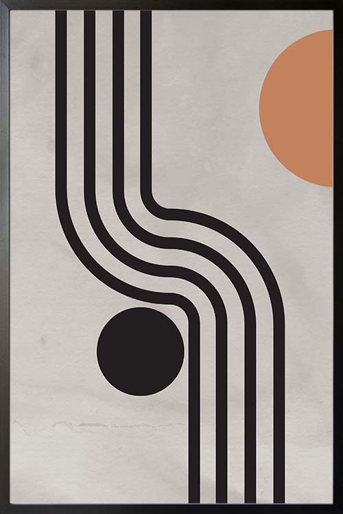
Give your wall a makeover that you will never forget. A fantastic poster design that will complete the overall appearance of the room. Abstract art of lines and shapes can stimulate the mind as you try to interpret its meaning. Make your room unique and interesting with this trendy and stylish art displayed.
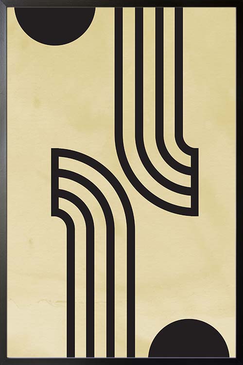
Give your wall a makeover that you will never forget. A fantastic poster design that will complete the overall appearance of the room. Abstract art of lines and shapes can stimulate the mind as you try to interpret its meaning. Make your room unique and interesting with this trendy and stylish art displayed.
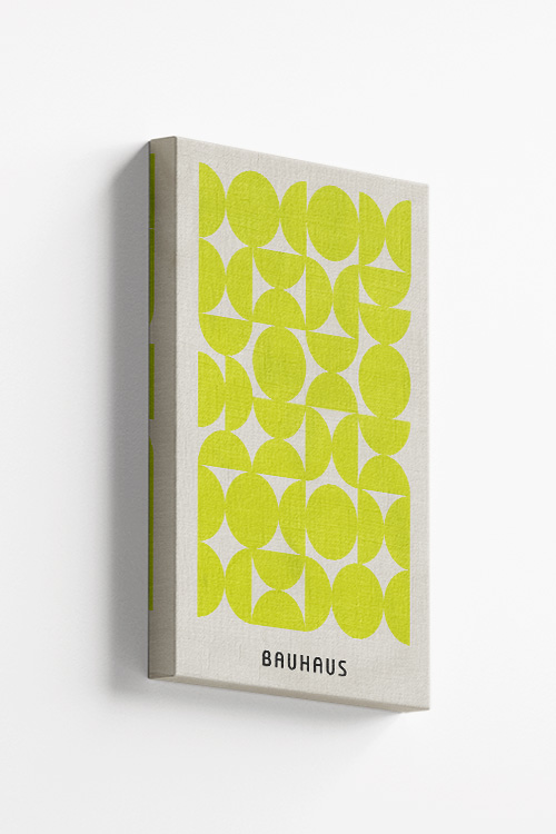
Introducing the Bauhaus Bloom 1, a mesmerizing piece that captivates with its intricate design of circles and semicircles in a striking yellow green hue. This exquisite artwork exudes a sense of modernity and sophistication, making it a perfect addition to any contemporary space. The harmonious composition of geometric shapes creates a visual feast for the eyes, drawing the viewer in with its dynamic energy and balance.
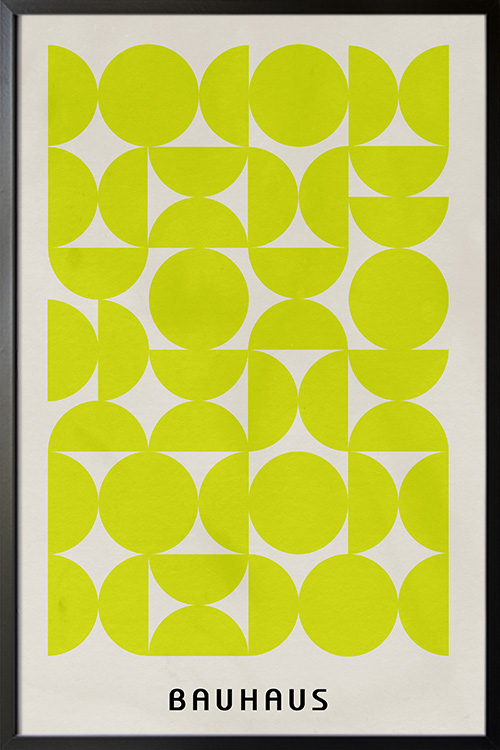
Introducing the Bauhaus Bloom 1, a mesmerizing piece that captivates with its intricate design of circles and semicircles in a striking yellow green hue. This exquisite artwork exudes a sense of modernity and sophistication, making it a perfect addition to any contemporary space. The harmonious composition of geometric shapes creates a visual feast for the eyes, drawing the viewer in with its dynamic energy and balance.
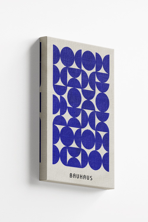
The Bauhaus Bloom 2 is a masterpiece of contemporary design that showcases a mesmerizing interplay of circles and semicircles in a striking shade of blue. This innovative piece seamlessly blends geometric precision with artistic flair, creating a dynamic visual experience that is both captivating and sophisticated. Crafted with meticulous attention to detail, the Bauhaus Bloom 2 exudes a sense of modern elegance that is sure to elevate any space. Whether displayed as a standalone statement piece or integrated into a larger design scheme, this exquisite artwork is sure to command attention and inspire admiration.
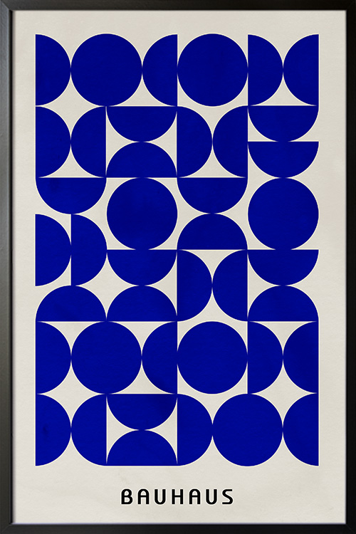
The Bauhaus Bloom 2 is a masterpiece of contemporary design that showcases a mesmerizing interplay of circles and semicircles in a striking shade of blue. This innovative piece seamlessly blends geometric precision with artistic flair, creating a dynamic visual experience that is both captivating and sophisticated. Crafted with meticulous attention to detail, the Bauhaus Bloom 2 exudes a sense of modern elegance that is sure to elevate any space. Whether displayed as a standalone statement piece or integrated into a larger design scheme, this exquisite artwork is sure to command attention and inspire admiration.
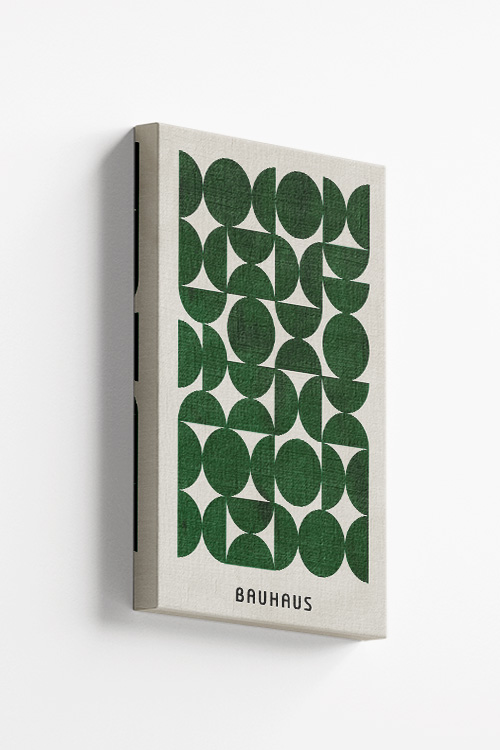
Bauhaus Bloom 3 is a striking piece that effortlessly blends geometric shapes to create a captivating design. This iteration features an array of circles and semicircles in a lush shade of green, adding a touch of nature-inspired elegance to any space. The meticulous craftsmanship and attention to detail are evident in every curve and angle, showcasing the impeccable artistry of the Bauhaus collection. Elevate your decor with the Bauhaus Bloom 3, a modern masterpiece that exudes sophistication and style.
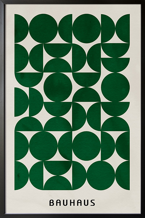
Bauhaus Bloom 3 is a striking piece that effortlessly blends geometric shapes to create a captivating design. This iteration features an array of circles and semicircles in a lush shade of green, adding a touch of nature-inspired elegance to any space. The meticulous craftsmanship and attention to detail are evident in every curve and angle, showcasing the impeccable artistry of the Bauhaus collection. Elevate your decor with the Bauhaus Bloom 3, a modern masterpiece that exudes sophistication and style.
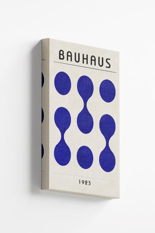
“Bauhaus Inspired 1923 No. 2” art print is a stunning representation of geometric abstract art, featuring a mesmerizing display of spherical shapes in a serene shade of blue. This piece exudes a sense of sophistication and modernity, drawing inspiration from the iconic Bauhaus movement of the early 20th century. The harmonious composition of circles and curves creates a sense of balance and harmony, making it a perfect addition to any contemporary space.
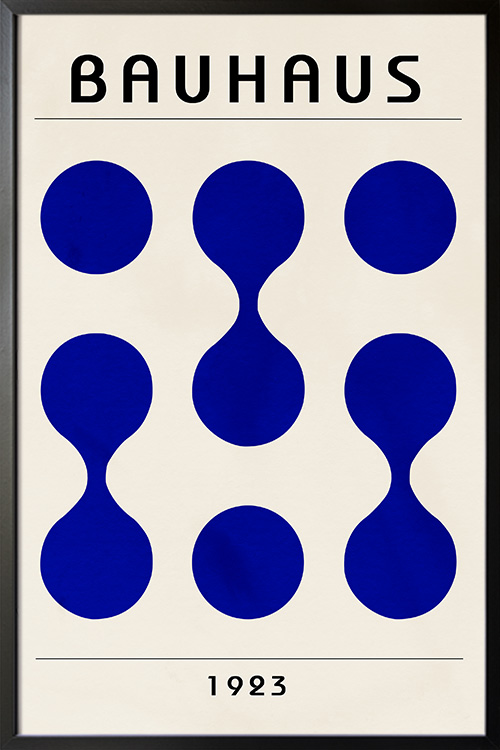
“Bauhaus Inspired 1923 No. 2” art print is a stunning representation of geometric abstract art, featuring a mesmerizing display of spherical shapes in a serene shade of blue. This piece exudes a sense of sophistication and modernity, drawing inspiration from the iconic Bauhaus movement of the early 20th century. The harmonious composition of circles and curves creates a sense of balance and harmony, making it a perfect addition to any contemporary space.


