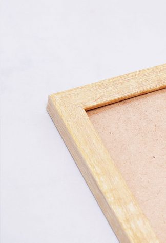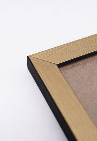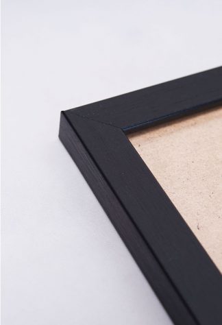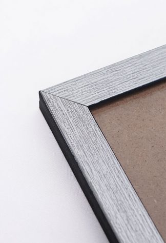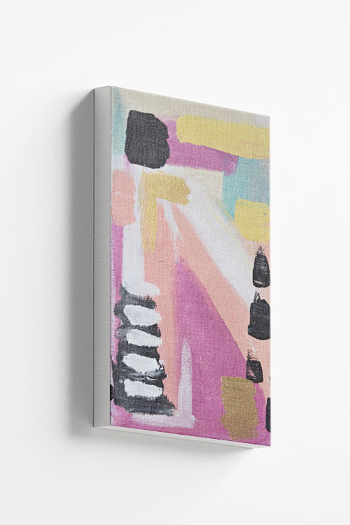
A colorful canvas design to make any room look lovely. This art is one of the vibrant designs that will make any room look amazing. A cool and trendy canvas from the collection of Artdesign.
A colorful canvas design to make any room look lovely. This art is one of the vibrant designs that will make any room look amazing. A cool and trendy canvas from the collection of Artdesign.
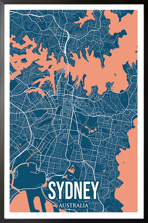
Sydney is a city of iconic attractions and beautiful beaches. This city is a travel destination you will never forget. This poster will surely make your home look legendary with the featured colors, lines, and curves.
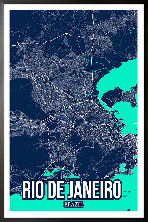
Rio de Janeiro is home to some of the world’s friendliest people and fantastic beaches. The city also has a colorful history making it one of the most diverse cities in the world regarding culture and tradition. Get this poster now and give your home a Brazilian touch.
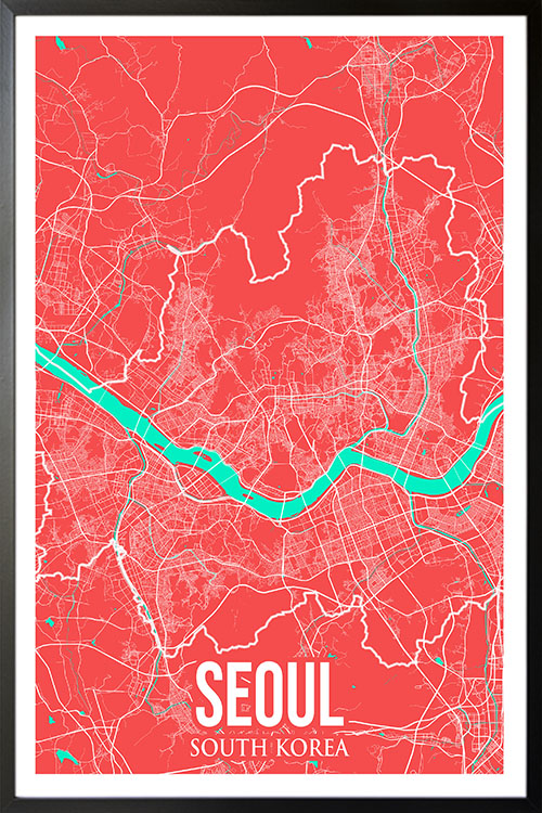
Are you a K-pop or K-drama fan? Here’s a little treat for you! Seoul has modern skyscrapers, neon lights, and Buddhist temples. Give your room a little “annyeonghaseyo” and flaunt it to your friends.
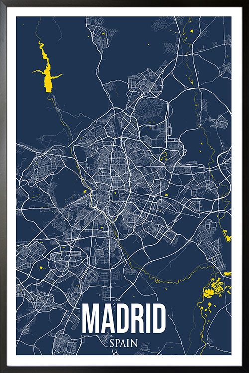
The capital of Spain, Madrid, is home to impressive architecture, world-renowned museums, and outdoor plazas. Give your room a fantastic view with this beautiful poster and give it a welcoming appeal.
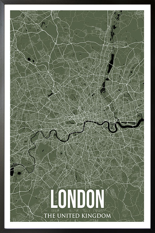
This is a spectacular poster design. Featuring one of the key cities in the world and its geographical appearance. Give your room a lively vibe with colors, lines, and curves for a more welcoming appeal.
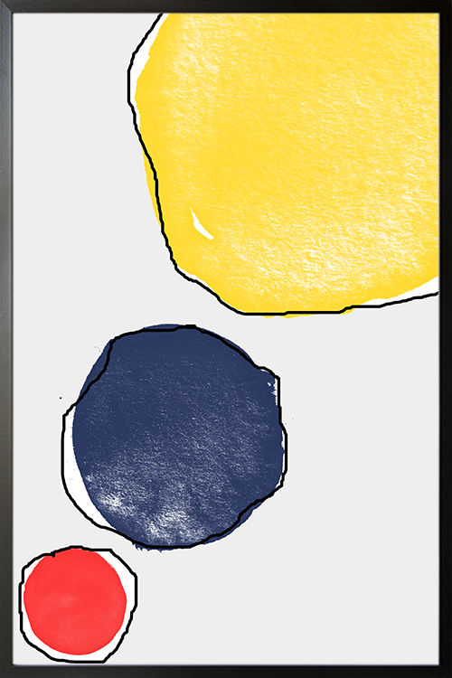
This poster is the perfect choice if you want to add something round to your wall. Not only that it will make any room look fantastic. This art will surely make the atmosphere look more warm and comforting.
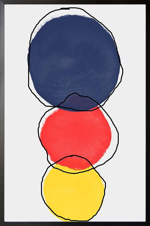
This poster is the perfect choice if you want to add something round to your wall. Not only that it will make any room look fantastic. This art will surely make the atmosphere look more warm and comforting.
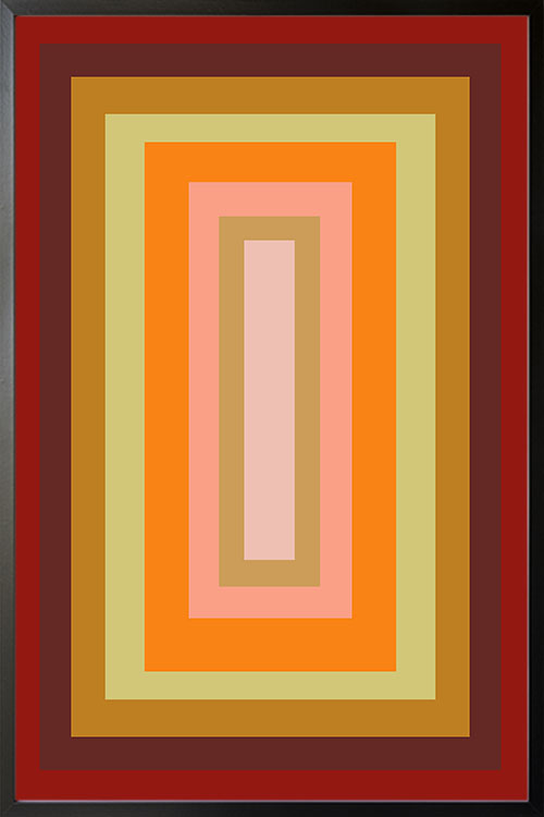
Shapes are simply fantastic when added to your walls. They can give your room some depth and will draw the eye of anyone. Display this poster in your room with a fun and cheerful vibe.
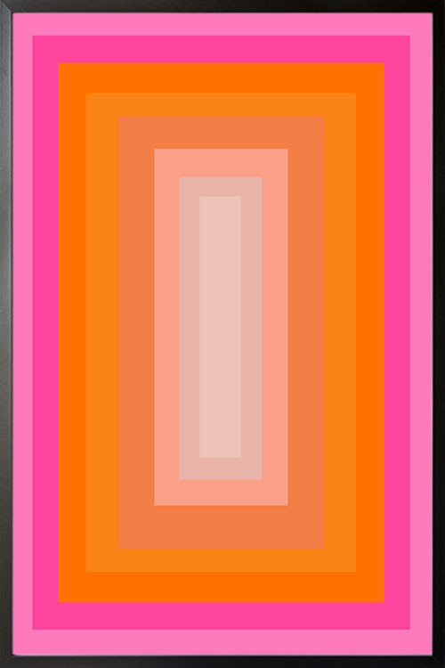
Tired of plain walls? This poster will instantly add a vibrant appeal that can be the center attraction of your room. With shapes and colors, your wall will have a pattern that is irresistible to look at.