Are you planning to host a dinner for your friends? Or want to prepare a special meal for your family? Then the dining room should also be prepped before the big day. Starting with the color scheme, it should be appetizing and blend with the whole aesthetics of your home. Here are some recommendations that you can use for a more appealing dining room interior.
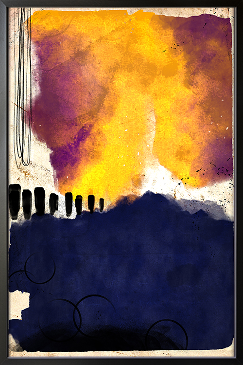
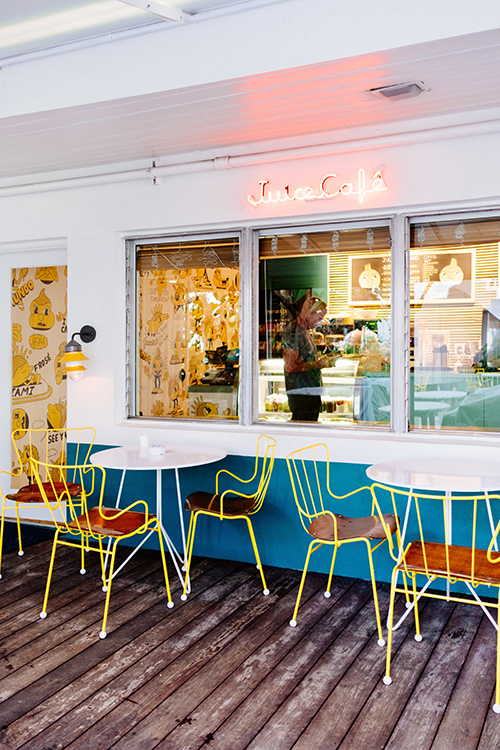
Yellow
This color is one of the warm colors and is considered to stimulate appetite. It can also be an intimidating color that, when overused, can be too bright and overwhelming to the entire room design. Adding pastel shades of yellow is one of the ways to give it a splash. If you have a wooden dining set, the color can give it a summer vibe to make you feel like you are basking under the sun. Display posters with yellow as the dominant color to match white-painted walls or even those painted in dark colors.
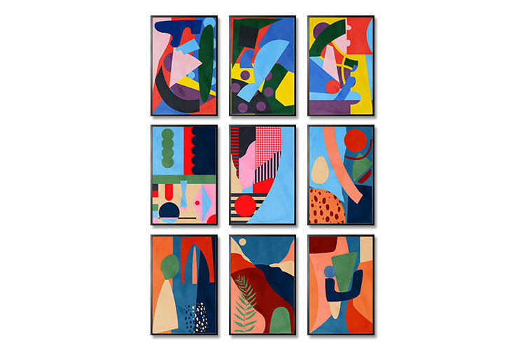
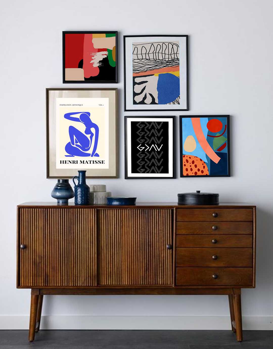
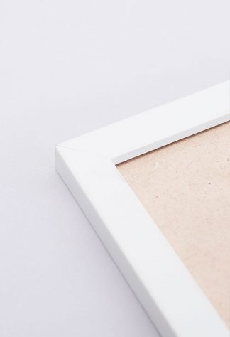
Neutrals and whites
If you are unsure what color scheme to use, go with neutrals and whites. These are the easiest, safest, and most common color schemes for the dining area. Working with these shades requires little effort, as any color can be paired with them. Create a wall gallery of black and white posters or any print in any shade. The dining room will have that minimalist and elegant feel that is perfect while dining with your family and guests.
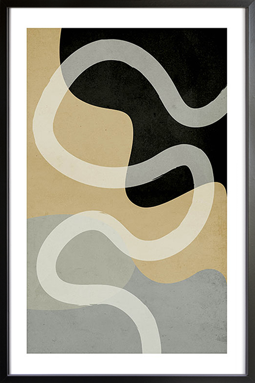
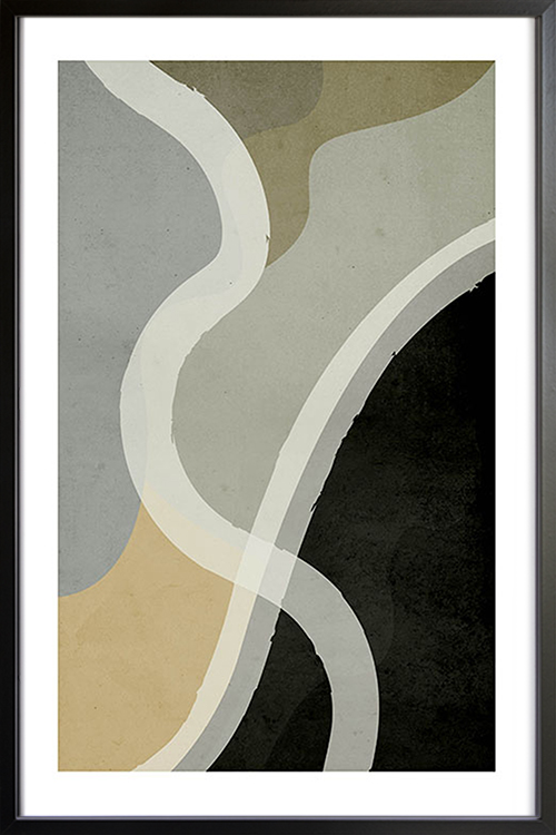
Gray
Gray is commonly used in the dining room to give it a formal and sophisticated appearance. The color scheme can be sleek but sometimes can be dull when overused. Unlike white and neutrals, shades of gray are not easy to work around. Choose one or two walls to paint gray and have the other walls with neutrals or white. Hang posters in lighter shades to contrast the gray wall, and you will have a formal-looking dining area.
Red
Red may not be the first choice of many homeowners, but this can stimulate the appetite. This is why many restaurants use color for their interior. Shades of red in posters can encourage conversation and give the room a dramatic statement. In addition, deeper shades of red do great in the dining room as it adds a cozy and luxurious appeal.
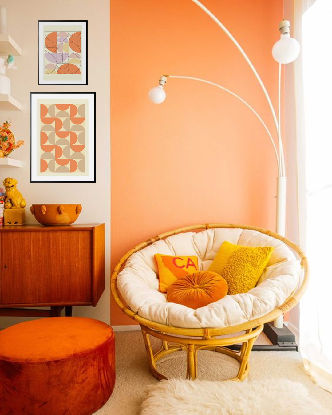
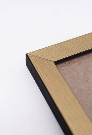
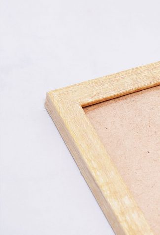
Brown Woods
Over the years, brown has been the favorite color in the bedroom. Wooden walls, shelves, and furniture pieces give the room a retro and modern appearance. Posters or prints n shades of brown can likewise give the room an appearance that is warm and comfortable