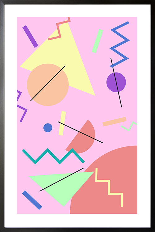
Simple yet funky poster design that can give a lively and cheerful vibe to your home. Set the mood for a party with a Memphis design style and see the smile on the faces of your family and friends.
Simple yet funky poster design that can give a lively and cheerful vibe to your home. Set the mood for a party with a Memphis design style and see the smile on the faces of your family and friends.
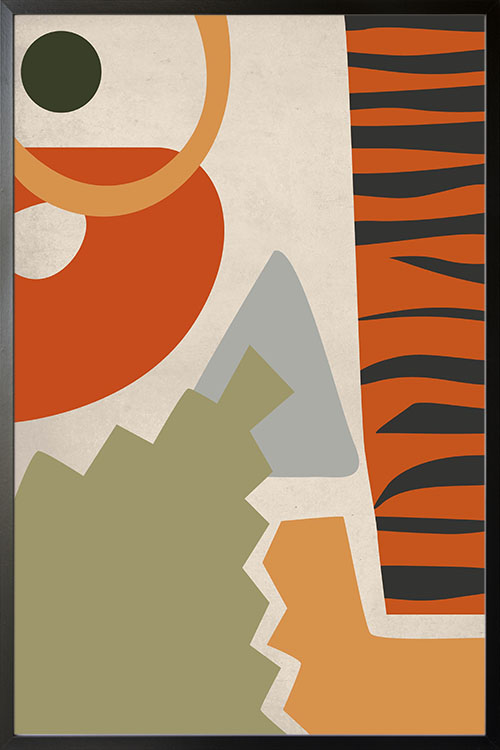
Let your home have the fun and enjoying atmosphere it deserves with a warm and stimulating poster. Experts believe that the display of a poster with warm and bright colors can add comfort and coziness to the room. It can also make any room look appealing and invigorating.
Let your home have the fun and enjoying atmosphere it deserves with a warm and stimulating poster. Experts believe that the display of a poster with warm and bright colors can add comfort and coziness to the room. It can also make any room look appealing and invigorating.
Let your home have the fun and enjoying atmosphere it deserves with a warm and stimulating poster. Experts believe that the display of a poster with warm and bright colors can add comfort and coziness to the room. It can also make any room look appealing and invigorating.
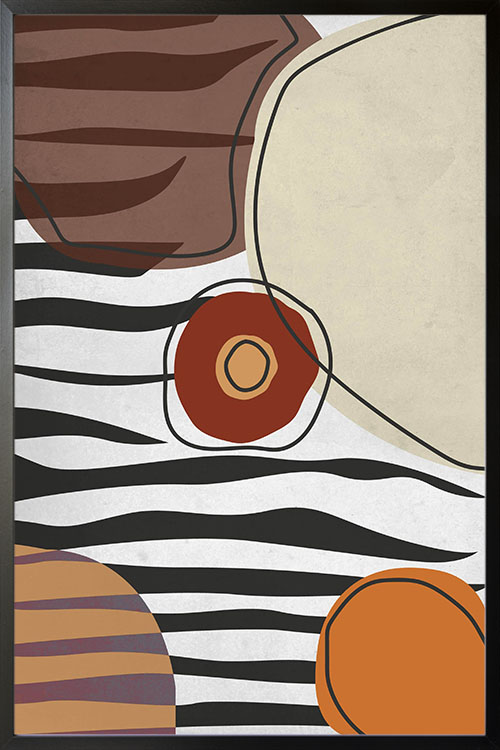
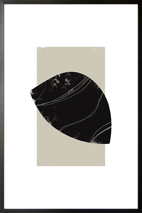
Shapes and lines in warm and neutral colors. Beautify your walls with a unique and interesting poster design. Filled with lines and curves, the poster art can make your wall look more captivating. The colors used also make the room look more stimulating and lively. With this poster displayed in your rooms, you will have a wall accent that can make your room look more stylish.
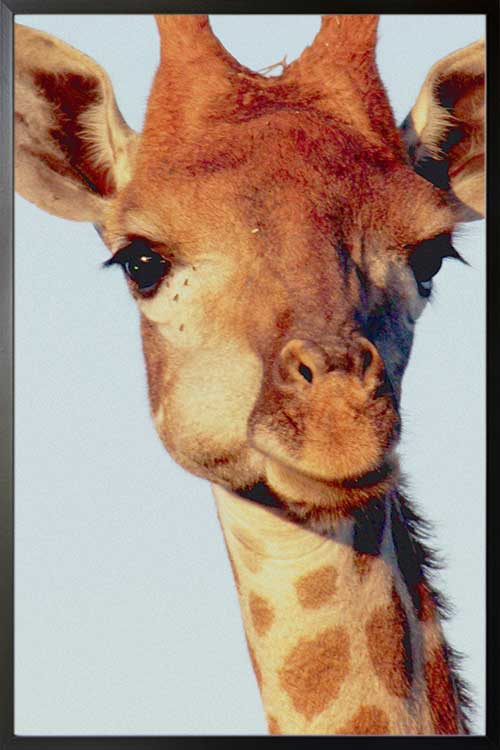
Giraffes are gentle animals yet powerful enough to fight their enemies. A photograph of this iconic animal in poster print is a perfect wall decor if you want to add life and vibrancy to your home. Beautify your walls with a trendy and stylish poster from the impressive collections of artdesign.
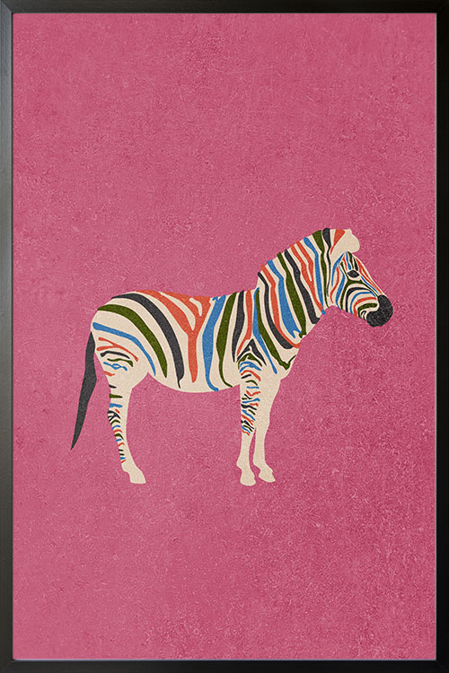
Animal posters are simply fantastic. Not only that these prints add life to your room. They can also symbolize who and what you are. Every animal represents traits that can customize your room and personalize your walls. These trendy art can likewise help create a room that is visually calming and relaxing.
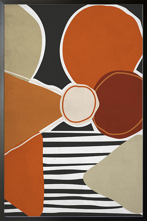
An art in abstract form that can be the highlight of your room. Beautify your walls with and art print that will make any dull and boring wall look fun and exciting. The trendy art can also blend with any wall color to make a captivating design.
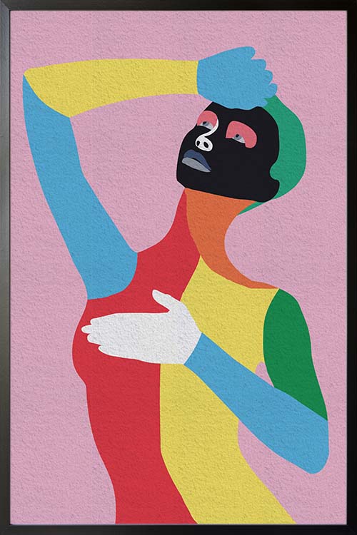
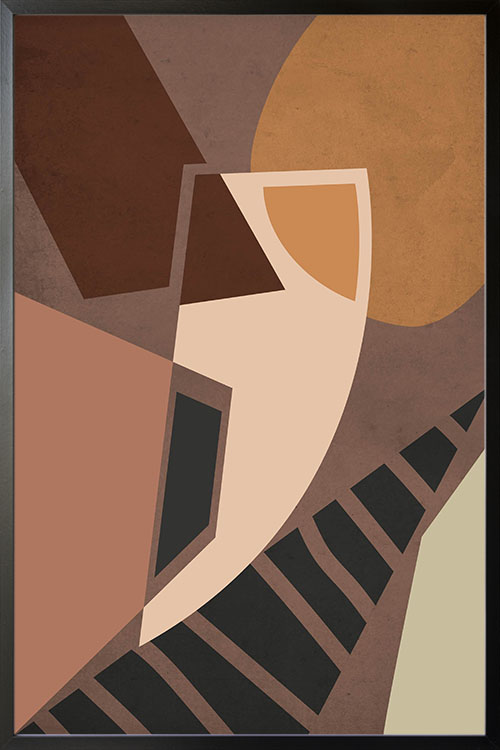
Add life to your walls with vibrant poster art. This trendy poster art of a woman in various colors can make the walls look unique and interesting. A perfect art to be added on plain colored walls. This is your chance to give your room a statement with the addition of trendy and stylish art.
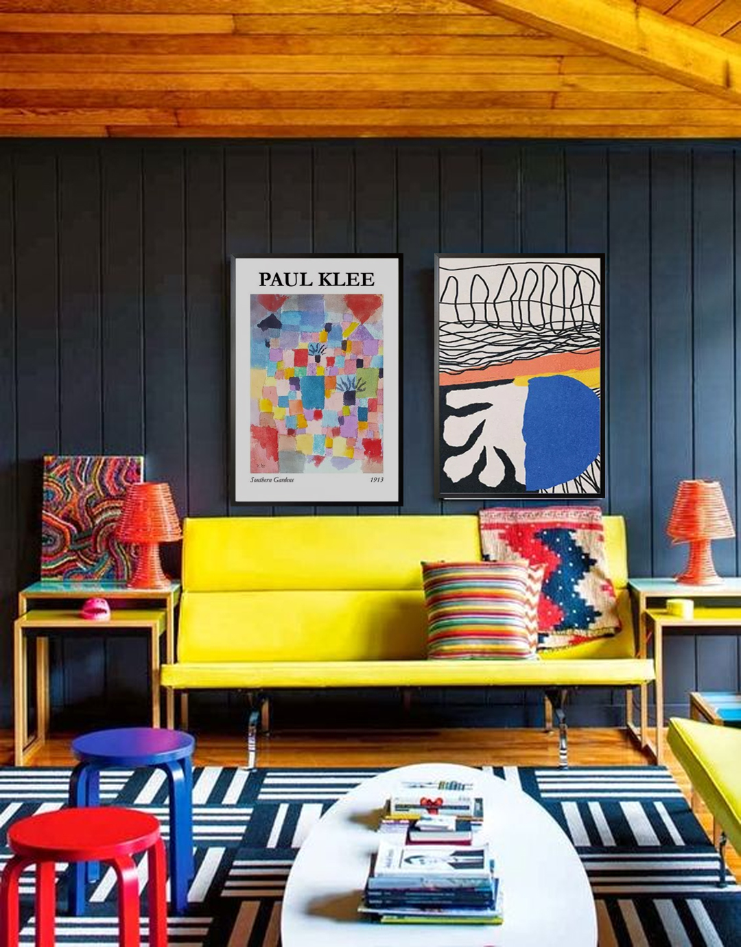
Paul Klee was a German-Swiss artist born in 1879 who fell in love with colors and tones. You may have seen some of his works and they can be described as child-like, simple, and can be appreciated by all ages and levels. His paintings are also rich in geometric forms and shapes. Some of his works can even be used to help kids in their learnings, such as letters, animals, and numbers. Some are in abstract form and can be used to add colors and design to your walls.
Over the years, colors are used to make any space look attractive. There are different types of colors and you can check the color wheel for references. Colors can also be divided into two groups, cool and warm colors. Warm colors are fun and exciting and can make you think of sunlight and heat. These are orange, yellow, and red, and a combination makes the team of warm colors.
On the other hand, cool colors are blue, green, and purples. These colors are calming and sooting. If your want your bedroom to have that ambiance that is perfect for resting and sleeping, then cool colors are a perfect choice.
Tones are created by adding neutral colors such as white, gray, or black. These colors, when added to primary or secondary colors alter their lightness. If you are on a decorating project, remember that darker colors help you to bring light color more in focus.
Paul Klee was known as an avid reader and lover of music. With his paintings filled with shapes and colors, they are rich with rhythm motivated by the modulations of Mozart and Bach or even the cadence of poems by Apollinaire and Rilke. Klee was also inspired by the art of kids as well as those who are suffering from psychological disorders. Their art was regarded as a pure form of expression. In 1914, during a trip to Tunisia with Macke and Louis Moilliet, Klee was deeply inspired. As a result, his artworks were added with the rich color palette and distinctive language of mystical symbols.
One of the most important personalities who have inspired Klee was Kandinsky. He is considered to be the godfather of abstraction along with the other members of the Munich-based group, Macke, Marc, Alexej von Jawlensky. In addition to these, the lyrical patterns and transcendent color palette of Robert Delaunay also affected Paul Klee.
Paul Klee was one of the prominent artists in the 1900s. He is known for changing the course of modern art. As a passionate artist, he was also one of the artists who have influenced younger generations of artists. Remember the time when painting became less popular, it surged again because of the influences of Paul Klee. His works can be considered to be unconventional as it encompasses almost any style like the art created by disabled people and practitioners of the occult.