Textured yellow watercolor poster

Textured yellow watercolor poster

Yellow is the color of sunshine, hope, and happiness. It also represents freshness, happiness, positivity, clarity, energy, optimism, enlightenment, remembrance, intellect, honor, loyalty, and joy.

Textured red watercolor poster

Textured red watercolor poster

Red is a powerful color that represents blood and fire. It is associated with love, passion, desire, heat, longing, romance, joy, strength, leadership, courage, vigor, willpower, rage, anger, radiance, and determination.

Christmas socks boho color poster

Christmas socks boho color poster

Upgrade your walls with cool and wonderful wall art of Holiday posters. Boho-themed Christmas socks will complete your decorating project this year. Make the holiday more fantastic with this poster as a gift to your loved ones.

Snowflakes boho color background poster

Snowflakes boho color background poster

Upgrade your walls with cool and wonderful wall art of Holiday posters. Boho-themed Christmas socks will complete your decorating project this year. Make the holiday more fantastic with this poster as a gift to your loved ones.

The Colorful World Of Paul Klee

Southern Gardens poster

Paul Klee is a talented artist who has contributed a lot to the world of art. He is also a natural draftsman who experimented with and mastered the color theory and wrote extensively about it. His lectures, Writings on Form and Design Theory, that is published in English as the Paul Klee Notebooks, are considered to be of utmost importance to modern art. Read on to learn more about the life and works of Paul Klee.

Biography

Paul Klee (1879-1940) was born in Switzerland and considered to be both a German and Swiss painter. His works were greatly influenced by different movements in art, including expressionism, cubism, and surrealism. He is a natural draftsman whose artworks have shown that he has mastered color theory. 

During his younger years, Paul Klee focused on becoming a musician, but later on decided to concentrate more on the visual arts. As a musician, he played mostly the traditional works of the 18th and 19th centuries. As a visual artist, he enjoyed practicing freedom to explore radical ideas and styles. 

During his school years, he is fond of drawing caricatures and already displaying and already displaying skill with line and volume. He also studied art at the Academy of Fine Arts in Munich wherein he excelled at drawing. After receiving his Fine Arts degree, he traveled to Italy along with his friend, Hermann Haller. While traveling, the two studied the master painters of the past centuries. 

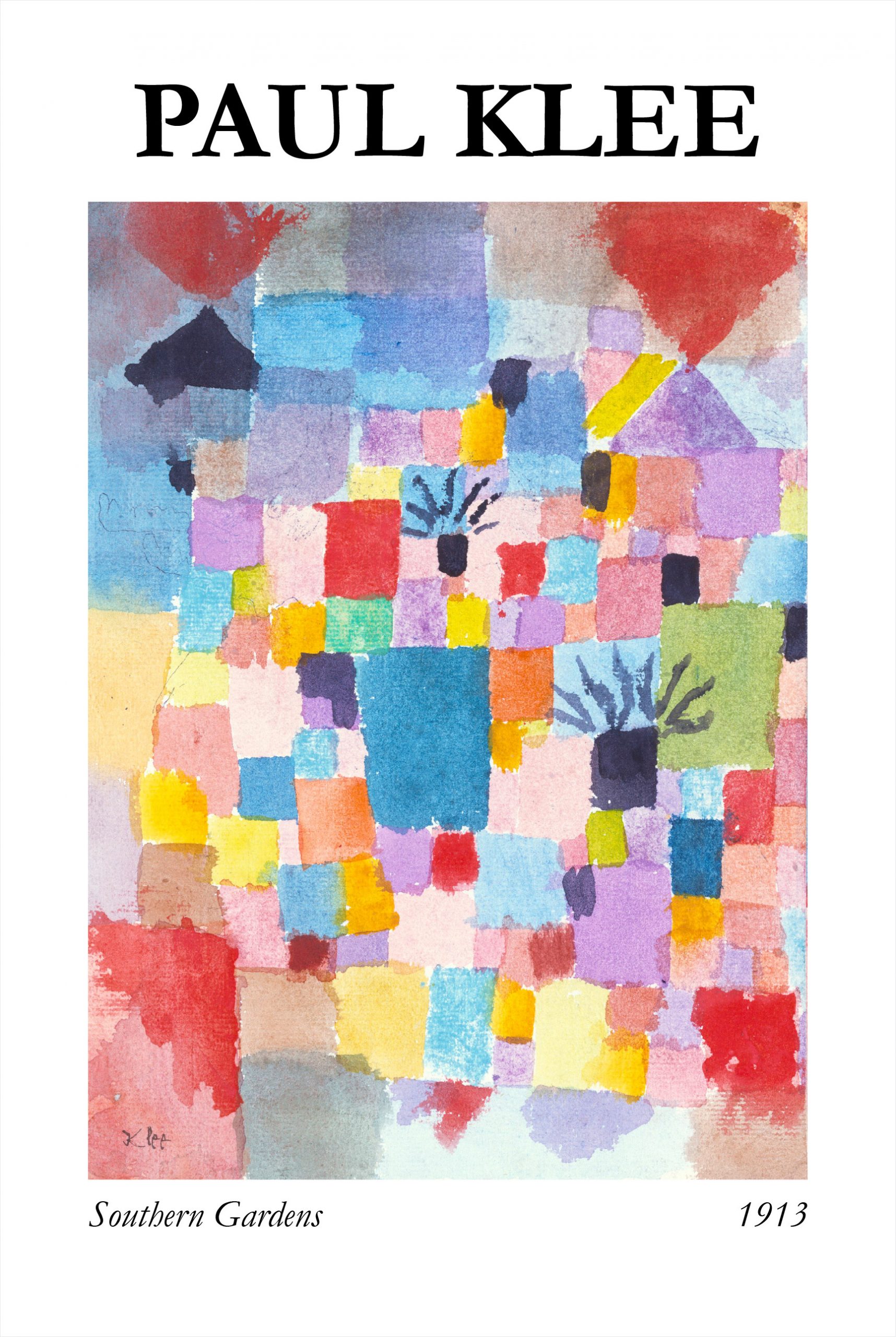
For Paul Klee, color represented the optimism and nobility in art, and a hope for relief from the pessimistic nature he expressed in his black-and-white grotesques and satires. By 1905, he was developing some experimental techniques, including drawing with a needle on a blackened pane of glass resulting in 57 works including his Portrait of My Father (1906). He also completed a cycle of eleven zinc-plate etchings called Inventions. 

From 1931 to 1933, Klee taught at the Academy of Fine Arts in Dusseldorf. He went back to his hometown when the National Socialists declared his art “degenerate” in 1933. His later works reflected the turmoil in Europe in which they have a somber tone. Lines turned into black bars, forms became broad and generalized, scales are larger, and colors are simpler. 

Methods and Styles

Paul Klee was associated with Expressionism, Cubism, Futurism, Surrealism, and Abstraction. He usually worked alone to interpret new art trends in how own way. He developed new techniques as he worked in different media including oil paint, watercolor, ink, pastel, etching, and others. He often combined these mediums in one artwork. He also used canvas, burlap, muslin, linen, gauze, cardboard, metal foils, fabric, wallpaper, and newsprint. He also used spray paint, knife application, stamping, glazing, and impasto and mixed media such as oil with watercolor, watercolor with pen and India ink, and oil with tempera. 

With his mastery of color and toes, many of his works combine these skills. Most works have a fragile childlike quality to them and are usually on a small scale. It is also common to see geometric forms and grid format compositions along with letters, numbers, animals, and people. Some of his works are abstract that may reflect dry humor and varying moods, as well as political convictions. His works often allude to poetry, music, and dreams. His later works are distinguished by spidery hieroglyph-like symbols.  

The Colors Of Christmas

Winter is here Christmas sock poster

In the Philippines, you will know that the Christmas season is coming when you are already hearing Christmas songs being played in malls, radio, or on television. Listening to those melodies will make you think of the presents that you have to prepare for your relatives, friends, and loved ones. Needless to say, the Christmas atmosphere can easily be felt with the colors seen around us. With green, red, gold, and silver surrounding us, the spirit of Christmas will surely make you hum your fave song!

Green

Green is the color of life and mystery. During winter, all of the other plants die, except for holly bushes and fir trees as they remain evergreen. These two plants survive even in the harsh conditions of the season. Romans during those times would weave holly wreaths and hang on their doors and wall. The wreaths signify the desire to see the rebirth of the sun and return of the summer. As such, green is associated with life. The color is also associated with nature and can give a refreshing and rejuvenating feeling. 

Red

In contrast with the green, red represents blood and death. This is one of the reasons why people started adding red berries to their green holly wreaths. Aside from the attractive appearance of the wreaths, the colors represent the birth, death, and resurrection of Jesus Christ. In addition to these, red symbolizes Christ’s teachings of unconditional love. If you are also wondering why Santa wears red? It is the color of the robes of bishops as well as what St. Nicholas wore. 

Gold

Gold is the color of the sun and light. It is also the color of extravagance, wealth, riches, and excess. It is also one of the presents brought by one of the three wise men to the infant Jesus. It is also the color of the star that the three wise men followed. In addition to these, gold represents the gift of eternal life as promised by Christ.

Blue

During medieval times, blue dye is more expensive than gold. This is the reason why blue-colored garments are used only by royal families and wealthy families. This color is also associated with Mother Mary and why many images and statues of her have the color on her robe. This is also considered as one of the cool colors that create a relaxing and calming vibe to the interior.

White

White is the color of purity. This is why the color is associated with Jesus Christ. He brought light in the dark and saved us from our sins. He is spotless, sinless, and pure. White is also important to churches during Christmas around the globe.

Purple 

Purple is the main color of the Advent season. It represents fasting and repentance and the altars of churches around the globe are covered with purple cloth. It is also the color of royalty and the first candle of the Advent Wreath is purple. 

Pink

This color is used during the third Sunday of Advent. It represents love and joy and the shift from repentance to joyous celebration.

Color Theory And Your Home Interior

Art wall 124

Color theory is the study of hues and how to use them in harmony. This is important in the design industry as the correct choice of scheme can influence moods, feelings, and even the quality of sleep. As such, the addition of furniture pieces and decorative items will be easy. 

Choosing the colors of the paint

Houses have different rooms, yet there should be an easy flow into each other. This design can create a cohesive decorating scheme making the home look more interesting. If the rooms feature different palettes or color schemes, the result would be disastrous. The colors in the room should be in perfect balance to achieve an interior that will be appealing to the sense of vision. 

There are homeowners who play safe and use one color of paint on the walls, especially those with open floor plans. Connections between rooms are mostly because of the pleasing effect of a color scheme. 

The harmony

Harmony refers to the relationship of the hues with one another on the color wheel. As such color combinations can be formed. There are six types of harmonies: monochromatic, analogous, complementary, split-complementary, triadic, tetradic. 

Color temperature

There are two temperatures or tones: warm and cool. Examples of cool colors are blue, indigo, purple, and green while warm colors are red, pink, orange, and yellow. Blending them results in rich and versatile hues and choosing the right tone can give a home an attractive theme. These colors are also perfect to be paired with neutral tones and cool accents. 

Color meanings

In decorating the interior, it is also important to know and understand the meanings of the colors. As such, they can reflect the emotions that the homeowners want in their homes. Red, for instance, represents ambition power, passion, and activity. Orange stimulates appetite, represents optimism, and being instinctive. Cool colors, such as blue represents intelligence, authority, control, and contentment. 

Color conveys these characteristics and blends with your senses to leave you feeling synergized with them. In addition to these, the saturation and scheme of a home can boost mood and provide a form of color therapy in any room. 

Palette balance

Balance allows you to use your palette in an attractive way. This can be achieved by choosing one color as the dominant one and fill about 60% of the space. In many instances, neutral colors are chosen to be the dominant colors then secondary and accent hues take about 30% of the space. The remaining 10% are for the accents. 

Light and Texture

Light is one of the best ways to feature and adjust colors. It gives more depth and value. With the use of light dimmers, you will be able to create a calm and relaxing atmosphere. Applying paint can be easy and affordable, but with the use of light, the colors that you added can be enhanced. 

Moreover, you can also add texture to your home with the use of fabrics. Surfaces with natural materials like wood and stone can also add texture to the whole interior. Use pillows, blankets, throws, and carpet to complete your home interior.

Baby Watercolor silhouette personal poster

Baby Watercolor silhouette personal poster

Impressive and attractive art of your little bundle of joy. Display your baby’s image in watercolor silhouette art to make things more interesting. This trendy art can easily make any room look cozy. Have it displayed in the bedroom or nursery, and you will have a focal point that will touch the hearts of its viewers.

Baby Watercolor reverse personal poster

Baby Watercolor reverse personal poster

Impressive and attractive art of your little bundle of joy. Display your baby’s image in watercolor reverse art to make things more interesting. This trendy art can easily make any room look cozy. Have it displayed in the bedroom or nursery, and you will have a focal point that will touch the hearts of its viewers.

Colors and Mood: Their Effects On Your Home

Art wall 106

Color psychology teaches us that different colors have relevant effects on mood. In fact, colors and mood are closely linked with each other. Warm colors evoke different emotions and bright colors even create different feelings. Colors either make us happy or sad and among other reactions of the body. Studies have shown that colors affect the psychological and physical aspects of the body. 

Colors and mood

The effects of colors on mood greatly depend on different factors. Examples are brightness, shade, tint, and tone. In general, colors are divided into two categories: warm and cool colors. 

Warm colors

Warm colors, such as red, orange, and yellow evoke feelings of happiness, optimism, and energy. They can also catch the attention of anyone. What makes red extra special is that it can increase the appetite of an individual. This is the reason why many restaurants incorporate the color red in their interior. 

Cool colors

Green, blue, and purple are examples of cool colors. These colors evoke a calming and relaxing vibe. On the negative side, cool colors, express sadness. If you want to be creative, it is recommended to use purple in the room. 

Cheerful colors

Bright and warm colors are known to uplift the mood. This is also true with pastel colors, such as peach, light pink, or lilac. It has been observed the brighter and lighter the color is, the happier the emotion is. Experts also recommend combining pops of colors for happier and youthful effects. 

Gloomy colors

Dark and muted colors are considered to be sad or gloomy colors. Examples are blue, green, brown, and beige. Some countries and cultures also use these colors for mourning. 

Calming colors

Blue, green, and their pastel counterparts are known to have calming and relaxing effects. This is also true with neutral colors, such as beige and gray. It is also recommended to use only a few colors when combining them. The principle is, the more simple, the more calming and relaxing they are.

Energizing colors

Bright colors, strong colors, and neon colors can feel energizing and make you feel active. These colors are attention-grabbing and can stand out in any environment. They also have stimulating effects and likewise, evoke refreshed and energized. 

Final Thoughts

Colors are very important when designing or decorating the interior. You need to consider what a person will feel when exposed to a particular color. The effects of color can almost always be agreed upon universally. Colors and mood are related to each other. With these, you can now freely choose the colors to incorporate in your home and see remarkable results. 

Moreover, it is recommended to think of the right colors to use in a room. For instance, eating areas need colors that can stimulate appetite like red and orange. Offices or study areas need green and pops of purple to keep everyone in the room focused on accomplishing their tasks. Try these in your homes or any other living spaces