Color Green And Its Origin

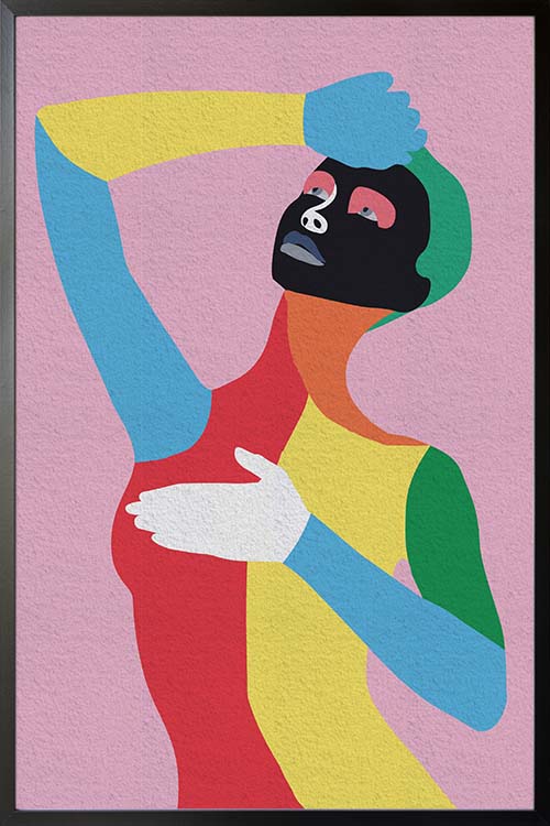
Vibrant green leaves poster

Among the colors in the color wheel, green is probably the most important of all. It is the color of nature and has been associated with “bloom”, “growth”, and “grass”. The leaves of plants have a green color because of the chlorophyll pigment present. This pigment is vital for the survival of plants for them to produce food and oxygen. In life, green is related to balance, calmness, and harmony.  However, not all green can be helpful. There are also green substances that can be harmful to health and the environment.

How color green is manufactured

Surprisingly, how the color is manufactured may be contradicting the common concept of the color green. Manufacturing the color is not environmentally friendly because of the chemicals used. It has been shown in several studies that you cannot dye certain materials like plastics without contaminating them. It is therefore a necessity to use stabilizers to manufacture the color green. Examples are chlorine, titanium, cobalt, and zinc oxides. Unfortunately, these chemicals are known to cause birth defects and cancer. 

Color green in the history of mankind

In the past, artists were struggling to create the right shade of green for their artwork. Even if they thought that they already have the exact shade of green, it will eventually fade or get discolored through time. Early green-colored paints are even corrosive and can damage the canvas. During the early period, the color green is created with the addition of arsenic, a known poisonous substance. Many experts also believe that the said chemical was responsible for the death of Napoleon Bonaparte in 1821.

However, as time goes by, the color is commonly used by environmentalists as it is associated with the natural color of nature. Whatever and however the color is manufactured, green has many benefits, both in health and the environment. 

Environmentalists and the color green

It was in 1970 that the color was used and resurfaced to be associated with certain environmental groups. The Canadian environmentalist group, Greenpeace, used a ship in Alaska to conduct a campaign against nuclear testing.

Since then, anything that is colored green is associated with the environment. Products with green-colored packaging suggest that they are environmentally friendly. Until this day, color is being used by many manufacturing companies in branding and marketing strategies. 

Final Thoughts

Green is a cool and calming color that is associated with many things. The color is often used in environmental-related things. Interestingly, it has a toxic history as manufacturing the color is not that easy. Certain harmful chemicals were used and these chemicals are known to be detrimental to health and the environment. These chemicals were used to stabilize the color and make it useful in creating the desired shades of green. As such, painters were able to use the color with ease but with side effects. For years, this has been the case but throughout the years, people used the color and associated it with the environment. A cool color that when used in the interior can create a comfortable and relaxing vibe.  

Orange Color abstract shapes poster

Orange Color abstract shapes poster

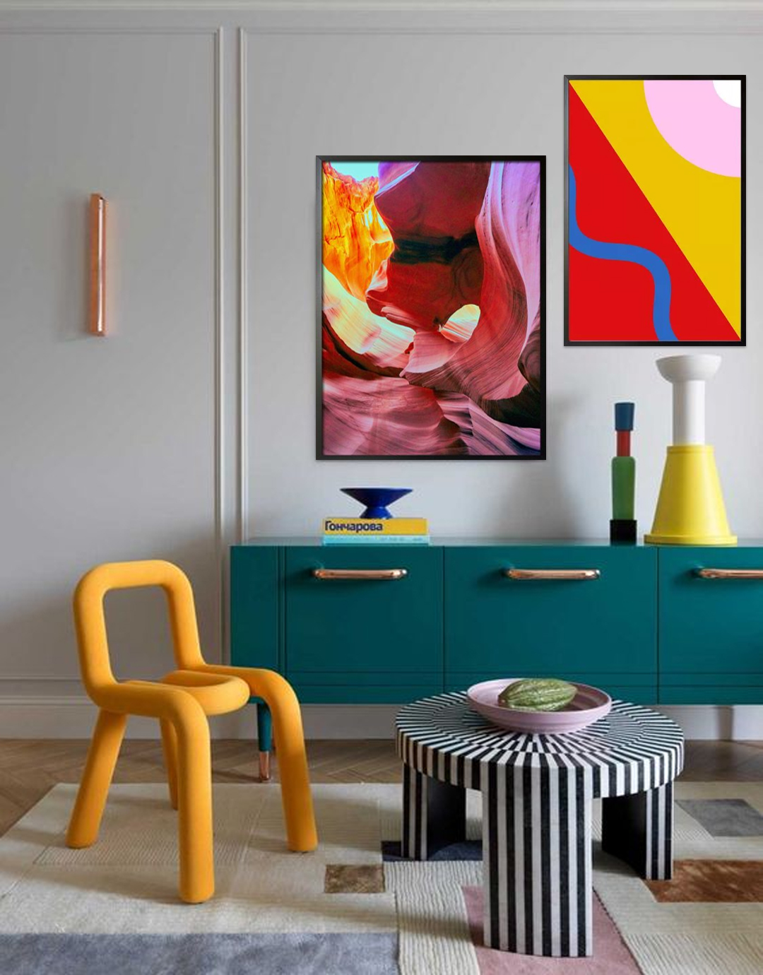
Vibrant and dynamic looking poster art that can add life to any dull and boring wall. A perfect poster for the dining room and the kitchen to stimulate your senses. Make your room appear trendy and stylish with an art of warm and enticing colors and shapes.

Blue Color modern abstract shapes poster

Blue Color modern abstract shapes poster

Cool and relaxing poster art that will help you achieve a relaxing and calming room environment. Create a room atmosphere that is conducive for sleeping with the shade of blue. This poster can also be displayed to add texture to your rooms.

Multi colored zebra poster

Multi colored zebra poster

Animal posters are simply fantastic. Not only that these prints add life to your room. They can also symbolize who and what you are. Every animal represents traits that can customize your room and personalize your walls. These trendy art can likewise help create a room that is visually calming and relaxing.

Choose The Right Colors For Your Red Interior

Window with a view of structure poster in interior

Colors are identified through wavelengths and this includes the color red. As one of the primary colors, the color red is used for many reasons. It also occurs naturally such as the color of many flowers. The color is also one of the warm colors associated with our physical needs and the will to survive. Red also represents many human traits, like masculinity, leadership quality, determination, and ambition, and is strong-willed.

It is a powerful color that many brands prefer to use in their products. In interior design and decoration, the color can blend well with many design styles from eclectic to traditional. Too much of the color may also be an eyesore that is why it is recommended to blend the color red with the right colors. Read on to learn more about the perfect colors that will go well with the color red. 

Midnight

Black and red are some of the favorite color combinations of many designers and homeowners. This color combo adds drama to your rooms and likewise makes them appear vibrant and lively. These colors also help in making the rooms look bold, striking, and stylish.

Navy

As a strong color, red needs to be neutralized to mellow down the overall appearance of the rooms. Navy can do the job by balancing and mellowing the color red. As a result, any room can have a stylish and chic look. 

Sunflower yellow

Sunflower yellow blends well in any interior with the color red. The combination of these colors evokes a fun and exciting room vibe. They also help in creating a bold, striking, and stylish room atmosphere and appearance. 

Red interior and Fuchsia

This color may appear similar to the color red, but they do differ when it comes to shades. The combination of these colors offers a monochromatic look but with layers. As such a room with these colors evokes a classy and sophisticated appearance. 

Cream your red interior 

Just like any contrasting color, the cream can also balance the color red. When red is painted on the walls, creamy white can create an elegant and sophisticated room appearance. 

Green

Red interior, especially cherry red can be paired with grassy green to evoke a trendy and stylish room. Green can also give your room a fresh and rejuvenating room vibe that will be loved by anyone. This color combination also offers a calm and relaxing room atmosphere. 

Chocolate brown with red interior 

Chocolate brown and red may not look perfect with each other but this color combination can give any room a touch of feminine. These colors can be a perfect backdrop for floral posters or prints that feature women. 

Turquoise

Combine this color with your red interior and you will have a room that is vibrant and lively. 

Almond

Almonds have been commonly used in many rooms over the years. Combine this color with a red interior and you will have a unique and interesting room appearance that is perfect for the whole family. This color combination can also evoke a welcoming and relaxing vibe that will be enjoyed by your family and friends. 

Bubblegum pink paired with red interior

This shade of pink is perfect to be paired with any color. But when paired with a red interior, the colors will have a color scheme that goes well with the kids’ room, playroom, or nursery. 

Gold

Red and gold evoke grandeur and luxury. These colors are perfect in the dining room and other formal areas as the color project a classic and timeless appeal. 

Multicolored art wall

Art wall 64

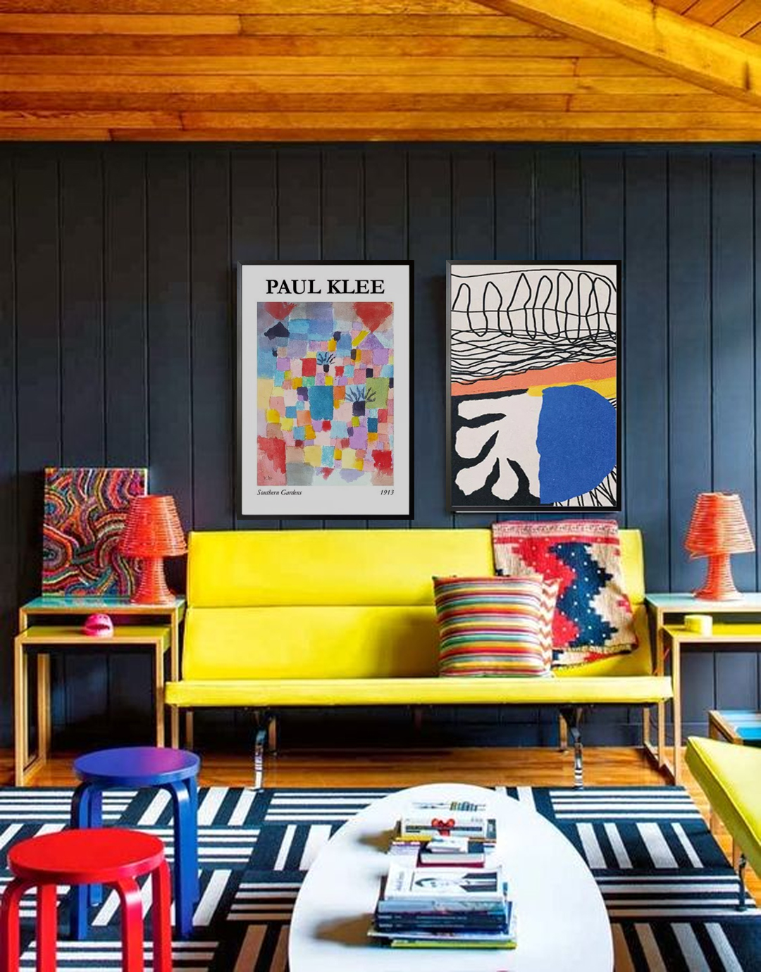
The display of these colorful poster prints is an ideal way to bring color to your home and create a lively and stimulating atmosphere.

Number of posters: 2

Cheerful Homes With Warm Colors

Modern textured Prints no. 4 poster in interior

Over the years, experts believe that colors have significant effects on the behavior of many individuals. In general, warm colors can evoke a fun and exciting atmosphere in any room. Moreover, colors like red, orange, and yellow, were known for bringing out the positive aspect of life. 

Colors and human behavior

Science describes colors as visual perception and they are categorized in different categories. Studies have shown that when eyes connect with colors, various chemicals are released from the brain. These chemicals have particular effects on the physical and emotional levels of humans. 

These are the reasons why in the world of advertising and marketing, certain colors are used to highlight the different products. Different color palettes have been used by companies in the packaging of their products and also in promotional materials. The color orange, for instance, is usually seen in restaurants due to the fact that the color stimulates appetite. Red, on the other hand, brings out masculinity. Many products for men use the color to encourage men in purchasing them.

Colors are also important in interior design. The use of colors is one of the important factors in creating the right atmosphere in a room. In many instances, home interiors are seen in neutral colors like black, blue, gray, and white. Unfortunately, these colors do not provide any health benefits as compared with warm colors.

The effects of warm colors

Warm colors are those that are in the red area of the color spectrum. In human health, warm colors are known to have positive effects. These colors evoke emotions that range from warmth and comfort to anger and hostility. These colors stimulate the body that creates a happy emotion.

On the other hand, cool colors are those that are in the blue side of the color spectrum. Examples are blue, purple, and green. These colors are calming and relaxing. However, they also evoke a feeling of sadness. 

Red

The color with the longest wavelength and considered to be powerful. It can catch attention as compared with other colors. These are some of the reasons why red is used in traffic lights as it evokes physical and psychological responses. 

The positive traits of red are courage, strength, warmth, energy, stimulation, and excitement. It was also observed that the color can stimulate circulation, thus increasing the circulation of blood and oxygen.

Yellow

The color with a relatively long and stimulating wavelength. In color psychology, yellow is considered to be a strong color. The right shade of yellow can uplift the spirit and boost self esteem as well as self-confidence and optimism. On the contrary, yellow can promote the feeling of irrationality, fear, depression, and anxiety.

Orange

The color that results from the combination of red and yellow. This is another stimulating color that has effects on the mind. Orange also represents human needs, such as, food, warmth, shelter, and sensuality. 

Final thoughts

Warm colors are considered to be stimulating colors as they help activate mind and body. As such, blood circulation is increased to help the cells receive more oxygen. This in effect promotes cell growth and organ function. In addition to these, the immune system is also stimulated to fight disease causing microorganisms. The brain is also well oxygenated making the mind sharp and focused.

Color Palette Ideas For Your Home

Art wall 53

The first thing to consider in creating a home is the color. Creating a home color palette will make your decorating choices much easier and can create a flow between rooms. Your choice of colors completely depends on you. Experts recommend sticking to 3 to 5 colors for the color palette. 

Monochromatic color scheme is ideal for homeowners who want to have a modern and clean home. Harmonious color schemes, on the other hand, can give you a calm and relaxing feeling. Complementary colors are opposite from each other on the color wheel and each color stands alone. 

So, whatever color palette you choose, will reflect who you are and what atmosphere you want for your home. 

Best color palette for the bedroom

Shades of blue are observed to be calming and people in blue bedrooms get more sleep than any other color. This is for the reason that there are receptors in our eyes that are sensitive to the color blue. The color can also lower the heart rate and blood pressure. Studies have also shown that blue bedrooms can make you feel happy when you wake up. 

Yellow is said to be the second best color for the bedroom. It stimulates the nervous system and encourages relaxation and promotes coziness. 

Green can also promote sleep and can help waking up with a feeling upbeat and positive. Warm colors are also observed to create a relaxing atmosphere that can aid digestion. The colors can likewise help warm and relax body muscles so that one may have a good night’s sleep. 

Cool color palette for the bathroom

Warm colors such as orange and red represent energy and activity. Cool blues and greens on the other hand, are soothing and calming. 

Before settling on a color palette, think about what you want to feel in your bathroom. Is it energized or relaxed? Color orange is energizing but does not overwhelm when paired with neutral tile. 

When red is paired with a clean white backdrop, the bathroom design mixes old and new to create something totally new. While classic neutrals such as beige and tan can create a casual, classic bathroom style that can be dressed up with colorful accessories. 

Design color palette for your kitchen

When it comes to the kitchen, the common colors seen are white, gray, blue, red, yellow and green. Each one of them can do something for the room by creating a warm and welcoming atmosphere. 

Red is also considered to be a warm color and can stimulate the appetite. The color is said to be one of the good choices for the kitchen. The color is likewise versatile and can be used on the cabinets or on the walls. White on the other hand, can energize the room and will wake you up the minute you step in. Color white on the countertops and backsplash can be fun especially when they are in brighter colors or designs.

Great color combinations in the living room

Colors commonly seen in nature such as sky blue and leaf green have a calming effect on us. While red is stimulating and yellow is said to be uplifting. Experts recommend that decorating with one color on walls and furniture is to use different shades of the same color together. For instance, soft apple green sofa paired with emerald metal side tables can create a wonderful effect. If you want to have a dramatic and modern look, paint the walls with dark midnight blue. Add furniture in rich shades like a pink sofa. 

Pastel colors such as powder blue, pink or lilac can be incorporated with striped or floral accessories to make the living room more interesting. Lighter shades of color can make the room feel as big as possible. 

Color Mixing Ideas For Your Home

Art wall 61

Many people find color mixing fun and interesting. This is the time when you stimulate the creativity side of your brain and come up with color combinations for your home. Others would find this challenging yet the results can be fantastic. Here we have some tips on how to do color mixing and apply them in your homes. So next time, you will feel like a pro in color combinations. 

Color mixing and the use of color wheel

Color wheel is an abstract organization of the different hues of colors that are arranged in circles. It represents the science behind color and likewise shows how colors relate to each other. Color wheel contains three primary colors, three secondary colors, and six tertiary colors. Understanding how colors affect each other will help you create the right color schemes. The complementary color schemes are made up of colors that are opposite to each other on the wheel. As such, the colors reflect light differently, creating a dynamic appeal.

Color mixing, on the other hand, has two types: additive mixing and subtractive mixing. Additive mixing is when you add colors to create white light. The primary colors are the most commonly used. While subtractive mixing is the four color printing process that uses cyan, magenta, black, and yellow.

How to mix colors for an appealing home 

If you know the fundamentals of the color wheel, then color mixing would be easy. Color mapping is the process when you pull the color throughout the space. It is mapping the color throughout the entire room. This method is to ensure that the three primary colors are repeated proportionally thus making the room cohesive. 

The use of black and white also create variety. Adding white to a certain color creates a tint, while adding black creates a shade. Both create the same color but with different tones and can be used to add vibe to your space. Colors with higher value are more intense while colors with lower value are more mellow. 

Still hesitant to start your decorating project? You may decide to begin with your favorite color. After which, you may decide the mood or atmosphere that you want to incorporate into your rooms. Use the color wheel to help you choose the right accent and tints. For sure, you will be awe-inspired when this project is completed.

Posters to add color

Gone are the days of plain-colored walls. The use of different wall decors help in creating a remarkable room appearance. Over the years, posters have been used to complete the overall appearance of your walls. Artdesign has a wide range of poster designs that will help you become successful in your project. 

Choose from the different themes that we have. Vibrant posters are perfect to create a fun and exciting interior. Black and white prints, on the other hand, can give you a classic and timeless appeal. 

Color Psychology and You

Light colors brush stroke poster

Color has been known to be associated with the mood and behavior of people. For instance, the colors of the room have been observed to reflect one’s personality. Colors also influence the mood and thoughts of humans. Read on to learn more about color psychology and its importance in decorating our homes. 

What is color psychology?

Color psychology is the study of colors in relation to human behavior. It focuses on determining how color affects our daily activities. Color psychology also has its importance in decision-making. For instance, the decision that you are going to make when choosing between the color or brand of a shirt. They likewise have meanings that are observed to be associated with culture and tradition, location, values, and other factors. 

Color Psychology and your daily life

Experts believe that the surroundings may be influencing your emotions and state of mind. There may be some places that make you uncomfortable or certain places that you find calming and relaxing. On many occasions, the colors in those places affect the way you feel. 

Color is associated with a person’s emotions and mood. Studies have revealed that individuals who are looking at the color red have increased heart rate. As such, the blood flow increases and adrenaline is pumped through the body systems. 

In general, there are two types of colors. They can be cool or warm colors. These colors can be easily matched with your desires, taste, and personality. In adding colors to the room, the type of color has a significant effect to the overall appearance of the space. Light colors are known to be expansive and airy thus making the room appear larger and brighter. On the other hand, dark colors are seen to be sophisticated and warm.

Red

Shades of red increases the room’s energy level. Experts consider this color to be intense and can boost the adrenaline in the body. If you want to make a room appear fun and exciting, adding red is a perfect choice. The color also encourages conversation among individuals when added in the living room or dining room. When placed in the entryway, your home will have a strong first impression. 

Yellow

The color evokes happiness in any room. Designers and homeowners prefer this color for the kitchen and the bathroom as it energizes the mood. The color can also be inviting when added in the entryway. However, it is not recommended to use yellow as the main color of the room as individuals tend to lose their temper. 

Blue

Blue is probably the most favored color of many people. Shades of blue are known to lower blood pressure, heart rate, and respiratory rate. It is considered to be a calming and relaxing color and recommended to be added in the bedroom and bathroom. Shades of blue can promote calmness and relaxation. However, too much use of the color in a room can promote sadness. 

Green

Known to be the color that cools things down. Green is the most relaxing color for the sense of vision. It is the color that encourages relaxation and unwinding, especially when used in the living room. Experts also believe that the color promotes fertility, thus recommending the color to be added in the bedroom. 

Orange

Shades of orange promote excitement and enthusiasm. It is one of the energetic colors. It is recommended to use the color in the gym as it promotes activity.