Want to Relax? Stare at Art

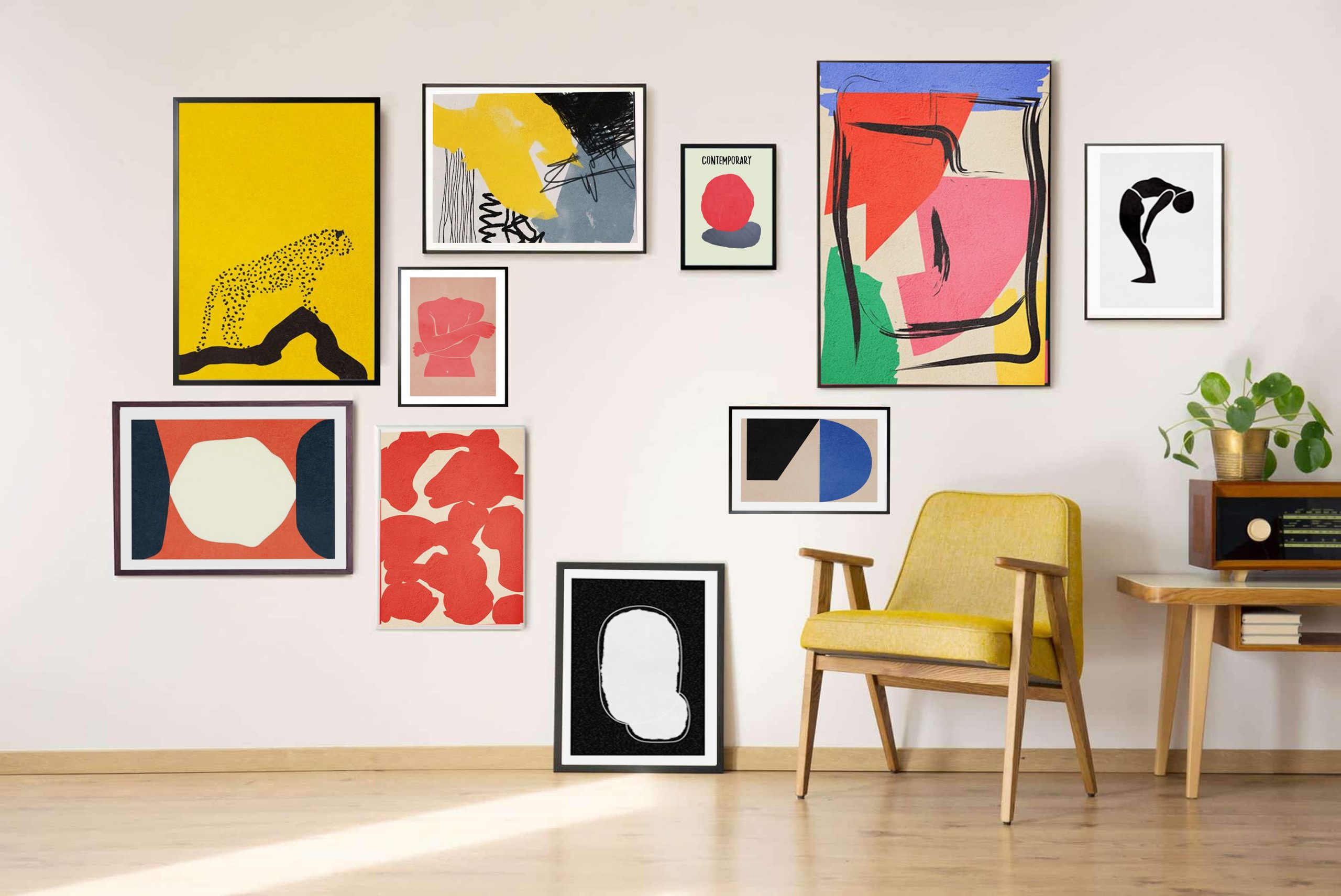
Art is a form of expression and it has been created to set the mood when viewed. Creating and looking at art has its benefits, both in mind and body. Art is used as a tool to help people relax. The colors, subject, designs, and arrangement have been used to promote relaxation. However, only specific aspects of art are good for relaxation. This includes its harmony with its surroundings. Here are some factors that need to be considered so that art can help create a relaxing mood.

Colors

We all are aware that there are different colors on the color wheel. In general, they are grouped as warm and cool colors. Brighter colors promote energy and activity, while dark colors tend to promote moodiness, reflection, and melancholy. As such, carefully choosing the colors for your home is important if you want to set the right atmosphere. 

The display of paintings with bright and warm colors, such as red and orange is not recommended if you want to relax. Red is associated with energy, passion, strength, aggressiveness, and masculinity. Different shades of color are often used in festivities around the globe. This is also true with the color orange as it promotes a high level of activity. 

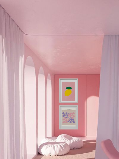
More subtle colors, like pink, can aid relaxation. It is also known to motivate and enhance confidence. Yellow is likewise considered to be a friendly color. 

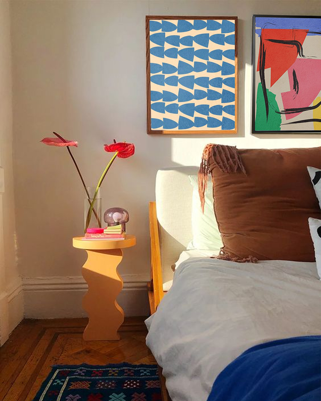
If you are looking for pictures for a more relaxing vibe, then the best choice is those that mimic natural elements. Blue is a calm color with sedative nature that stimulates cool temperatures to which people respond with serenity. Green also promotes peace and creates balance. Studies have also shown that shades of green can help lessen depression, nervousness, and anxiety.

Purple is a combination of blue and red, meaning that it has the qualities of both colors. It is soothing like blue but bold as red. 

The subject

There are many subjects to be used and displayed in your space. Subjects can either help or block relaxation. Landscapes, especially where water is featured are highly recommended to promote a relaxing state. 

Lines are also important as they influence the direction of the gaze of the viewer. Lines also add illusion and depth to the image. Heavy angular lines convey a message of tension and dynamism, while oblique lines promote a sense of movement. Horizontal, straight lines give an impression of space, calm, and tranquility, especially when used in landscape photography. 

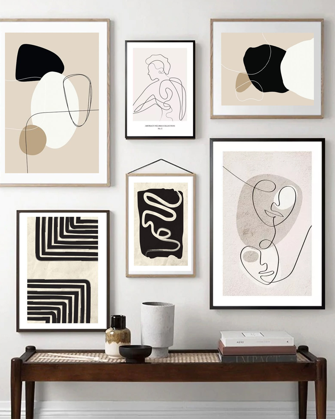
Artwork with a simple, single focus is relaxing, while an artwork with a lot of clutter can be ab eyesore. 

Display

Anything that is cluttered, whether you are talking about a painting, print, photograph, or furniture arrangement, can cause a feeling of anxiety. Another example is a wall that is filled with different colors can be irritating and not conducive to relaxation. 

These decorative items should be in harmony with the surroundings. As such, the most dominant colors should blend with the other decorative items in a room.

Hallway Color Schemes That You Will Adore

First impressions last forever. Choosing a suitable color scheme for the hallway is just as important as picking the colors for the bedroom. If you are planning to liven up the hallway, then this article will be of great help. Read on and know the perfect scheme that will boost the overall appearance of your hallway. 

Why add colors in the hallway?

A beautifully designed hallway sets the tone for the rest of the house and introduces your own interior style for everyone to see. The hallway is the first part of the house that your guests will encounter. It is just right to see the area with attractive colors that will impress anybody. 

Colors to add in the hallway

When it comes to the colors of paint, you can be brave and bold or choose to be subtle with soothing colors. Neutral colors can make your hallway light and spacious. You may consider light shades of yellow, green pink, and blue pastels to make the hallway look cheerful. If you want to be safe, shades of gray will create timeless beauty.

Try to be bold with colors 

If you want to give a lasting impression, then be brave with the color combinations and patterns to add to the hallway walls. Add yellow if you want to give a summer vibe. Pair this color with black for a stunning result. The flooring likewise needs something to inspire your guests. A patterned floor works well as it highlights that area of the house. 

Bold colors up to your waist

Divide your walls into two by using a heavier accent color on the lower portion of the wall leaving the top in a bright white. The balance of colors can help prevent overwhelming feelings. Waist-level wall color can add vibrancy and a different perspective, making the space feel bigger.

The woodwork in contrasting colors

Want to have a modern-looking hallway? Pick woodwork on a staircase in a bold contrast color. This will certainly make that part of the house stylish, especially with black wood stains. 

Mix and match complementary colors

Try to experiment with colors and the hallway is the best place to start this. For instance, combine colors that are opposite to each other in the color wheel. With these, you will be able to prove to yourself and others that opposites attract. 

A blue entrance for a refreshing vibe

Many homes have small and narrow hallways. It is often imagined to be lacking in space and light. However, the vibe can be changed with the use of a lighter shade of blue. Paint the door, ceiling, and walls with this shade and evoke comfortable feelings. In addition to these, the hallway will also have a coastal appeal that can be seen in many restaurants and other establishments. 

Dark colors for a sophisticated look

Dark walls are not to be afraid of. In fact, dark walls evoke a classic and sophisticated appeal that is loved by many. Especially if natural light is present, the effect is simply amazing. To prevent the dark walls from being too overwhelming, add decors such as posters and collectibles. 

Introduce fun and friendly accents

Use a versatile mix of color, patterns, and accessories. Sometimes a plain wall is fine but with the addition of accents at least. These may be any furniture pieces, collectibles, framed art, or personalized posters. Not only that these items add beauty, but they can also boost the overall appearance of the space. 

Decorating Your Room with Wall Art

Wall art is the life of any room. If designed beautifully, wall art adds attraction and creates a fun and cozy vibe that will be enjoyed by its viewers. A wonderfully designed wall gallery of photos or trendy poster art can transform the interior appearance of any room or space. 

Why add wall art?

Walls are important in every home. They can function in both aesthetics and structure of any building. Walls bring a room together and make everything look more cohesive with the design elements added to them. Designing and creating wall art is one of the ways to make the room look more exciting and fun. 

Wall art is thought and planned last and usually after all the other decorations have been placed. Many homeowners even do not consider the addition of wall art as they are already satisfied with the color and appearance of a plain wall. On the contrary, a blank wall is like a canvas where art should be painted.

The blank wall

Staring at an empty wall has never been fun. Blank walls give you an opportunity for limitless design ideas. Properly planned and designed wall art can make any room look unique and interesting. As such, many designers and homeowners consider the addition of wall art in their room or space.

One of the interesting ways to add wall art to your design is by creating a wall gallery of photos. This can evoke a nostalgic atmosphere that is perfect for the family. An attractive collage with the use of different paintings and photographs can also create compelling wall art. Frames that are used in photos and posters are of great help in designing and decorating the wall. You can feature a similar color palette or consider the use of different colors.

Create one in your room

Choosing the right color for the rooms is one of the challenges for many homeowners. Sometimes choosing the color that you love and applying it to the walls is enough for many individuals. However, this is not always the case as you are still looking at a dull wall. 

Wall art can instantly create a focal point that will be enjoyed by its viewers. Think of the wall art as a magnet that can draw the attention of anyone who sees it. They can eventually be the center of attraction in any room such as wall art that is created in the living room or the bedroom.

Furthermore, wall art adds texture to any room with the use of 3D art like sculptures. These artworks can give depth to the room by creating an illusion that there are more layers to unleash. Many experts believe that to create an intimate-looking interior, rough textures must be added. On the other hand, decors with smooth textures can create a sophisticated and classy-looking interior. 

Decorating the Girl’s Bedroom In Style

Art wall 100

Your little girl’s bedroom is commonly known for being posh, stylish, and chic. If you are looking for a fun and entertaining activity, then decorating your little princess’s room is an activity to consider. The good thing is that you can also involve your daughter in the process. From the planning process up to doing the actual project, this will be a memorable activity to share with your daughter. 

The colors to use in the bedroom

Although decorating the girl’s bedroom is a fun activity to share with your little princess. There are still some challenges that we need to face before succeeding with the project. The first thing to consider when decorating the room are the colors to use. Traditionally, shades of pink are used in the girl’s room. However, these are not just the options as there are other colors that can be used. 

Even though pink is preferred in many homes, the girl’s bedroom need not be overwhelmed by it. You can add other colors such as purple to give an accent. The combination of pink and purple evoke a romantic vibe and is likewise considered to be a classic girl bedroom color combination.  What makes this color combination remarkable is that it can easily blend well with other colors. 

Combine a bright shade of pink with yellow, lime green, and other bright colors as these will enhance the feminine vibe of the room. Pink and orange are great to combine and will look impressive with white furnishings. You can also combine pink and black and this can give an elegant and sophisticated look. 

Neutral colors are known to evoke a peaceful and serene room atmosphere. Neutrals are recommended to be used as a backdrop for furnishings and decorative items. These colors may also be considered to be versatile and can be used with various furnishings without changing the colors of the wall. 

A fairy tale in your home

Since we were kids, we have loved fairy tale stories. Sometimes we also imagine ourselves being part of these stories. Many daughters also aspire to become princesses, at least in the bedroom. Fulfill this dream by transforming the room into a world that they will love. Create a mini kingdom with the addition of images, decors, and toys of castles, fairies, kings, queens, princes, and princesses. Create a magical world with posters of fairy tale characters, enchanted forests, animals, and others. 

VIntage girl’s bedroom

Redesigning the girl’s bedroom may be costly, especially if you are going to buy new items. Take a look at what furniture you already have as you might be able to upcycle instead of buying new ones. You can simply add a fresh coat of paint to give old furniture a modern twist for the girl’s bedroom. 

Display their art

Instead of buying a bunch of art to decorate the girl’s bedroom, use the art they finished in school. Group them accordingly and make a themed gallery. You can also have them framed for a more personalized touch. 

Best Colors for Small Living Rooms

Choosing a paint color for small living rooms may be challenging but can be a fun activity. It may be confusing as well as there are a lot of shades and hues to choose from. Although those neutral shades are commonly used, there are still many hues in the color wheel that will look best in small living rooms. If you are having trouble deciding which color to use, worry no more as this article may help you with your interior decorating project. 

White

Pure white is excellent but not much used as many would think. Some whites reflect tones of blue, pink, and green. The color is ideal in a small living room as it reflects natural light, making it look more spacious and cozy. Having the color also creates a room that appears pure and clean. This is one of the reasons why hospitals and clinics prefer to use white. Moreover, white is seen in minimalist rooms and can be blended with many decors and styles. 

Cream

Many homeowners prefer the color and ideal in small living rooms as it makes them look open and bright. The color is best to be paired with hardwoods and other natural materials. The color cream is safe to use as it can be a perfect backdrop for other decors and colors. 

Yellow

Bright yellow may be too bright for most people, but you can use a softer tone. This can instantly make any dull room look warm and bright. It is a versatile color that can easily blend with contrasting colors such as red. It is also an ideal substitute for white and cream. 

Gray

Use gray if you are confident enough to make a difference in a small living room. The color can add depth and create a visually cozy and trendy interior appearance. Just like white, you can easily blend the color with any hues and decors. Darker shades of gray can be partnered with patterns and pops of color mixes to achieve an eclectic look in the room. 

Indigo

Just like gray, many homeowners choose this color in their small living rooms. It can help create a moody and sensual atmosphere. In addition to these, the small living room can have a cozy feel with a cool and relaxing feel. What makes the color more interesting is that it can easily be blended with other colors and decors. The dark indigo tone can likewise be a great backdrop for any wall decor and wall art. If you have this color on the walls then the ceiling should be in the color white. 

The 7 Principles Of Interior Design

You might think that the principles of interior design are not that important. However, they are vital to have a dream home that you can flaunt to your friends. Having a well-designed interior enhances the aesthetic and economic value of your house. Here are the interior design principles that will make any home look cool and awesome. 

Balance

This means creating visual harmony in the space by ensuring that the elements are evenly distributed. As such, the interior will have a sense of equilibrium. Balance can be achieved with many forms, such as shapes, colors, patterns, and textures. 

Traditional symmetrical balance can be achieved when you place objects symmetrically on either side of an imaginary central axis. Asymmetrical balance keeps the focal point on the imaginary axis while allowing dissimilar and oddly numbered objects. Evenly distributed visual weight can be maintained with objects of similar dimensions. Radial balance, on the other hand, can be achieved by arranging objects around a central focal point. Examples are round dining tables and chandeliers. 

Unity

Unity in interior design refers to the uniformity or harmony among the elements used in the design. These include having patterns or textures, equal spacing, and similar colors of objects. This also refers to the repetition of elements to create a continuity of elements. 

Rhythm

Rhythm is about creating repetition and contrast in an interior to help carry visual interest around the room. You can add this to the room by painting the wall green and using the same color again on the furniture pieces. 

Emphasis

Emphasis is another principle that focuses on the need of every room on one central element as a focal point. The other elements should complement the focal point. This can be any large piece of furniture such as art, painting, accent wall, color, pattern, or texture. 

Contrast

This is created when one combines two or more different forms, such as color, shape, or space. Achieve this principle with the use of opposite colors like black and white. Another example is to combine a round mirror with a rectangular dining table. 

Scale and Proportion

This principle refers to the ratio. For instance, the size and dimension of the objects in a room should relate to one another proportionally. One example is for homes with high ceilings should have larger furniture pieces. This will help achieve harmony in the design. 

Details

This principle tells us that the little things must not be overlooked. Nothing is too small or too unimportant to pay attention to. This can be anything, from embroideries on cushions, handles on the cabinets, or personalized framed art displayed in your room. 

The Speakeasy Bar

Speakeasy cuisine themed poster banner

Speakeasy bars are those that are behind closed doors offering exclusive cocktails and food menu items in a restricted environment that is only accessible to a few. The origin of speakeasy bars can be traced back to the first decades of the 20th century in New York City during the prohibition era. 

During the prohibition era, the city is governed by dry law. This law prevented the manufacture and consumption of alcohol. However, the law is broken and hidden bars began to appear behind closed doors, and eventually evolved into night restaurants. Most restaurants operate discretely in which customers request an alcoholic beverage without arousing suspicion. 

The location of the restaurants is spread only by word of mouth. The loyalty of the customers protected the locations of these restaurants. The customers were responsible for inviting new friends to visit speakeasy bars. Passwords were used to gain access to the place. Speakeasy bars likewise have striking secret entrances. Some even have their entrances hidden within one of the restaurants’ rooms, such as the bathroom. 

Are speakeasy bars different from underground restaurants?

Underground restaurants are sometimes called supper clubs or closed-door restaurants. These are social dining establishments operated in someone’s home, bypassing local zoning and health-code regulations. Underground restaurants are usually spread by word of mouth or guerilla advertising. The experience that an underground restaurant offers is to sample new food at a low cost as compared with the traditional restaurant experience. 

The variety of speakeasy bars

Speakeasy bars are relatively small with little or no entertainment involved. The gradual growth made these bars popular and expanded to many different areas with new additions of entertainment. It eventually became one of the biggest businesses during the Prohibition era and was often kept even after the Prohibition ended. There were even underground rooms used for these bars.

Speakeasy bar decorating idea

Creating a speakeasy bar is uncomplicated. The interior should evoke a feeling that it is quietly glowing and not brightly lit. As such, the lighting added such as overhead lighting, table lamps, and sconces need to be dimmer. The overall appearance needs to have a low-profile, classic club-style seating in leather and velvets. Sofas and chairs should be arranged in clusters that facilitate small, intimate conversation instead of large group gatherings. 

Windows should be concealed enhancing the speakeasy vibe. With a few more elements, speakeasy bars will have that modern vibe. Restaurant owners may add a dark and moody color palette with dark tones of gray, blues, and greens.

Your Home Needs Personalized Wall Art

A blank wall is considered to be a sign of emptiness and loneliness. Though some people may think otherwise. However, it is an eyesore having to stare at blank walls and it may leave a bad impression on your guests. These days, creating wall art is becoming a trend in every living space. Many experts believe that a wall without a captivating and personalized wall art is like an artist without creativity. 

Wall art makes any wall look fun and exciting. Styling your wall with paint is a thing of the past. With carefully selected pieces, you will have the interior appearance of your dreams. Though sometimes choosing the right pieces may be quite a challenge since they need to blend well with the overall style of your home. Read on to know about the advantages of having good personalized wall art. 

Create a focal point in your room

Every room looks better with a focal point that captures the attention of your family and guests. A beautifully designed wall art reflects everything about you. A framed poster of a landscape or seascape can boost the appearance of the room and can be called your very own. 

Make any wall look vibrant

If you get the chance to visit classrooms these days, you will notice that the walls are covered with posters. This is so that students may not feel lazy or sleepy. They will have something to look at and can somehow stimulate their mind and interests. The right wall art can set the mood in the room where you can relax, dream, and imagine. Wall art also helps in transforming any depressing environment into a lively place. 

Wall art reflects your personality

The wall arts on your walls are all about your interests. For instance, your interests are in sports or any outdoor escapades. The wall art that you create somehow tells your story uniquely and interestingly. As such, you must choose the pieces carefully and according to your preferences. 

Stimulates conversation

Tired of the routine and boring conversations? Experts believe that if you share the same interest with someone, you will be able to initiate a conversation that may last long. As such, it should be fun and engaging. Personalized wall art is a great conversation starter. 

Choose the right color palette

Wall art decorations help you to pick the colors of the paint to complete the beauty of your place. With wall art, you will now have a complete picture of what colors to add to your room. With the wall art in place, the process of choosing the right color palette will be easier than usual. With the use of framed personalized art, the color palette of your room can be chosen according to the colors that are seen in the art. For instance, art that has cool colors mean that the palette may be in blue, green, or any other cool hues. The bedroom for instance can be dominated by cool colors for a more relaxing and comfortable ambiance. 

Sleep Soundly With These Bedroom Color Ideas

Art wall 231

Insomnia is one of the biggest dilemmas of many individuals. It has been observed that there are different reasons why this is experienced by many people. One of the reasons is the ambiance of the bedroom which is influenced by certain factors. The color of the room greatly affects the mood and contributes to the sleepless nights of many people. This can easily be remedied by choosing and incorporating the right color for the room. Read on to learn more about choosing the right bedroom color and decor to help people have a deep and relaxing night. 

What color to choose?

Many experts believe that there are ways to help an individual have a deep sleep. One of these is the design of the interior, particularly the colors. Choosing the right bedroom color can be one of the solutions for people to have a proper sleep pattern. Cool colors such as blue and green are proven to help create a room that is calming and relaxing.

The colors and sleep

It is a proven fact that the colors of the bedroom influence sleeping patterns. Studies have been continuously conducted to find the association between room colors and sleeping habits. 

Rooms that are dominated by cool colors, particularly the color blue help people enjoy longer sleep as compared to those in a room with different colors. Hues of blue are associated with calmness and can help in lowering blood pressure and heart rate. People who are staying in a room with hues of blue can sleep for an average of 7 hours and 52 minutes. 

Other colors may also contribute to sleeping patterns, yet the average length of hours of sleep is shorter than those of people in a bedroom with shades of blue. Yellow, for instance, promotes sleep for around 7 hours and 40 minutes, green for 7 hours and 36 minutes, orange for 7 hours and 28 minutes, purple for 5 hours and 56 minutes, gray for 6 hours and 12 minutes, and brown for 6 hours and 5 minutes. 

The reason why the color blue promotes good sleep is because of the receptor cells in the retina of the eyes. These cells are called ganglion cells and are highly sensitive to the color blue. Ganglions are likewise responsible for sending information directly to the brain. As a result, body activities are regulated and controlled. 

If blue is not your preference, you can still use other colors and hues that can promote deep sleep. Neutral colors such as gray and silver are also known to promote good sleeping habits. In addition to these, pale yellow can have the same effects as that neutral colors. 

Wall decor and sleep

The display of posters is one of the easiest and fastest ways to set the mood and atmosphere of the bedroom. The designs and images featured in posters come in a wide variety. They also come in colors that can help promote sleep. With the creation of wall art in the bedroom that is dominated by hues of blue, individuals will be able to have a good sleeping pattern. 

Mix Colors Like A Pro

Art wall 124

Color mixing may be challenging but can be a fun and exciting aspect of interior decorating. If properly done, the output can be satisfying. Knowing the basics of mixing colors is important to be successful in the decorating project. Read on to learn more about mixing colors and how to do it like the pros.

Mixing colors and your room

Mixing colors is one of the activities that you cannot do without when it comes to decorating your room. This activity can unleash your creativity and resourcefulness. It can be challenging as well because of some rules to consider. However, this can easily be done with the help of some experts and various references. 

The color wheel and how to use it

We often tend to be a bit complicated when it comes to thinking and handling things. Sometimes we forget that there are easy ways to deal with them. When it comes to home decorating projects, we usually take a difficult path. However, if things go haywire, we seek the help of professionals that costs us extra cash.

The good news is mixing colors can be learned and done with the help of various references. The truth with mixing colors is that you have absolute freedom in choosing the colors for your room. It is also vital that some key tips are followed and observed for a more remarkable interior.

Over the years, color wheels have been used in different fields. It is an abstract organization of colors in a concentric arrangement. The color wheel represents the science behind color and the relationship among the colors. Just like what we have learned in our early years in school, the wheel has three primary colors: red, blue, and yellow; three secondary colors: green, violet, and yellow; and six tertiary colors: red-orange, yellow-orange, blue-green, blue-purple, red-purple.

There are two types of color mixing: additive mixing and subtractive mixing. Additive mixing is a type of mixing when you add colors to create white light. This mixing usually makes use of primary colors. The subtractive mixing, on the other hand, makes use of cyan, magenta, yellow, and black. 

Tips on mixing colors

Now that you know what color wheel and color mixing are, you can use them to transform your room. Color mapping is one of the techniques you can use. This is a method where you can pull all the colors throughout the space. This is to guarantee that all the primary colors are employed proportionally in the space to make the whole room look more cohesive. Black and white can likewise be added to make an accent.

Black and white create design variety. White makes a tint when added to a particular color, while black adds shade. Understanding how colors relate to each other will give you a color scheme that can be used in any room or living space.