Empty walls have a lot of potentials and can be filled with anything that you may think of. With the right wall decor, you can make your house look and feel more like home. If you are looking for ways to make your walls the focal point of your room, then this article will be able to help you with your decorating project. Here are some ideas that will give your walls a refreshing vibe.
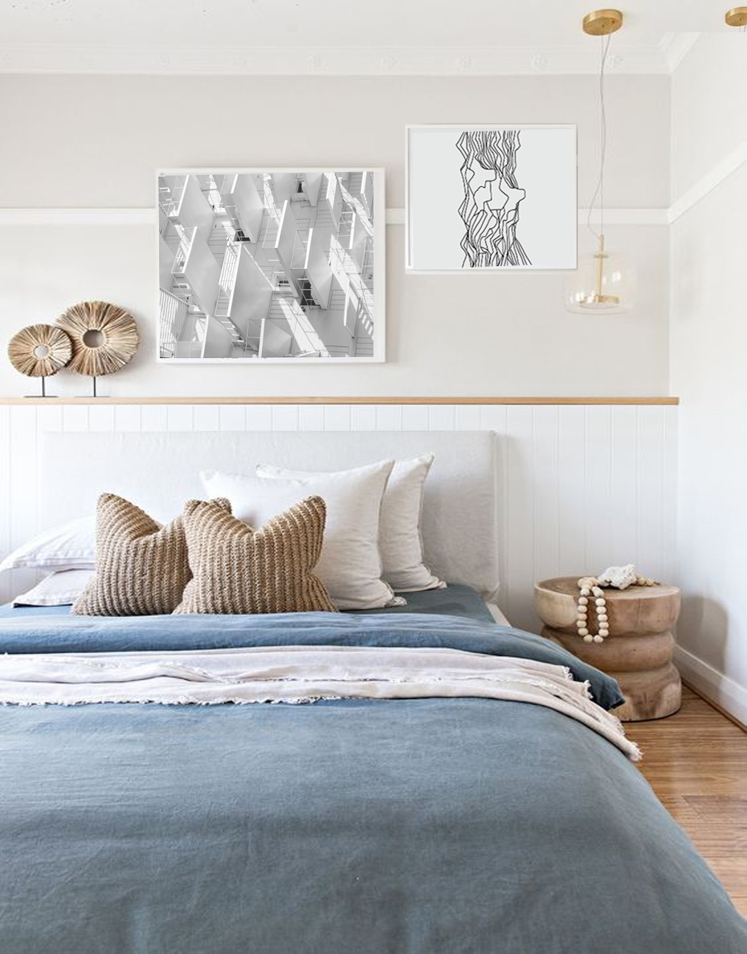
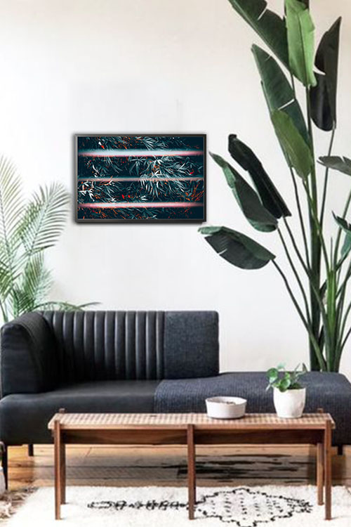
Display large art
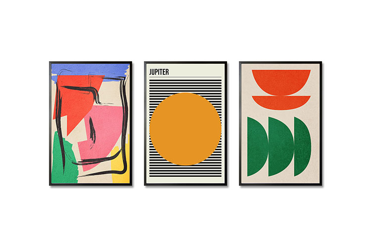
One of the good things about ordering prints from a reputable poster shop is that you can request the size that you need. A large piece of art can instantly grab attention and set the tone even in a small living space. You can choose black and white prints to match a minimalist interior design style. Vibrant prints such as abstract art or graphical art can give your room a cheerful atmosphere. In the Philippines, large pieces can also be seen in many offices, restaurants, schools, and other public places.
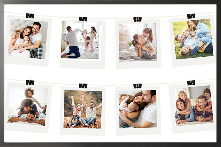
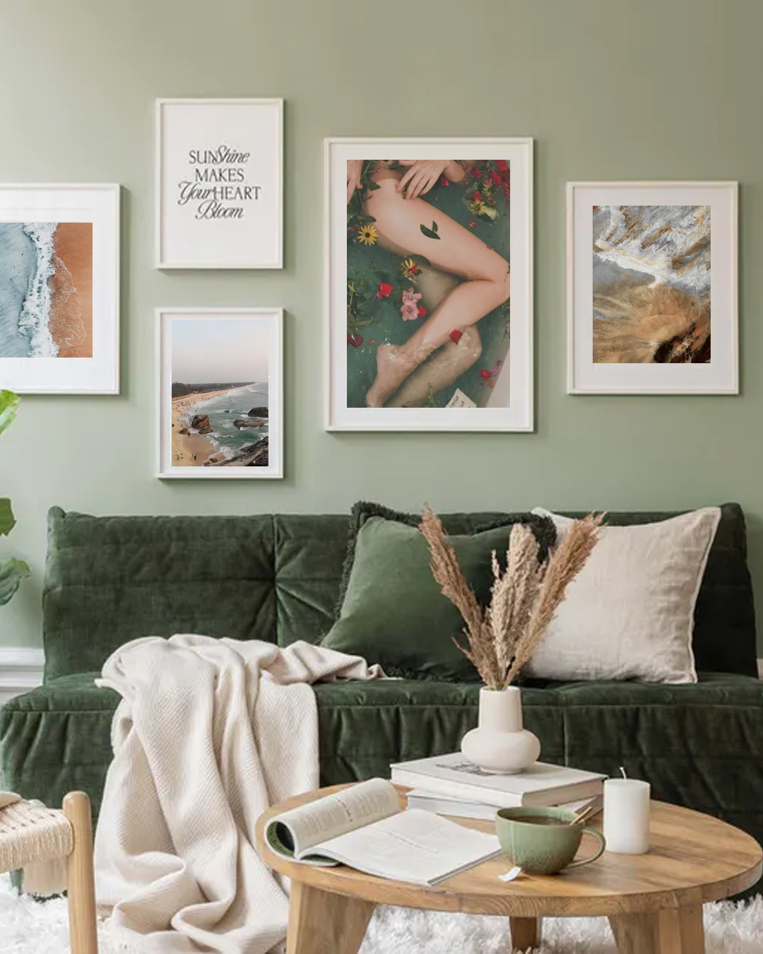
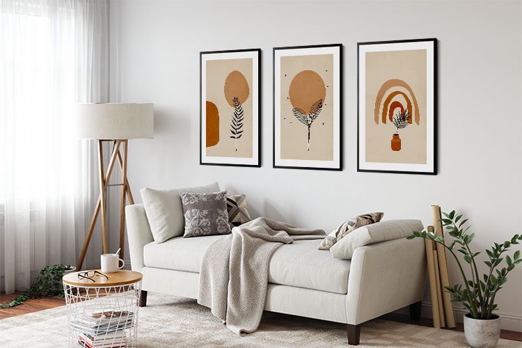
Create a wall gallery
A wall gallery can easily add personality and color to your home. If you have a collection of art, then do not just hide them in storage. The same thing goes for the photos in your album. These can be displayed in any room of your home to level up the wall design. Add frames that will blend well with the interior design style and the art. You can look at different references for the layout that will be perfect for your walls.
Accent wall for an impressive effect
Decorating the walls is another way of leveling it up other than displaying objects. Use paint in bold and bright colors or you can choose wallpaper, stenciling, and decorative paint techniques. You will be surprised that these suggestions can give a big impact even on small spaces.
Use fabric to create a focal point
Posters, prints, and wall galleries are not the only things that you can add to a fantastic wall. A tapestry of wall hanging can also add style and personality to the entire room. If you have old scarves or appealing textiles, you may opt to have them framed so that the final output will look like any artwork.
Display mirrors
Mirrors can be useful in making the wall look remarkable and can likewise be functional. In addition to using mirrors to look at your reflection, they can also be used to reflect natural light and bring warmth and brightness to your space. When displayed in a small room, mirrors can make it look visually larger.
Install hanging shelves
Hanging shelves are beautiful inventions as they can be used in various ways and can save space, especially in small rooms. With today’s trend in urban living, people usually have limited spaces. With hanging shelves, you can save enough space for your other furniture pieces or personal items. You can use these shelves not only for storing your belongings. These can also be used to display your art, prints, posters, collections, and other decorative items. When displayed on hanging shelves, any poster can give your room a modern touch.
Go green with nature-inspired posters
Green is one of the cool colors that can give any room a refreshing and rejuvenating atmosphere. We understand that not all people love plants in their homes for various reasons. With nature-themed posters, you can still give your room the mood that real plants also offer.
Customize your rooms with personalized art
If you think that the decors you already have may not suit your taste, then you can create personalized art that will really show and tell others who and what you are. In many instances, personalized posters are designed with an image of yourself, your family, or any of your loved ones.