Wall decorating trends in 2024 reflect a diverse blend of styles, colors, and materials, showcasing the evolving tastes of homeowners and designers. This year, the emphasis is on creating personalized and sustainable environments that echo individual stories and preferences. Here’s a closer look at some key trends shaping the world of wall decor in 2024.
Natural Elements
This year, there’s a strong inclination towards incorporating natural elements into wall decor. Homeowners are increasingly drawn to wood, stone, and natural fibers. Wooden wall panels, reclaimed wood shelves, and stone accent walls bring warmth and organic beauty to interiors. Botanical prints and nature-inspired wallpapers are also popular, reflecting a desire to bring the outdoors inside and create a calming, serene atmosphere.
Minimalism
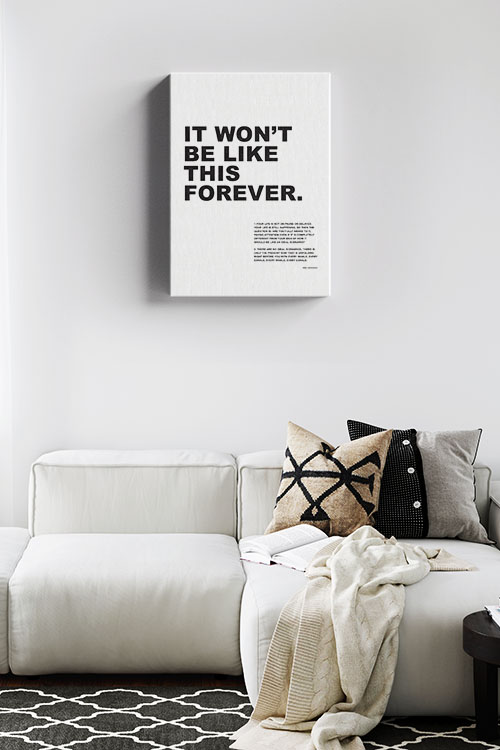
Minimalism continues to influence wall decorating significantly. Clean lines, simple shapes, and a focus on functionality characterize this trend. The minimalist approach often involves a neutral color palette, which helps to create a sense of space and light. White walls, for instance, provide a blank canvas that can be accented with carefully chosen decor pieces, such as monochromatic artwork or sleek, modern shelves. This trend appeals to those who prefer a clutter-free and serene living environment.
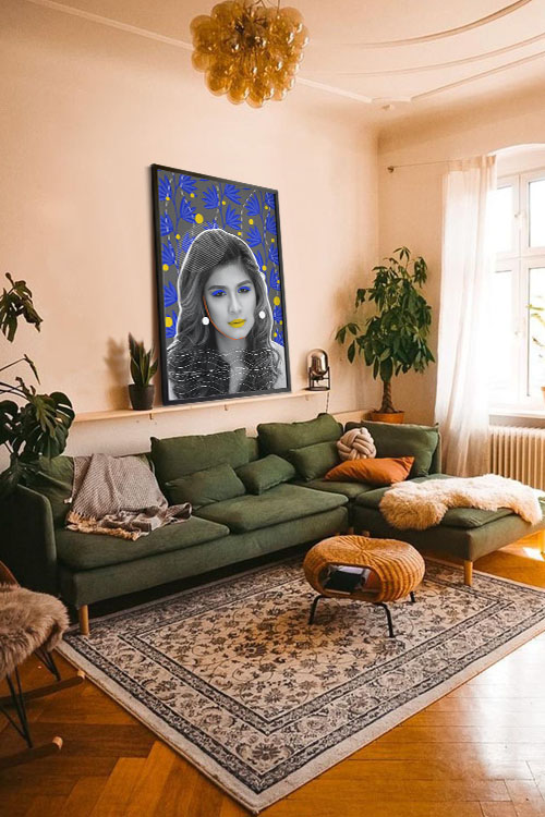
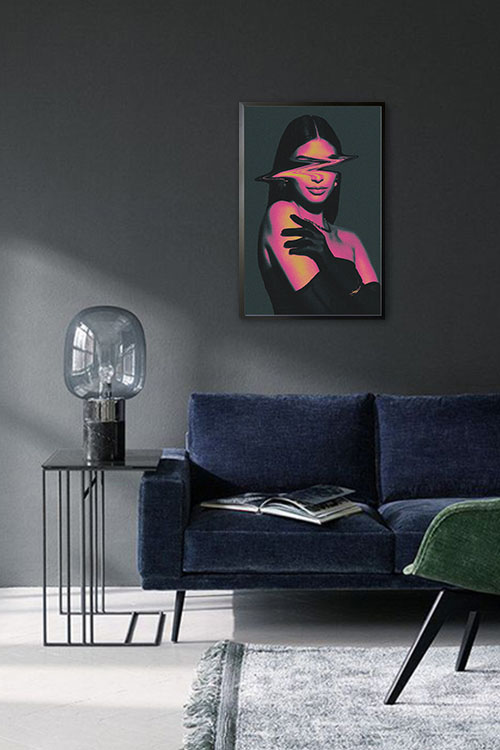
Bold Colors and Patterns
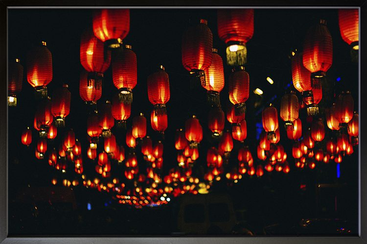
Contrasting the minimalist trend, bold colors and patterns are making a solid comeback in 2024. Vibrant hues like deep blues, rich greens, and striking yellows create accent walls that add personality and energy to a room. Geometric patterns and abstract designs are also popular, providing a modern and dynamic look. These elements can be introduced through wallpapers, painted murals, or large-scale artworks, making a statement and transforming any space into a focal point.
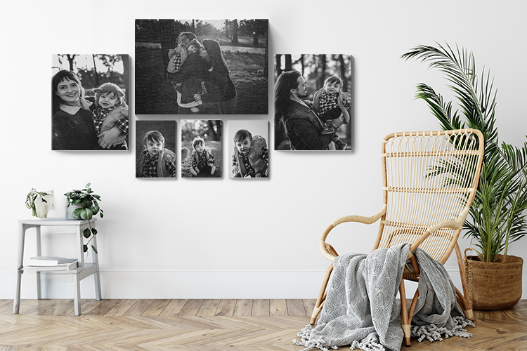
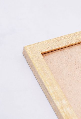
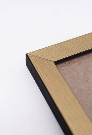
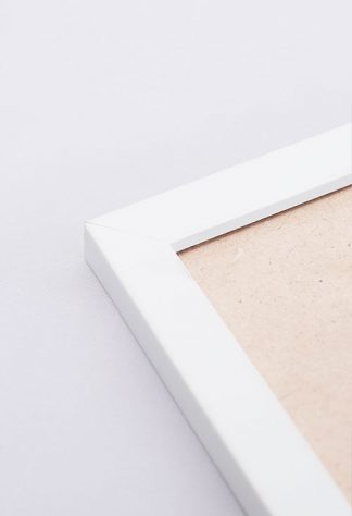
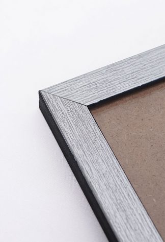
Gallery Walls
Gallery walls remain a beloved trend, allowing for a highly personalized and artistic display of photographs, paintings, and other memorabilia. This trend encourages creativity, as endless ways exist to arrange and combine pieces. Mixing different frame styles, sizes, and colors can create a visually exciting and cohesive display. Gallery walls are not limited to living rooms; they are also becoming popular in bedrooms, hallways, and bathrooms, adding character and a personal touch to any home area.
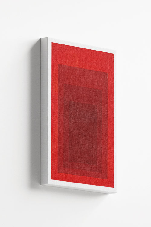
Texture Play
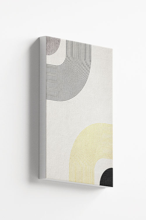
Texture is a crucial element in 2024’s wall decorating trends. Textured wallpapers, fabric wall hangings, and 3D wall panels add depth and interest to flat surfaces. These elements can create a tactile experience that enhances a room’s aesthetic. For example, a woven tapestry can bring a sense of warmth and comfort, while a metallic or embossed wallpaper can add a touch of luxury and sophistication.
Statement Murals
Statement murals are a bold and artistic way to decorate walls in 2024. Large-scale artworks, whether painted directly onto the wall or applied as wallpaper, can serve as a stunning focal point in a room. Murals can depict anything from abstract designs and landscapes to personal stories and cultural themes, offering a unique way to express creativity and individuality.
Sustainability
Sustainability is a growing concern, reflected in wall decorating trends. Eco-friendly materials, such as recycled wood, non-toxic paints, and sustainable wallpapers, are increasingly popular. Homeowners are more conscious of their decor choices’ environmental impact and opt for beautiful, sustainable products. This trend not only supports the environment but also promotes healthier living spaces.
In conclusion, the wall decorating trends of 2024 are a testament to the diversity and dynamism of interior design. From natural elements and minimalist aesthetics to bold colors and sustainable choices, these trends offer something for everyone, allowing homeowners to create stylish spaces that reflect their values.