Posh, cozy, and appealing. These are the words that best describe a girl’s bedroom. Decorating the room is one of the entertaining activities you can do with your little princess. From the decision-making to the decorating activity, your child will have an excellent memory that they will bring until adulthood. Read on to learn more about decorating the girl’s bedroom, especially with the display of lovely posters.
Colors for the girls’ bedroom
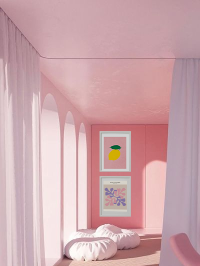
Decorating the girl’s bedroom is considered by many to be an enjoyable activity that you can share with the other members of the family. There is a wide range of choices when it comes to this. The colors, for instance, may come in different appearances and are commonly adored by girls. Pink, or any shade of pink, is the most frequently used color for the bedroom.
Though it is the most preferred color, the room can handle it. You can add other colors to give the room some accent. You can also add purple, a classic girl’s color. These colors can be romantic and may be considered girlish territory. These colors can blend well with other colors to make the room look more compelling.
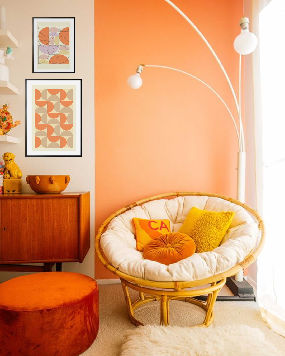
Combine a bright shade of pink with yellow, lime green, and other bright colors, as these will likewise help create a feminine and striking look in the room. Pink and orange are another powerful combination and will look impressive with white furnishings. Another interesting color combination is pink and black, especially with black furniture pieces, as this combination can give a sophisticated appearance.
For a peaceful and serene room atmosphere, it is recommended to have the walls colored with neutral colors. This may be a beautiful backdrop for the furnishings and decorative items you will add. Neutral colors are also versatile, as you can use different furnishings without changing the colors of the wall.
Make her a princess
Every little girl dreams of becoming a princess. Becoming part of a fairy tale is one of the loveliest things you can do to your little girl. This can be achieved by creating their fairy tale in their bedroom. Images, decor, and toys of castles, fairies, kings, queens, princes, and princesses will help transform their bedroom into a kingdom.
Posters that feature different fairy tales can help you create stories for them and let them be part of the adventure. Nursery-themed prints can make the room look adorable. Prints of cartoon-like animals can help them learn about their nature. You will bring fantasy into your kids’ bedroom.
Posters for a lovely girls’ bedroom
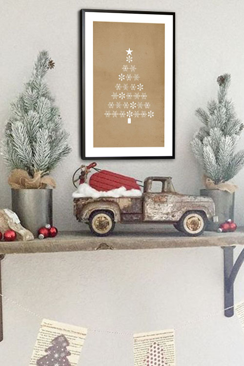
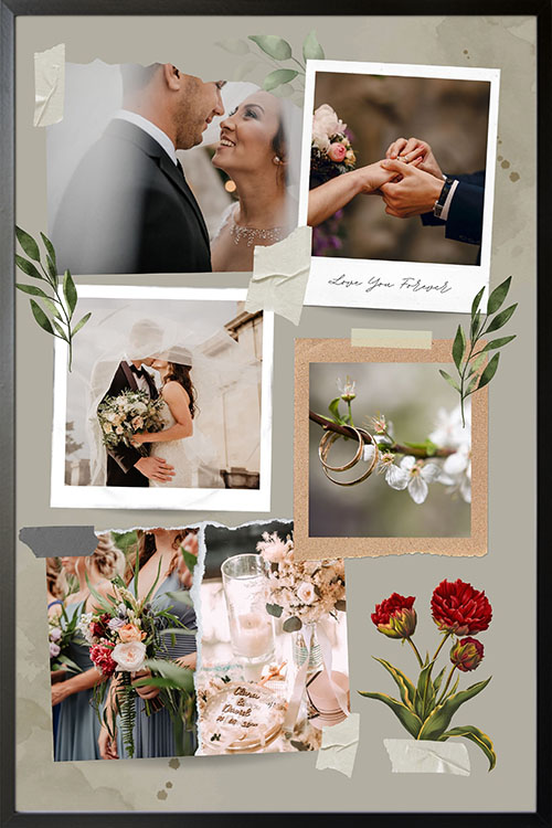
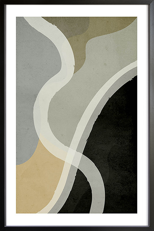
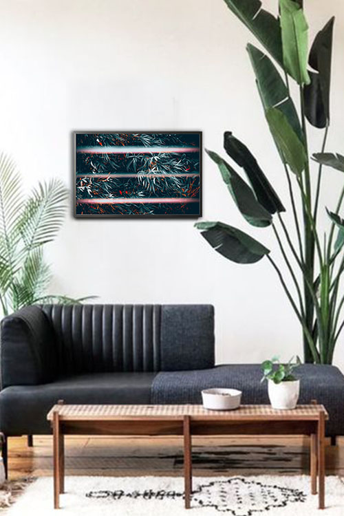
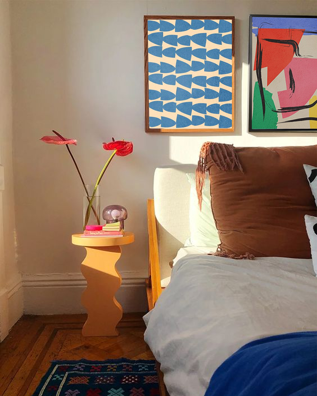
The display of posters is one of the easiest and most cost-efficient ways to decorate the girls’ bedroom. There is a wide range of available designs that young girls will adore. Examples are prints that feature flowers, cartoon characters, nature, typography, and others. These posters are beautiful and can instantly transform the overall appearance of their room.
In addition, prints in frames add beauty to the walls. Neutral-colored frames will enhance the appeal of the prints. They will likewise make the walls look more attractive and exciting.
