Mixing Patterns and Textures in Your Home

Flowers pattern colors Canvas

Mixing patterns and textures in home decor can transform a space, adding visual interest, depth, and personality. However, achieving a cohesive and aesthetically pleasing look requires thoughtful planning and a clear understanding of design principles. Following key guidelines, you can master combining patterns and textures to create a stylish and harmonious environment.

Establish a Neutral Base

The foundation of any well-designed space often begins with a neutral base. Neutral colors, such as whites, beiges, or grays, create a calm and versatile backdrop that allows patterns and textures to stand out without overwhelming the room. Use neutrals for large surfaces like walls, flooring, or significant furniture. This approach provides balance and ensures that the space remains adaptable to future updates.

Select a Cohesive Color Palette

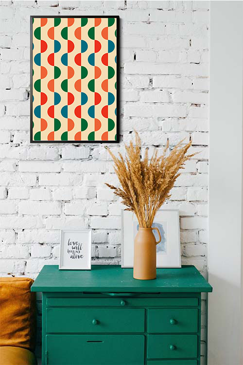
A unified color palette is essential for successfully blending patterns and textures. To maintain harmony, choose complementary colors or stick to various shades of a single hue. For instance, pairing cool tones like blues and grays with warm accents like gold or terracotta can create a balanced and inviting atmosphere. Repeating colors across patterns and textures helps tie the design elements together.

Balance Pattern Sizes

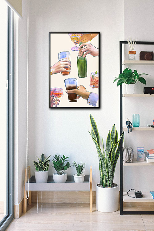
One of the most effective ways to mix patterns is to vary their scales. Large, bold patterns work well for statement pieces, such as area rugs or accent walls, while medium-sized patterns are suitable for upholstery or curtains. Smaller patterns, like subtle prints or intricate designs, can be used for throw pillows or smaller accessories. Balancing different pattern sizes prevents the space from feeling chaotic and ensures that each element contributes to the overall design.

Incorporate a Variety of Textures

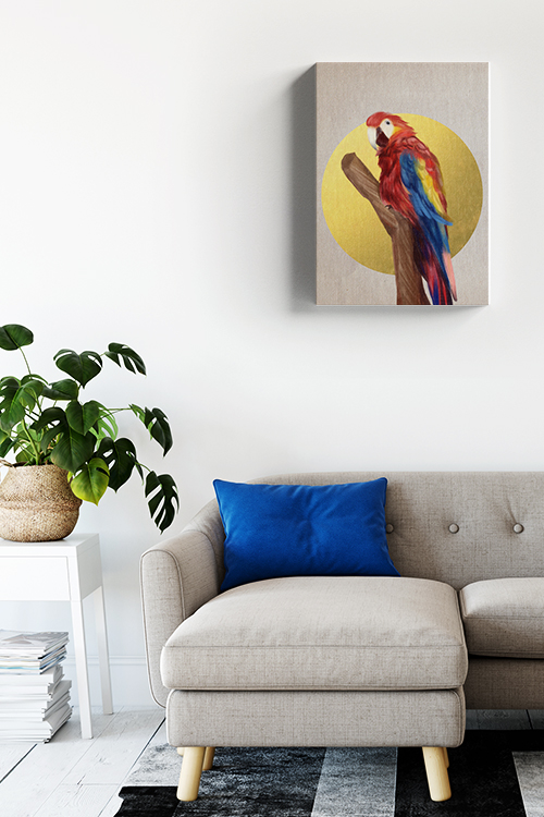
Texture plays a crucial role in adding depth and dimension to a room. Mixing soft, rough, and smooth textures creates a layered effect that interests the space visually. For example, pair a plush velvet sofa with a jute rug, a sleek glass coffee table, and a woven throw blanket. You can achieve a rich and dynamic look by blending different materials, such as wood, metal, fabric, and stone.

Anchor with Solids

Anchor your design with solid-colored elements to avoid overwhelming the space. Solids provide a visual rest and help balance the complexity of mixed patterns and textures. For example, a solid-colored bedspread can ground a bedroom filled with patterned pillows and textured throws. Similarly, a monochromatic sofa can be the perfect backdrop for various patterned cushions.

Experiment and Edit

Creativity and experimentation are essential when mixing patterns and textures. Start by gathering swatches or samples to see how different elements interact. Create a mood board or test arrangements before committing to large purchases. Editing is equally essential; if a particular element feels out of place, don’t hesitate to remove or replace it.

Reflect Your Style

Finally, the most successful designs reflect the homeowner’s personality and style. Incorporate unique pieces such as handmade ceramics, heirloom quilts, and travel souvenirs to add character and authenticity to your space. These personal touches make the room feel special and ensure it resonates with you.

By carefully combining patterns and textures, you can create a visually captivating, comfortable, and uniquely yours home. With a bit of planning and creativity, the possibilities are endless.

What is the best color for the living room?

Birds collection Parrot Canvas

Choosing the best color for a living room is an artful balance between style, mood, and functionality. The living room is a central space in the home, used for relaxation, entertainment, and gatherings, so selecting a color that feels inviting, comfortable, and complements the overall decor is essential. Here are some of the top color choices for living rooms and the effects they bring to the space.

Neutral Tones: Beige, Grey, and White

Due to their versatility, neutral colors are often considered ideal for living rooms. Beige, soft greys and warm whites create a calm, welcoming ambiance and work well as a base for other accent colors. Neutrals provide a backdrop that can easily accommodate different furniture styles, artwork, and textures, allowing you to change accessories without a major overhaul. These colors make a room feel more spacious and allow natural light to play a prominent role, adding a touch of elegance and sophistication.

Earthy Hues: Olive, Terracotta, and Warm Browns

Earth tones are famous for creating a cozy and grounded feel in the living room. Colors like olive green, terracotta, and warm brown develop a sense of warmth and connection to nature, making the space feel comforting and serene. These hues work particularly well in living rooms, incorporating natural materials like wood or stone, and pair beautifully with neutral furnishings. Depending on the decor style, earthy colors can also lend a rustic or bohemian vibe.

Soft Blues and Greens

For a more refreshing atmosphere, consider light blue or green shades. Soft blues evoke tranquility and openness, while greens offer a fresh, revitalizing feel. These shades effectively create a calm, relaxing environment that promotes peace. They pair well with white trim and natural textures, adding a subtle elegance that can make the living room feel like a serene escape.

Bold Colors: Navy, Charcoal, and Deep Teal

For those who prefer a more dramatic look, deeper tones like navy, charcoal grey, or teal add sophistication and depth to the living room. These colors can make a statement and create a more intimate, luxurious atmosphere, especially when paired with metallic accents or rich textures. Darker shades work well in larger living rooms, making the space feel more inviting without appearing too overwhelming.

Ultimately, the best color for a living room depends on personal preference and how you use the space. Consider your decor style, lighting, and the atmosphere you want to create, and choose a color that enhances the room’s purpose and comfort.

Great minimalist bedroom design for small rooms

Wedding Portrait canvas

Creating a minimalist bedroom in a small space is not just about design. It’s about achieving a sense of freedom. It combines simplicity with functionality, allowing the room to feel open and clutter-free. The minimalist design emphasizes clean lines, essential furniture, and a neutral color palette, perfect for smaller rooms with premium space. You can make even the tiniest bedroom feel spacious and serene with a few strategic choices.

Start with a Neutral Color Palette

The minimalist design relies heavily on a neutral color palette to create a calm, uncluttered look. Shades of white, beige, light gray, or even soft pastels can make the space appear larger and more open. Choose one or two primary colors and stick with them throughout the room to keep it cohesive. To add warmth, consider layering in subtle earth tones, like tan or taupe, through accessories like pillows, rugs, or wall art.

Invest in Multi-functional Furniture

Furniture serving multiple purposes is a lifesaver in a small bedroom. Opt for a bed with built-in storage drawers underneath or a platform bed with shelves for additional storage. A fold-down desk, floating shelves, or a wall-mounted bedside table can also help save valuable floor space while keeping everything you need within reach. If possible, keep the number of furniture pieces to a minimum—each item should have a purpose.

Keep Surfaces Clutter-Free

One of the hallmarks of minimalism is clean, uncluttered surfaces. Make sure your nightstands and dresser tops aren’t crowded with objects. Instead, limit it to just one or two essential items, like a reading lamp, alarm clock, or a small plant. For personal items and necessities, consider placing them in organized trays or boxes within drawers. Keeping surfaces clear will make the room feel larger and more inviting.

Maximize Natural Light

Light can make even the smallest rooms feel more expansive. If you have windows, keep window treatments simple and airy to allow as much natural light as possible to flow into the space. Sheer curtains or light blinds in neutral colors work well for this. To further amplify the light, use mirrors to reflect it around the room, creating the illusion of a larger space. A well-placed mirror opposite a window can dramatically enhance the light and openness in the room.

Stick to Simple, Clean Lines

Minimalist design is all about clean, straight lines, so choose furniture with a simple design and avoid overly ornate details. Sleek, low-profile beds, narrow nightstands, and streamlined storage solutions will keep the room from feeling cramped. When possible, select furniture that stands on legs rather than sitting directly on the floor—this will give the illusion of more space by allowing the eye to see the floor underneath.

Use Textures for Added Warmth

While minimalism often leans toward a clean and straightforward look, adding various textures can keep the room from feeling too stark or sterile. A soft, cozy throw blanket, a plush rug, or linen bedding can add subtle dimension without crowding the room. Stick with one or two texture types for balance; too many textures can clash and undermine the minimalist aesthetic.

Limit Your Decorations

When decorating a minimalist bedroom, less is more. Choose a few meaningful pieces of decor to display, such as art, a couple of small plants, or a single decorative object. Avoid too many picture frames, wall hangings, or collectibles, making a small space crowded. Each item should serve a purpose and add value to the room’s overall look.

In a Nutshell

Minimalist bedroom design for small spaces is not just about aesthetics, it’s about creating a peaceful sanctuary. It focuses on simplicity, function, and a calm color palette to maximize space and create an inviting atmosphere. By investing in multi-functional furniture, keeping surfaces clear, and letting in as much light as possible, you can transform a compact bedroom into a tranquil retreat that feels larger than it is. With thoughtful choices and a mindful approach to decor, a small bedroom can become a minimalist sanctuary.

Making Small Spaces Look Bigger: The Power of Color

Abstract gray shade with gold dust no. 2 poster

Many homeowners face the challenge of designing a small room to feel bigger, but one of the most effective and transformative tricks to achieve this is using color. The right colors can make a room feel more spacious, open, and airy. Here’s how color influences the perception of space and which hues are ideal for creating the illusion of a larger room.

Light and Neutral Colors

Light colors are universally known to make spaces feel more open. White is a classic choice, reflecting the most light and making walls recede, which can create a sense of depth. Pure white, off-white, or soft beige can make a small room feel less confined. The effect is further enhanced when the ceiling is painted white or a lighter shade than the walls, drawing the eye upwards and adding height.

Other neutral shades like light gray and cream also help enlarge a room. They provide a subtle backdrop that doesn’t overwhelm the senses and allows light to bounce around more freely. These tones create a serene, uncluttered look, ideal for small spaces. Light neutral tones work exceptionally well when paired with similar tones in furniture, creating a seamless, continuous flow of color.

Cool Colors

Cool colors, like soft blues, greens, and lavenders, are calming and recede into the background, creating the impression of a larger room. Light blue mimics the sky or the sea, giving a sense of openness and tranquility. Pale blue tones paired with white trim or soft grays create an airy, fresh environment that feels more expansive.

Light greens also work well, evoking nature and soothing, expansive energy to the room. Mint green, seafoam, or sage are excellent choices for adding depth while maintaining a calm and inviting atmosphere. Lavender and light purples can also give a small room an airy quality, making it feel less constrained.

Monochromatic Palettes

A monochromatic color scheme is another powerful way to make a small room appear larger. This technique involves using different shades of the same color throughout the room. For example, pairing a light gray wall with a darker gray accent or soft furnishings creates depth without overwhelming the space. The key is sticking to light tones that blend seamlessly, avoiding bold, contrasting colors that could make the room busy or enclosed.

High-Gloss Finishes

For small spaces, high-gloss finishes can be a secret weapon. Light reflects off glossy surfaces, amplifying the natural light in the room and making it feel bigger. Glossy paint on walls, ceilings, or furniture can make a small room look more open and brighter. However, using this sparingly is essential, as too much gloss can create an overwhelming effect.

Strategic Accent Colors

While light colors are vital to creating a spacious feel, accent colors can be used strategically to enhance the effect. For instance, a pop of a darker or more vibrant shade on one wall (an accent wall) can add depth without closing in the space. Darker colors like navy, charcoal, or forest green can provide a contrast that draws the eye, making the room feel more dynamic and layered. Consider a navy accent wall in a predominantly light blue room or a forest green feature wall in a room with light green walls.

In a Nutshell

In conclusion, remember that these color tricks are practical and easy to implement to make a small room look bigger. By using light, neutral, and cool tones, creating monochromatic palettes, and experimenting with glossy finishes to maximize light, you can transform a cramped room into a comfortable, airy space that feels much larger than its square footage suggests.

Maximizing Your Small Bedroom: Tips for a Cozy and Functional Space

Glimpse of memories no. 1

A small bedroom doesn’t have to feel cramped. You can transform your limited space into a cozy, functional retreat with creativity and planning. Here are some tips to help you make the most of your small bedroom:

Declutter and Simplify

The first step to maximizing your small bedroom is to declutter. While it may seem daunting, this process will bring a sense of relief and optimism. Remove any unnecessary items and keep only what you truly need. Consider storing seasonal items in a separate location to free up space. A minimalist approach can make your room feel more spacious and airy.

Choose the Right Furniture

Opt for furniture that is both functional and space-saving. This choice is liberating, empowering you to take control of your space. Look for pieces with clean lines and compact designs. A platform bed or a bed with built-in storage can maximize floor space. Consider using a small nightstand or bedside table instead of bulky dressers.

Utilize Vertical Space

Remember to look up! Utilize vertical space by installing shelves or a pegboard on the wall. This resourcefulness will give you a sense of accomplishment. These can store books, clothes, or decorative items. A headboard with built-in shelves is another great way to add storage without taking up floor space.

Maximize Natural Light

Let as much natural light into your room as possible. Keep windows clean and curtains or blinds open during the day. If your room lacks natural light, consider adding a floor or desk lamp to brighten the space.

Create a Focal Point

A focal point can help draw attention away from your room’s small size. This could be a piece of artwork, a statement headboard, or a colorful accent wall. A focal point can make the room feel more visually interesting and less cluttered.

Use Mirrors Strategically

Mirrors can make a small space feel larger by reflecting light and creating the illusion of more space. Place a mirror on a wall opposite a window to reflect natural light. You can also use a full-length mirror to develop a sense of depth in the room.

Choose the Right Colors

Light, neutral colors can make a small room feel larger and brighter. Consider using white, cream, or light gray for the walls. Add pops of color with accent furniture, bedding, or artwork.

Consider Built-in Storage

If you have the budget and the space, consider adding built-in storage solutions. This could include shelves, drawers, or a closet organizer. Built-in storage can be a great way to maximize space and keep your room organized.

Remember, a small bedroom can be just as cozy and functional as a larger one. By following these tips, you can create a stylish and practical space.

A Harmony of Hues: The Art of Color Combination

Alcohol variety poster

Color, a fundamental element of visual perception, can evoke emotions, convey messages, and create aesthetic appeal. The judicious selection and combination of colors can elevate a design, whether a piece of art, a fashion statement, or a simple room decor. Understanding the principles of color harmony is beneficial and essential for achieving visually pleasing and impactful results.

One of the most common color harmony schemes is analogous colors. These are hues adjacent to each other on the color wheel, such as blue, green, and yellow. Analogous color combinations create a sense of unity and continuity, often associated with nature and tranquility. For example, a bedroom decorated in shades of blue, green, and teal can evoke a calming and serene atmosphere.

Another effective color scheme is complementary colors. These colors sit opposite each other on the color wheel, like red and green or blue and orange. Complementary color combinations create a high level of contrast and visual interest. They can be used to create bold and attention-grabbing designs or to add a pop of color to a more neutral palette.

Triadic colors are three equally spaced colors on the color wheel: red, yellow, and blue. Triadic color combinations offer a vibrant and energetic aesthetic. They can be used to create visually stimulating designs, but it’s essential to balance the colors carefully to avoid overwhelming the eye.

Split-complementary colors, a variation of complementary colors, involve a base color and two colors that are adjacent to its complement. This combination balances contrast and harmony, making it versatile for various design applications. It’s a great tool in your design arsenal, empowering you to create unique and creative designs.

Beyond these basic schemes, numerous other color combinations can be explored. Monochromatic colors involve different shades, tints, and tones of the same color, creating a cohesive and elegant look. Neutral colors such as black, white, gray, beige, and brown provide a timeless and versatile base for other colors, adding a touch of sophistication and refinement to your design.

When selecting colors for a design, it’s crucial to consider the overall mood and message that you want to convey. This thoughtful consideration can significantly influence the impact of your design, making it more intentional and resonant. Bright and warm colors like red, orange, and yellow can evoke energy, excitement, and enthusiasm. Cool colors like blue, green, and purple are often associated with calmness, tranquility, and reliability. Neutral colors can create a sense of sophistication and timelessness.

In conclusion, color combination is a powerful tool for enhancing any design’s visual appeal and impact. By understanding the principles of color harmony and considering the desired mood and message, you can create visually stunning and emotionally resonant compositions that leave a lasting impression.

Creating a Welcoming Entryway: A First Impression

Geometric shapes retro poster

The entryway is a home’s first impression, setting the tone for the entire space. A well-designed entryway can make visitors feel welcomed, comfortable, and intrigued. Here are some tips for creating a welcoming entryway.

Declutter and Organize

A cluttered entryway can quickly become overwhelming. Start by removing unnecessary items and organizing the remaining belongings. Consider adding storage solutions like a coat rack, shoe rack, or a small console table to keep things tidy.

Lighting is Key

Adequate lighting is essential for creating a warm and inviting atmosphere. Install a light fixture that provides both ambient and task lighting. Consider adding a small lamp or sconces to create a cozy nook. Natural light can also enhance the space, so maximize window exposure.

Color Palette

Choose a color palette that reflects your style and creates a welcoming ambiance. Neutral colors like white, beige, and gray can provide a clean and timeless backdrop, while bolder hues add a personality touch. Consider using a contrasting accent color to draw attention to specific elements in the space.

Furniture and Accessories

The right furniture and accessories can transform an entryway from ordinary to extraordinary. A comfortable seating area, such as a bench or pair of chairs, can invite guests to stay awhile. Personal touches like framed photos, artwork, or decorative objects can make the space feel more inviting.

Flooring

The flooring material can significantly impact an entryway’s overall look and feel. Consider using durable and easy-to-clean materials like ceramic tile, hardwood, or vinyl. A rug can add warmth and texture to the space while also helping to define the entryway area.

Make it Functional

An entryway should be both welcoming and functional. Ensure adequate space for coats, shoes, and other frequently used items. Consider adding a small mudroom or coat closet for added convenience.

Following these tips, you can create a welcoming entryway that sets the tone for your home. Remember, a well-designed entryway is a place where guests feel comfortable and invited to stay.

Make Your Home Irresistible: A Guide to Boosting Appeal

Fun dad, Wise Dad Canvas

As a homeowner, you have the power to create a welcoming home that is more than just a place to live; it’s a sanctuary where you can relax, entertain, and create lasting memories. Whether you aim to impress potential buyers or simply enhance your living experience, these tips will help you transform your house into a home that exudes warmth and charm.

First Impressions Matter

  • Curb Appeal: The exterior of your home is the first thing visitors see. Maintain a well-manicured lawn, tidy flower beds, and a clean driveway. A fresh coat of paint can work wonders.
  • Entrance: A welcoming entryway sets the tone for the rest of your home. Ensure the door is clean and inviting, and consider adding a stylish doormat and potted plants.

Create a Warm and Inviting Interior

  • Declutter: A clutter-free space feels more open and inviting. Start by removing unnecessary items and organizing belongings.
  • Lighting: Good lighting is essential for creating a warm atmosphere. Combine natural light with strategically placed lamps to create a cozy ambiance.
  • Colors: Choose a color palette that complements your style and creates a relaxing atmosphere. Neutral colors often work well as a base, while accent colors can add personality.
  • Textures: Incorporate different textures to add depth and interest to your space. Think soft rugs, plush cushions, and woven throws.
  • Scents: Pleasant aromas can create a welcoming atmosphere. Use candles, essential oils, or room sprays to infuse your home with inviting scents.

Personal Touches

  • Artwork: Display personal artwork or family photos to add character and warmth to your home.
  • Plants: Bring nature indoors with indoor plants. They not only add life to a space but also improve air quality.
  • Books: A collection of books can instantly make a room feel lived-in and inviting.
  • Comfort: Invest in comfortable furniture and soft textiles to create a relaxing and inviting atmosphere.

Functional and Stylish

  • Kitchen and Bathroom: These rooms are often the most used, so ensure they are both functional and visually appealing. Keep countertops clear and organized.
  • Storage: Adequate storage is key to a clutter-free home. Utilize built-in storage solutions or invest in stylish storage pieces.
  • Maintenance: Regular maintenance is essential for keeping your home looking its best. This includes cleaning, repairs, and updates.

Remember, a home that feels inviting and welcoming is a canvas for your personality and style. By incorporating these tips, you can create a space that truly reflects you and that your guests will love.

Posters and Canvas Prints: Elevating Your Space

Posters and canvas prints, once considered mere dorm room essentials, have now evolved into versatile and stylish decor elements. Their vast array of designs, sizes, and finishes offer endless possibilities for personal expression and aesthetic enhancement, inspiring you to get creative and transform any space. 

Choosing the Perfect Pieces 

Consider the size of the wall and the distance from the viewing point when choosing the size of your posters and canvas prints. A large wall can accommodate a statement piece or a gallery wall, while a smaller wall might be better suited for a single, medium-sized print. The first step to successful poster and canvas print decorating is selecting pieces that resonate with your style and complement your existing decor. Consider the overall ambiance of the room and the mood you want to create. Opt for clean lines and neutral colors for a minimalist space, while a bohemian-inspired room might benefit from vibrant patterns and eclectic designs. 

  • Theme – Determine the focal point of your decor. Choose pieces that align with your desired atmosphere, whether it’s nature, urban landscapes, abstract art, or inspirational quotes. 
  • Color Palette – Coordinate your prints with your room’s color scheme. You can either complement existing hues or introduce a bold accent color. 

Creating Impactful Displays

Your power to significantly impact the overall look of your space lies in how you arrange and display your posters and canvas prints. Here are some creative ideas that will empower you to take control of your space:

  • Gallery Wall – This timeless arrangement allows you to showcase multiple pieces cohesively. Mix and match different sizes, frames, and styles for a dynamic and eclectic look.
  • Statement Piece – A single, large-scale canvas print can be a focal point and instantly elevate a room design. Choose a piece with a strong visual impact to create a bold statement.
  • Layering and Texturing – Add depth and dimension to your display by layering prints with different textures and finishes. Combine canvas prints with framed posters or incorporate decorative elements like mirrors or shelves. 
  • Unexpected Placement – Think outside the box when it comes to placement. For a surprising touch, consider hanging prints above a sofa, fireplace, or even in a hallway or bathroom. 

Styling Tips for Different Rooms

The type of prints you choose and how you display them will vary depending on the room.

  • Living Room – Create a welcoming atmosphere with nature-inspired prints, abstract art, or cityscapes. A gallery wall can be a focal point, while a large canvas above the sofa can anchor the space. 
  • Bedroom – Choose calming and serene themes like landscapes, botanicals, or inspirational quotes. Consider creating a relaxing ambiance with soft, muted colors. 
  • Dining Room – Make a statement with bold and sophisticated prints that reflect your style. A collection of black-and-white photographs or abstract art can add a touch of elegance. 
  • Home Office – Inspire productivity with motivational quotes, world maps, or abstract art. A gallery wall of inspirational images can create a stimulating workspace.

Caring for Your Prints

Proper care is not just essential; it’s a responsibility to ensure the longevity of your posters and canvas prints. Protect them from direct sunlight, which can cause fading, and dust them regularly with a soft cloth or feather duster. For canvas prints, avoid hanging them in humid areas to prevent warping.

Following these guidelines and incorporating your style, you can transform your home into a stylish and inspiring space with posters and canvas prints. 


Personalized Graduation Posters for Your Loved Ones

Graduation Picture Canvas in Interior

Creating personalized graduation posters for your loved ones is a beautiful way to celebrate their achievements and show pride. Here are some ideas and steps to help you create memorable and meaningful graduation posters.

Ideas for Personalized Graduation Posters

  1. Photo Collage:
    • School Memories: Include photos from different stages of their education, from kindergarten to graduation day.
    • Family and Friends: Feature photos with family, friends, and significant moments.
  2. Inspirational Quotes:
    • Favorite Quotes: Add quotes that have inspired the graduate or reflect their journey.
    • Custom Messages: Write a heartfelt message from family or friends.
  3. Accomplishments and Milestones:
    • Academic Achievements: Highlight significant achievements such as awards, honors, and scholarships.
    • Extracurricular Activities: Include achievements in sports, clubs, and other activities.
  4. Future Plans:
    • College or Career Path: Showcase the graduate’s plans, whether it’s the college they will attend or their career aspirations.
    • Bucket List: A fun list of future goals and dreams.
  5. Timeline of Growth:
    • Life Timeline: A chronological timeline featuring critical moments from birth to graduation.
    • Before and After: A side-by-side comparison of early school years and graduation day.
  6. Custom Art:
    • Caricatures: Commission a caricature or custom illustration of the graduate.
    • Digital Art: Use graphic design tools to create a unique and artistic representation of the graduate’s journey.

Steps to Create Personalized Graduation Posters

  1. Choose a Theme and Style:
    • Decide on a theme that reflects the graduate’s personality and achievements (e.g., classic, modern, whimsical).
  2. Gather Photos and Information:
    • Collect photos, dates, and critical information about the graduate’s achievements and memories.
  3. Select a Design Tool or Service:
    • Create your poster using online design tools.
    • Alternatively, hire a professional designer or use custom print services.
  4. Design the Poster:
    • Layout: Plan the layout of your poster, ensuring a balanced and visually appealing design.
    • Text and Fonts: Choose fonts that are easy to read and match the overall style.
    • Colors: Use a color scheme that complements the photos and reflects the graduate’s school colors or personal preferences.
  5. Personalize with Details:
    • Add the graduate’s name, graduation year, school name, and any particular messages or quotes.
    • Incorporate personal touches like favorite colors, hobbies, or interests.
  6. Review and Edit:
    • Double-check for any spelling or factual errors.
    • Ensure all photos and text are clear and high-quality.
  7. Print and Display:
    • Choose high-quality printing options (matte, glossy, canvas) based on your preference.
    • Consider the size of the poster and where it will be displayed.
    • Frame the poster for a polished look and to preserve it as a keepsake.

Tips for a Stunning Poster

  • Consistency: Keep a consistent design style throughout the poster.
  • Balance: Mix text and images in a balanced way to avoid clutter.
  • Highlight: Make sure vital achievements and photos stand out.
  • Proofread: Ensure all information is accurate and well-presented.

Example Poster Themes

  1. Classic Elegance:
    • Neutral colors with gold or silver accents.
    • Elegant fonts and formal layout.
  2. Modern Chic:
    • Bold colors and contemporary design elements.
    • Sleek fonts and dynamic layout.
  3. Whimsical Fun:
    • Bright colors and playful graphics.
    • Fun fonts and creative arrangement.

Creating a personalized graduation poster uniquely honors your loved one’s hard work and celebrates their accomplishments. It serves as a lasting memento of this significant milestone in their life.