Still looking for the right design for your home? Searching for the right decor and design for your rooms may be quite confusing at times. Designing and decorating it may also be quite a challenge as there are many factors to consider. Think about the budget, size of your family, and the availability of resources. However, unique and interesting ideas can give your home the boost it needs. How about decorating your rooms based on your zodiac sign. This inspiration can surely help you create a perfect space that will be adored even by your guests.
Be eclectic and eco-friendly with Aquarius
You may want to be free and be close to nature. Try to incorporate eco-friendly materials as possible. Like installing solar panels and rain-catching systems. These ideas will let you plan for better ways to help the environment. You will also love the idea of having a lot of space with extra rooms to help others.
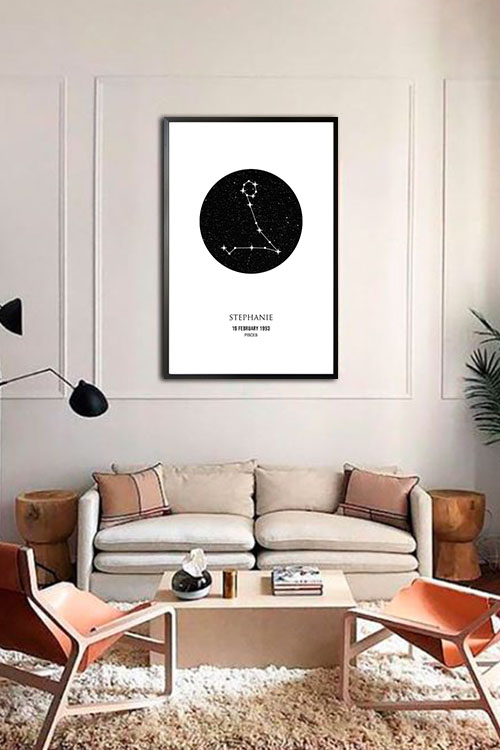
Serene rooms by Pisces
As a symbol of fish, you are drawn to designing your home to be calm and relaxing. Choose colors that will make your space cool and serene. Shades of blue or teal will do the trick and are surely great colors to incorporate in your rooms. Make the furniture pieces comfy as well with soft throws on the couch and plush pillows and blankets on the bed. Also, try to make the room design open as possible to allow the flow of air.
Lively room appearance with Aries
Born under Aries have a big personality and they tend to chase after life and experience it to the fullest. Homes would most likely have bold colors and patterns, especially in the furniture pieces. Homes need to have extra rooms to create a more active space. You also need recreation rooms to fight boredom especially during these times of quarantine periods.
Timeless and classy Taurus
The sigh of the bull wherein you enjoy beautiful things as well as a comfortable and stable environment. A large and comfortable couch is your best friend. The appearance of your kitchen will surely be the focal point of your home. As an earthy sign, add understated tones and neutral colors to bring balance to the entire house.
Luxurious Gemini
As a social individual and with the drive to bring the whole world at your fingertips, you would do everything to make your space look large. The addition of large glass panels and wide windows would allow the entry of natural light. This will make the whole room look more open and comfortable.
Be traditional with Cancer sign
Try designing your home to make it look vintage or traditional. As such, you will need furniture pieces and other items that will fall under these categories. Make all areas of your home comfortable and cozy at all costs. Your home will eventually be your sanctuary especially with lighter colors on the walls.
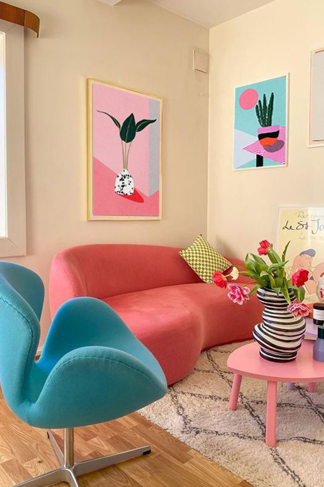
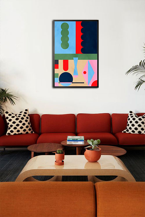
Vibrant rooms with Leo
Bright and bold colors and eye-catching furniture pieces are needed to make your space vibrant. Accessorize your walls with personal keepsakes and vibrant art. These will help you create a home that is perfect for parties and entertaining guests.
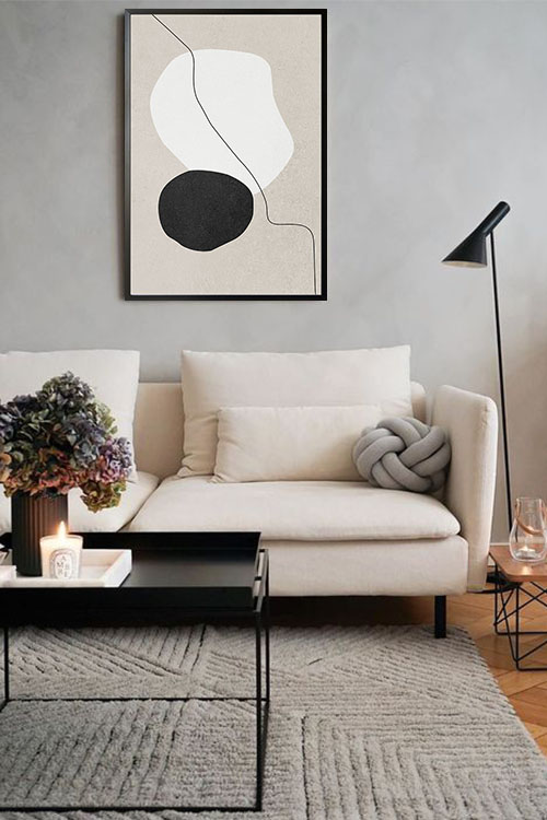
Simple and stylish Virgo
Your home would likely feature neutral colors as they can easily blend with anything. Whether the theme of your room or decorative items, they will surely create a simple and trendy room appearance. Organize your stuff with storage items and areas as clutter will ruin everything.
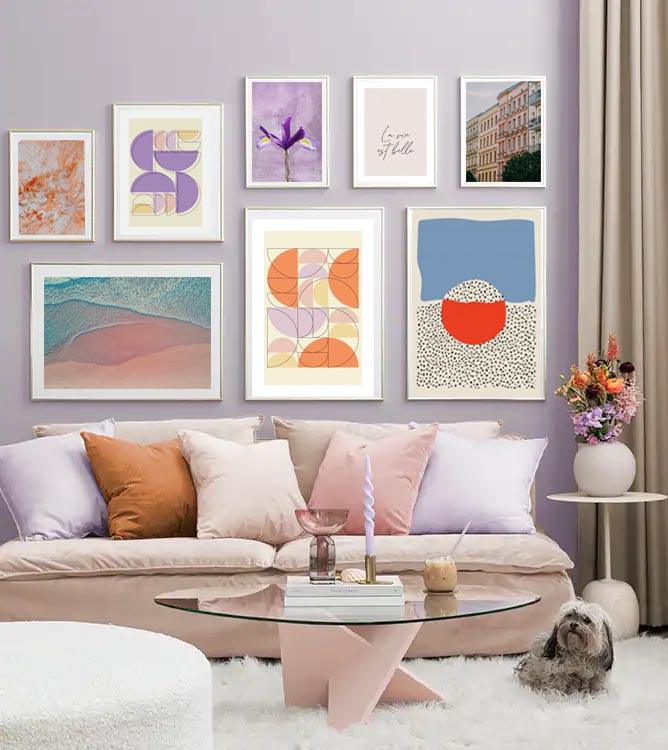
Harmonious Libra
You love to make all things balanced, especially the appearance and feel of your room. Add lighter and pastel colors as these will create an inviting space. There should also be a balance with the furniture, wall furnishings, and accent pieces as possible. Incorporate curtains, throws, and decorative mirrors to make the room look vibrant.
Chic and stylish Scorpio
Personalize your rooms with a design that will reflect your personality. However, keeping your life private, introspective, and mysterious. Add darker colors such as furniture pieces and the colors of your walls. As a result, you will have a private and quiet home.
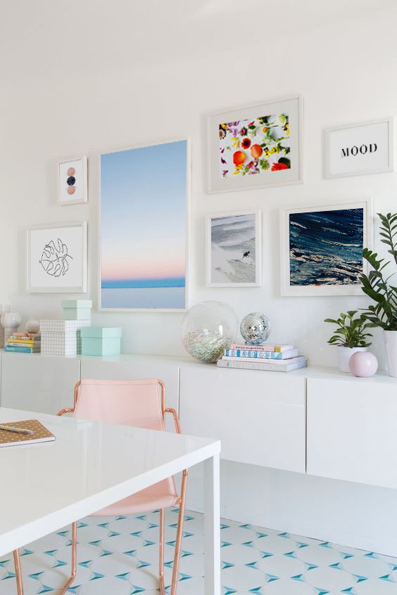
Creative and compact Sagittarius
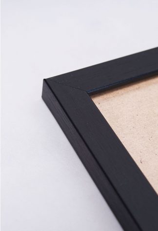
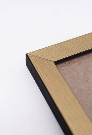
Be artistic in decorating your walls such as creating your own wall gallery. The display of photos of your family and friends in frames will do the trick. So the next time you take pictures, think twice before keeping them in albums. Display them in a creative layout so that you will have a wall that will create a nostalgic vibe.
Stylish and smart room with Capricorn
Add things to your home that you value most. You tend to lean towards a sleeker decor style with a minimalist room appearance. Keep your home organized and easily manageable. In addition to these, the addition of a large desk with sturdy shelves and drawers are needed to keep things in their rightful places.