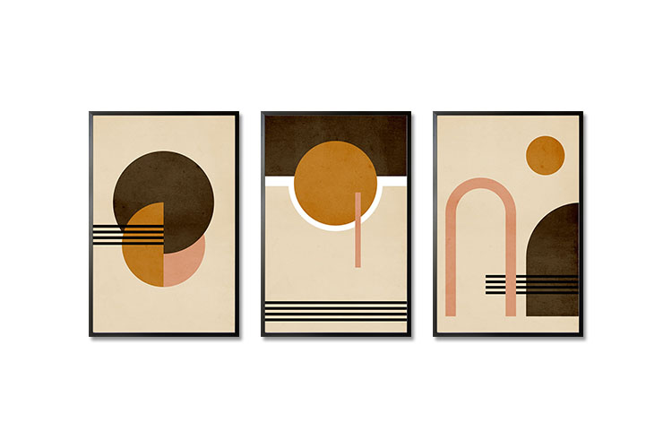
Still searching for the right wall decor for your rooms? Worry no more as these poster bundle will make the necessary transformation. Featuring lines and shapes, as they evoke beauty that blend with any interior design style.

Still searching for the right wall decor for your rooms? Worry no more as these poster bundle will make the necessary transformation. Featuring lines and shapes, as they evoke beauty that blend with any interior design style.

Over the years, we have displayed portraits of the family in our homes. Try to visit a home in the Philippines and you will see framed photos displayed on the walls of the living room. It is also common to see framed diplomas to flaunt the achievements of the children. These photos instantly create a wall gallery that can serve as the focal point of the room.
These days, there are many wall decors and coverings available that not only make the walls look appealing but also set the mood in the room. For many fur parents, it is wonderful to have a PAWtrait of their dogs as there are many reasons why they are displayed. Dogs always hold a special place in the life of their owners and having a personalized print just for them means a lot. Here are some of the reasons why you should have your dog’s PAWtrait in your home.
Dogs are not just pets. They are part of the family. Many families consider them as one of their kids and it is only right to treat them with trendy prints. They are always with you wherever you go, even when going to malls, parties, or any family affairs.
Typically, dogs live for over a decade, which means that we have developed a strong bond with them. They offer unconditional love and completely understand who and what we are, especially our needs. In return, we also treat them like any family member or loved one. Dogs become our best friends that you get to spend time with daily. As such, it is only natural to get them a customized poster to be displayed in your home.
However, they do not live that long and we often mourn their passing. With the PAWtrait displayed, you can immortalize them and bring back memories of happy times with them. Looking at their PAWtraits creates a nostalgic vibe that you will surely love.
These customized posters are great for telling the story of your dogs. A great image of your pet can make them larger than life. In a well-captured photo, you will be able to capture their personality and understand them. A story in the PAWtrait includes finding the right textures, shapes, color, composition, and angles, as well as the background. As such, the location is important when creating a personalized PAWtrait.
Displaying the PAWtrait in your home is best when they are hung in the living room or the bedroom. Having them enlarged and framed is even better as it creates a focal point and may also become a conversation starter whenever you invite your friends over.
You can easily create your dog’s PAWtrait by sending a lovely photo to Artdesign. We offer customized prints that will captivate your hearts. These types of posters can easily show how special your dogs are to your hearts.
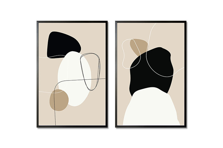
Still searching for the right wall decor for your rooms? Worry no more as these poster bundle will make the necessary transformation. Featuring lines and shapes, as they evoke beauty that blend with any interior design style.
Beige Tone Shapes And Lines No. 2 Poster
Beige Tone Shapes And Lines No. 1 Poster
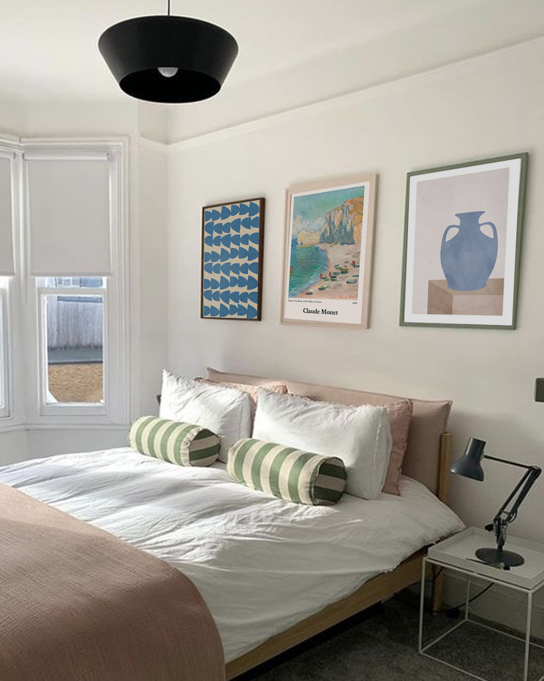
The bedroom may be considered your sanctuary where you can relax and recharge. These are the reasons why the space needs a personal touch when decorating it. Before purchasing the things you need to upgrade, think twice. There are smart ways to create a luxurious bedroom without emptying your pockets. Here are some ways to level up your bedroom without spending that much.
White-colored walls are great for a minimalist style. This wall color can instantly make your bedroom look elegant. Decorate it with wall coverings like wallpaper, paint, artwork, and prints. As a result, you will have a wall that appears bright and warm. Dark-colored walls also deserve treatment for the same decors that are added to white walls.
A luxurious-looking headboard may be expensive but it can give an elegant effect to your bedroom. However, this is not always true. There are still affordable headboards available in the market that will also rock the bedroom interior. The headboard should have an appearance that will catch the attention, such as bold colors, unique shape, impressive height, and elegant-looking fabric.
Whatever type of lighting you prefer: ceiling fixtures, table lamps, statement lamps, or others, choose those with a shiny finish. It may be gold, glass, or crystals. Large-sized lighting can also make the room look elegant.
Seating can be added to the bedroom if there is any unused space. This can be beside the window, in front of the bed, or adjacent to a nightstand. Not only that the seating can add life to your room. It can also be functional and help create a small nook for reading or working.
Add mirrors on the wall, above the nightstand, or behind any lamp. These are some of the tricks that many designers do to add glamour to the room. Mirrors create depth and can make small rooms look larger. Choose mirrors with a gilded finish or unusual shapes.
No need to buy a new nightstand if you already have one. You just have to declutter it by removing excess items like papers and other possessions. Leave only the lighting, a small vase of flowers, and a book. You may also add something shiny like a mirror, crystal, or brass.
Add large-sized pillows combined with the standard-sized ones as well as two to three smaller throws. Rule of thumb, the pillows must not occupy more than a quarter of the length of the bed. Select pillows in silk, velvet, or faux fur to make the room look more luxurious.

Chinese lanterns have been in existence since ancient times. They were used to provide light and in religious practices. Nowadays, Chinese lanterns are used for decoration and as modern forms of celebration and worship. They are likewise symbols of national pride in China and are commonly seen in homes and public areas. Traditionally, the lanterns are seen in the color red and adorned with gold or red tassels. Do not be surprised as well if you see them in various shapes.
The earliest recorded Chinese lanterns were during the Eastern Han Dynasty (25-220). Lanterns were used as lamps or covers during that period. The lanterns were used in several religious practices like Buddha worship. Buddhism was known to spread in China due to the efforts of the Eastern Han emperor. The emperor ordered that lanterns be lit every 15th day of the first lunar month to worship Buddha. Eventually, this celebration became the famous Lantern Festival.
During the Tang dynasty in 618-907, paper lanterns were displayed to celebrate the peaceful life and power of China. This led to the popularity of lanterns throughout the country.
During ancient times in China, making lanterns was a collection of crafts including painting and paper-cutting. There are various materials used in making lanterns, and the most commonly used were bamboo, wood, wheat, straw, paper, and silk. Illustrations were also seen in traditional lanterns and these show some of the beautiful landscapes of China, portraits of key personalities, mythical creatures like dragons and phoenixes, birds, and fish.
Colors say a lot about the culture and tradition of China. They have different meanings and are used on various occasions. Red lanterns represent wealth, fame, and prosperity. These lanterns are usually used at weddings, family reunions, and several festivals to show joy and harmony.
During imperial times, yellow lanterns were displayed in palaces as the color represents the emperors of ancient China. As such, it was forbidden to use yellow lanterns by the public. These days, yellow lanterns are displayed to bring good luck to students.
White lanterns, on the other hand, are used in any event that has something to do with death. Therefore it is common to display or see white lanterns during funerals. While green lanterns symbolize health, prosperity, and harmony. These are likewise seen during temple fairs or the infamous Lantern Festival.
These are the days to feast your eyes on colorful and beautiful Chinese lanterns. The tradition of viewing lantern displays can be traced back to the Han Dynasty around 2000 years ago. One of the favorite activities during the Lantern Festival is guessing lantern riddles. People gather around the displayed lanterns and guess the answers to the riddles. It is a form of competition wherein the person who answered the most number of riddles win.
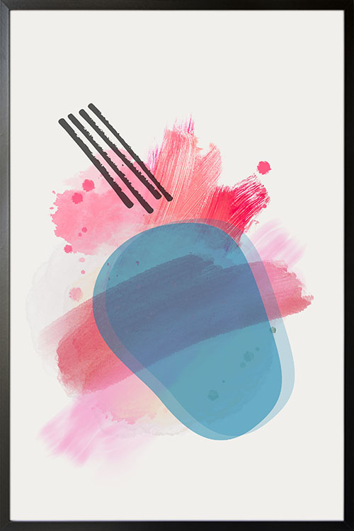
Level up your wall appearance with abstract art. A lovely piece that features colors and shapes in what appears to be brush strokes.
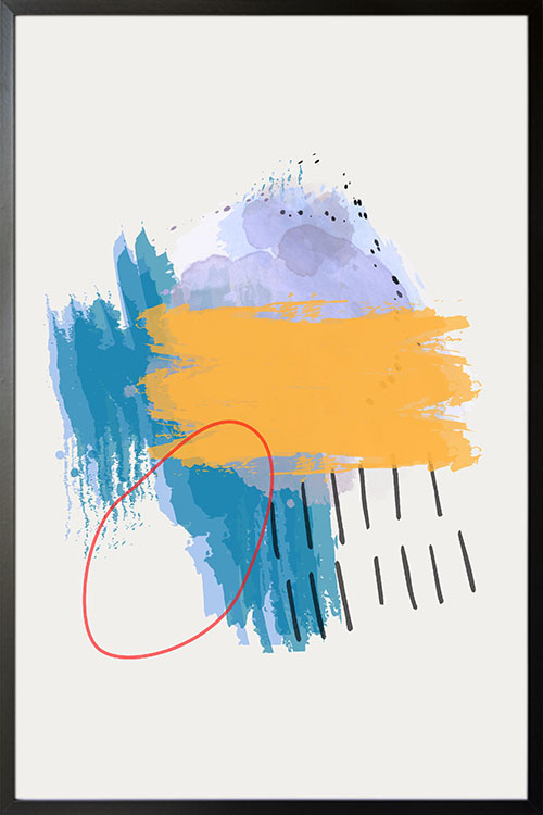
Abstract art that shows colors and shapes to add a fun and exciting vibe to the room. A perfect art to be displayed in any room of your home.
For some time now, open-plan living rooms have captured the attention of many homeowners and designers. Designing, furnishing, and lighting an open-plan living room needs some guidance. Read on to learn some tips on how to achieve an open-plan living room.
Having an open-plan living room requires space. This is a fact! However, if space does not permit you to have the interior appearance that you love, there are ways to adjust it. Making some structural changes like moving or blocking up a doorway, switching the direction of a staircase, or adding sliding glass doors can help increase space and improve flow. These recommendations will not bankrupt you as well.
In many instances, the dining room is separated from the other rooms, such as the kitchen. Increase the space by removing the walls that separate them from each other. Another cost-efficient idea is to create a large opening between the rooms. It is cheaper and very effective to help you achieve the interior design style.
Lighting, whether natural or artificial, is important in an open-plan living room. It is worth creating a lighting scheme as they may have multiple functions. Ask an electrician to do some wiring in the living room. Choose the lighting that can adjust the mood in the room.
There are many activities that can be done in an open-plan living room. Therefore, it is important to identify an area for each to avoid confusion. A sofa can be used to mark the boundary of a seating area in a multi-purpose space.
With the number of condominiums and apartments emerging these days, living areas are blended neatly with the kitchens and dining areas. The objective is to create zones that would identify the space. This can be achieved with the breaks in color, design, flooring, and furniture. The use of rugs is a cost-efficient way to create zones.
Using different flooring, decorative light fittings, or color schemes help define the role of each zone. However, never forget the design cohesion as this will make the room appealing and functional. Similar shapes, materials, or textures can maintain cohesion across the space.
There are many reasons why a space becomes uncomfortable. Cooking, electric fans, old model air conditioners, speakers, and others. You may want to keep the noise at a minimum by buying appliances with noise reduction mechanisms. It is worth checking the decibel ratings before buying.
Transforming an industrial space can be challenging. You will be dealing with unusual dimensions, incorporating statement features into the layout, and navigating planning permissions. The open-plan layouts of warehouses can feel much larger than their actual dimensions. The elements of open-plan space can be achieved with old warehouses. For instance, they tend to have larger windows such that natural light can enter freely.
You might think that the principles of interior design are not that important. However, they are vital to have a dream home that you can flaunt to your friends. Having a well-designed interior enhances the aesthetic and economic value of your house. Here are the interior design principles that will make any home look cool and awesome.
This means creating visual harmony in the space by ensuring that the elements are evenly distributed. As such, the interior will have a sense of equilibrium. Balance can be achieved with many forms, such as shapes, colors, patterns, and textures.
Traditional symmetrical balance can be achieved when you place objects symmetrically on either side of an imaginary central axis. Asymmetrical balance keeps the focal point on the imaginary axis while allowing dissimilar and oddly numbered objects. Evenly distributed visual weight can be maintained with objects of similar dimensions. Radial balance, on the other hand, can be achieved by arranging objects around a central focal point. Examples are round dining tables and chandeliers.
Unity in interior design refers to the uniformity or harmony among the elements used in the design. These include having patterns or textures, equal spacing, and similar colors of objects. This also refers to the repetition of elements to create a continuity of elements.
Rhythm is about creating repetition and contrast in an interior to help carry visual interest around the room. You can add this to the room by painting the wall green and using the same color again on the furniture pieces.
Emphasis is another principle that focuses on the need of every room on one central element as a focal point. The other elements should complement the focal point. This can be any large piece of furniture such as art, painting, accent wall, color, pattern, or texture.
This is created when one combines two or more different forms, such as color, shape, or space. Achieve this principle with the use of opposite colors like black and white. Another example is to combine a round mirror with a rectangular dining table.
This principle refers to the ratio. For instance, the size and dimension of the objects in a room should relate to one another proportionally. One example is for homes with high ceilings should have larger furniture pieces. This will help achieve harmony in the design.
This principle tells us that the little things must not be overlooked. Nothing is too small or too unimportant to pay attention to. This can be anything, from embroideries on cushions, handles on the cabinets, or personalized framed art displayed in your room.
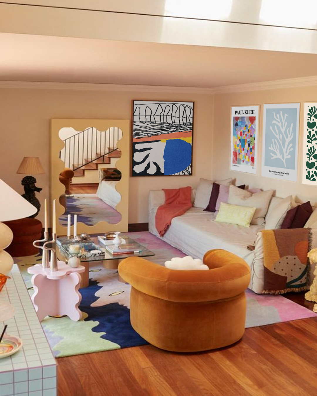
When designing or decorating a space, it is important to consider the 7 key elements to make it look balanced. Read on to learn more about these elements and how they can help you achieve a striking and stylish living space.
The first thing that a decorator or designer will do is conduct an ocular visit. Knowing the overall size and the positions of doors, windows, and others is vital for a smooth design. A living space that is filled with furniture pieces is called a positive space, while an empty one is known as a negative space. A balance between the two makes the room look inviting and cozy.
A line brings structure, creativity, and a sense of direction. There are three types and these are horizontal, vertical, and dynamic. Horizontal lines are commonly seen in tables, chairs, and other furnishings. Vertical lines are common in doors, windows, and other tall structures. While dynamic lines invite activity, such as the staircase.
This element refers to the shapes of the room. This may be the shape of the whole room, including the furniture, decor, and light fittings. Forms have two types: geometric and natural. Geometric forms are anything that is man-made, such as furniture pieces. Natural shapes, on the other hand, are organic, such as plants.
Light sets the mood in any living space. Whether it is man-made or natural, a balance of both is needed to ensure a good atmosphere throughout the day. Lighting also influences the choice of colors for the space.
Colors make any room look vibrant and lively. They can be used as a complementary or contrasting element. They are often based on color psychology to ensure that the right mood is set in the room.
Adding texture also means incorporating depth and interest. Two types of texture exist: visual and actual. A texture that is visual refers only to the appearance, while actual textures are both seen and felt such as velvet.
The use of patterns can add interest and excitement. Patterns are defined as any repetitive decorative element.