The Story Behind Minimalist Interior Design

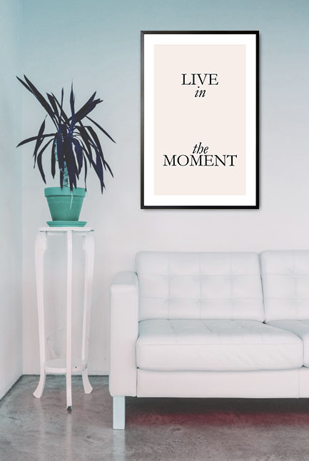
Live in the moment poster in interior

The minimalist interior design style is one of our favorites. It has the beauty and appeal that can give your freedom. Minimalism can be defined as a tool that assists you in finding the best with many opportunities available. The removal of any distraction so that one can focus on the more important things is the highlight of the minimalist interior design style. Being a minimalist is different from being simple. Minimalism means promoting the things that we value most and excluding the others that may cause distractions. 

What really is minimalism?

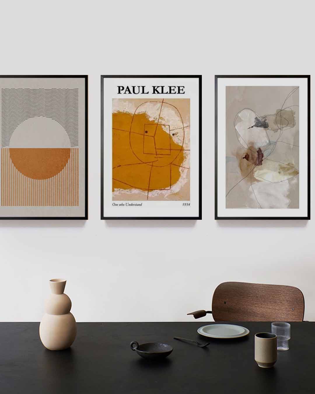
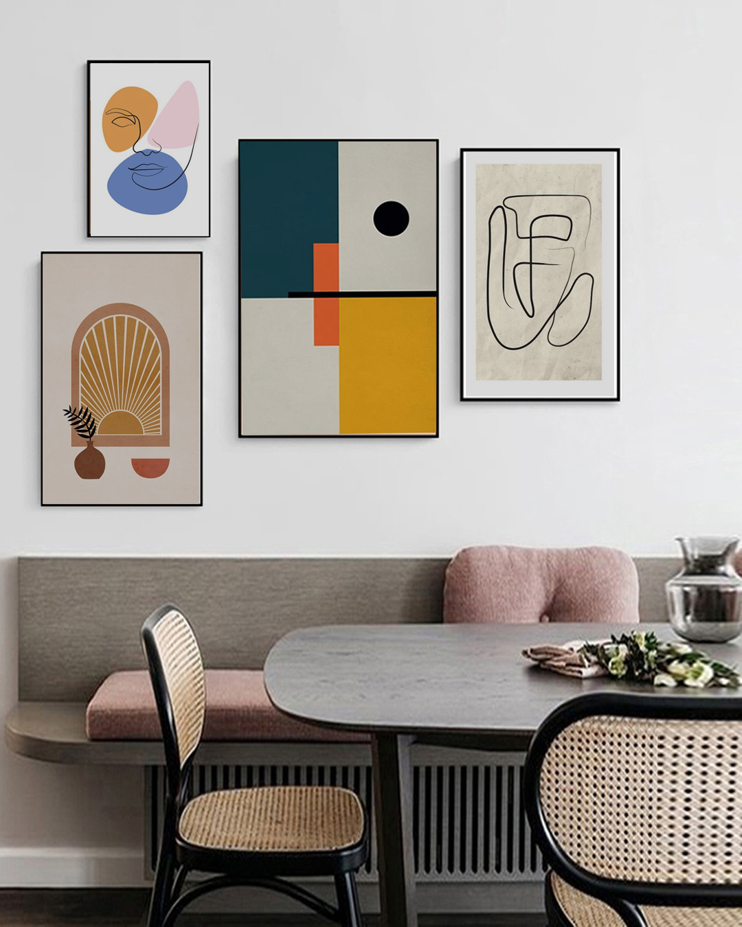
In the world of art and design, minimalism is expressed in a way that encompasses even beyond the social, geographical, and political divisions. The design style is very similar to modern interior design that involves only the bare essentials. As such, any living space will have a simple and uncluttered look. The minimalist design style is characterized by simplicity, clean lines, and a monochromatic palette with a few colors only used as accents. The interior also has an open floor plan, great lighting, functional furniture, and a handful of essentials. 

A brief history of minimalism

Minimalism is most commonly associated with the Western art movement that started in the 1950s. The movement focused on the idea that “art should have its own reality and not be an imitation of some other thing”. The style is influenced by many things such as abstract expressionism. However, minimalism focused more on geometric shapes, subtle colors, and the phrase “less is more”. 

The Japanese concept of wabi-sabi also influenced minimalism. The concept is all about imperfection and impermanence. Japanese minimalism uses clean lines, neutral tones, carefully placed tatami mats, and natural materials. In fact, many celebrity homes use the Japanese concept of wabi-sabi. 

The minimalist interior design style that we know today has a mixture of characteristics. Probably because of the different influences it had over the years. But the core concept of simplicity, clean lines, neutral tones, and unclutteredness never disappears. 

The Scandinavian decor and design style is also influenced by minimalism. It is common for Scandinavian homes to have light wood, dried greenery, and clean lines. 

Achieve the minimalist interior design style in your home

Since your home has different rooms, you can easily incorporate the design style by following some tips. For instance, the living room can look perfect with white or neutral walls, uncluttered coffee tables, soft colors, geometric patterns, and plants. These can help achieve an inviting and cozy atmosphere especially with lots of natural light getting in. For the dining room, the colors should likewise be simple. Choose neutral or black accents along with ceramic dinnerware in light hues to complete the view. 

The bedroom can be your sanctuary and should have an appearance that is relaxing and comfortable. It is all about creating a tranquil environment with the use of minimalist concepts. Use blankets and pillows in similar tones as well as a nightstand that appears simple. Be sure that they blend into the overall appearance of the room. 

Final thoughts

Decorating and styling your home is not a joke. It means that you have to be creative in your own way. The minimalist interior design style is not that hard to achieve. All you need to do is to incorporate the core concept of the style into your home and you will have the interior design of your dreams. 

The History of Art Nouveau

Art wall 147

Art Nouveau is a design style that is commonly used in architecture, applied art, and fine art. Its popularity rose in the 1890s until the beginning of World War I. The goal of the design style was to modernize the design and move away from the eclectic historical styles that were popular during that period. In fact, the concept of Art Nouveau originated from the stems and blossoms of plants. Read on to learn more about Art Nouveau and how it all began. 

A brief history of Art Nouveau

Art Nouveau was based on the name of an art gallery in Paris, “Maison de l’Art Nouveau”. The gallery was owned by an art collector, Siegfried Bing. The gallery featured artworks that were created in the Art Nouveau style. Along with modern furniture pieces, tapestries, and other decorative items during the 1900 Exposition Universelle made the place popular that the name of the place was used to denote the design style. 

Simultaneously, Les Vingt and La Libre Esthetique promoted the design style in Belgium. While the magazine, Youth, promoted the design style in Germany. It was an illustrated magazine on art and lifestyle in Munich. 

Though the exact origin of Art Nouveau is not really determined. Many art historians agree that the origin is linked with the English Arts and Crafts Movement. It also has influences from Celtic art to Japonism. The beauty of Art Nouveau is that it can be applied to other disciplines like architecture, interior design, fine arts, glassware, and illustrations

Its worldwide popularity is short-lived, however, because of the rise of the Art Deco movement. It made its comeback in the 1960s. The emergence of Art Nouveau is the response to the traditional design style. The goal was to do away with the traditional ones and modernize the concepts and ideas in the decorative arts. The design style is inspired by the organic and geometric forms, evolving elegant designs that mimic the stems and blossoms of plants. The beauty of Art Nouveau features lines and curves as well as colors and hues. 

Traits of Art Nouveau

Here are some of the traits of Art Nouveau that will make a difference to your homes:

  • The design of the furniture pieces is styled with flowers, leaves, buds, and roots. 
  • Designers have the freedom and flexibility to choose the color as long as they are light.
  • The floor is usually made from hardwood that is stained and varnished with the addition of an oriental or colorful rug. 
  • Tiffany lamps and stained glass windows create the atmosphere. 

Achieve the design style in your home

For homes that employ the design style, it is common to see elongated curves and linear shapes. The style is influenced by nature such as flowers, spider webs, and feathers. Here are some ideas and tips to achieve Art Nouveau interior to your home. 

  • Wall colors – usually the colors of the wall are soft and muted mixed with palettes of gray, mustard, brown, olive, and lilac.
  • Floors – parquet floor or wood finish will achieve the classic appearance, whitewash the floor, or mid-toned wood. 
  • Lighting – Tiffany lamps were the popular ones during the period.
  • Decors – add curved or straight lines which are geared upwards from the ground. Stained glasses can be used with the same design which resembles blossoms of plants. 

Art wall 128

Art wall 128

Fantastic wall art with posters of shapes and lines. A cool way to add life to your room. These trendy posters can bring your wall decorating project to the next level. Create spectacular wall art with abstract art and your home can be as elegant as it gets. Get your posters now!

Number of posters: 2

The Elements of Interior Design

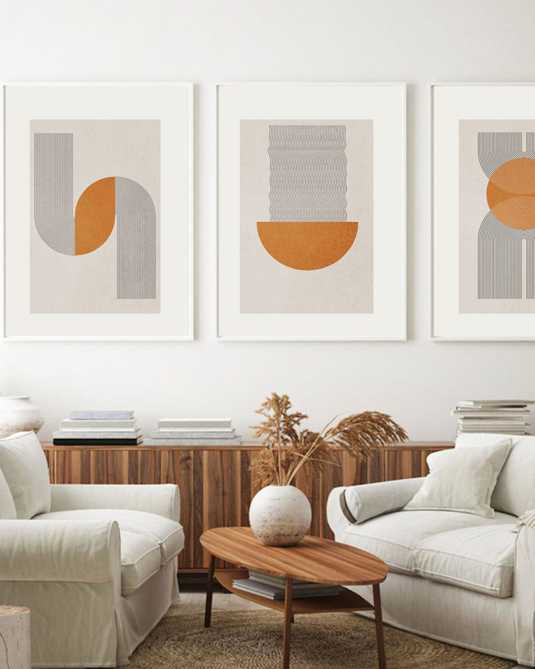
Graphical lines and half circle no. 1 poster in interior

There is more to painting the walls and adding furnishings when it comes to interior design. Interior design is not just about making any space attractive. It is actually both art and science. It is important to note that when decorating any living space, the reaction of the body and mind matters a lot. As such designers employ skills and techniques that will reshape how we perceive living spaces. In this case, the elements of interior design are integrated to successfully achieve the appearance that will be loved by your family and friends.

Space

One example of smart utilization of space in interior design is the “open concept” floor plan. This design focuses on the balance between negative and positive space. Negative space is about an empty space giving a room a lofty and open feel. While positive space is the space filled with decors such as furniture pieces and other decorative items. Walls are removed in this concept that makes the brain feel like the space is bigger in contrast to when the walls are present. 

Lines

Another important element are lines (horizontal, vertical, and dynamic). Horizontal lines give any room a tranquil and peaceful feel. They make the space feel wider and more expansive. However, too much use of horizontal lines makes the space feel dull and boring. Vertical lines, on the other hand, draw the eyes upward. Too much, though, can cause people to feel confined. 

Dynamic lines suggest movement and stimulation. These lines encourage the eyes to move in the direction of the line. Examples are zigzag, angular, and curved lines. Offer different movements or effects on the feeling of a room. They provide energy and life to the whole room and examples are zigzag and angular lines. Curves and smooth lines add balance and smoothness. 

Pattern

Patterns are a collection of lines and forms. Just like shapes, they highlight certain parts of the room such as stairs, ceiling, and walls. These can be achieved with the display of posters, the installation of wallpaper, picture frames, or pillows. 

Light

Light can set the right mood in your rooms. Natural light can represent warmth and happiness. It can show the natural beauty of paint colors and highlight furniture pieces that you want to feature. Place them near windows or doors to allow them to be illuminated with natural light. Regulate the entry of natural light with curtains, shades, or drapes. 

Artificial lighting, on the other hand, can be added if natural light is not enough. They can be used to highlight a particular piece of art, poster, or wall art. Examples of these are task lighting, accent lighting, and ambient lighting. 

Color

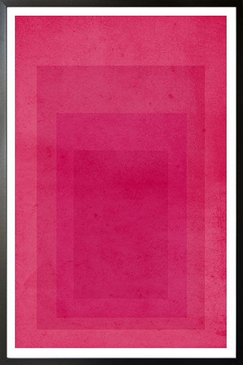
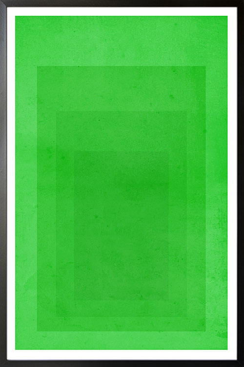
Colors evoke certain messages and moods as the brain reacts to the different colors inside a room. Certain colors produce the desired effect that you want for your home. Both cool and warm colors evoke different kinds of feelings. Green, for instance, suggests tranquility and peace. As one of the cool colors, green also evoke an atmosphere of relaxation and calmness. Warm colors like red, on the other hand, promote activity and stimulation. Red stimulates hunger, while purple represents royalty. 

Texture

There are two types of texture: actual and visual. The actual texture shows how a material truly feels. Like the smoothness of silk and the toughness of leather. Visual texture is how something appears to feel to your eyes. Posters and other wall coverings feature images that make the eyes perceive of having the real deal. For example, posters or wallpaper that feature stone can give an illusion of stones on the wall.

Poster Design Ideas For A Better Home Interior

Make today magic poster

Posters are the favorites of many designers and homeowners when it comes to beautifying the walls. They are chic, stylish, and creative. They can likewise stimulate various emotions. There are different themes and designs that can make a total transformation to the interior of any room. Some designs may also provide information about certain products or services. Knowing the audience will give you an idea of what poster design to get or make. 

Use color to make the room appealing and to create a mood

Color is one of the important elements of interior design. Colors add energy, catch attention, and elicit a mood. Colors can be bold, romantic, or subtle. The most important thing about colors is that they should blend well with each other to achieve a wonderful background. 

Typography posters

These posters have various uses. By definition, typography posters are filled with words that convey messages and information. If you are planning to use this kind of poster, make sure that the fonts are clean and simple. Many typography posters may appear simple. Yet the message they contain has a big impact on the viewer. Having them in the bedroom, kitchen, or office will be a constant reminder for us. Some also have inspiring messages that will help us get through rough times. 

Create visual hierarchy

With the aim of catching the attention of the viewers, posters should have elements that will make them easy to read and understand. Rank the information according to its importance. The letters should be bold, with simple graphics or photos. However, if you have many things to add, create a headline so that the viewers will have a bird’ eye view regarding the content of the poster. 

Black and white for a classic view

Black and white posters have never disappointed us. They are simple yet create a big impact on the overall appearance of the room. What makes them more interesting is that they easily blend with any interior design style that you have. Having a gallery of black and white posters is like creating a classic setting for a movie. 

Less is more

Less is more. This may sound like a cliche but it’s the truth when creating a visually stunning interior. A single word or dramatic image can easily convey the message of a poster. Avoid extra graphics or words. Minimalist shows elegance that cannot be seen in other designs. 

Use shapes to create visual interest

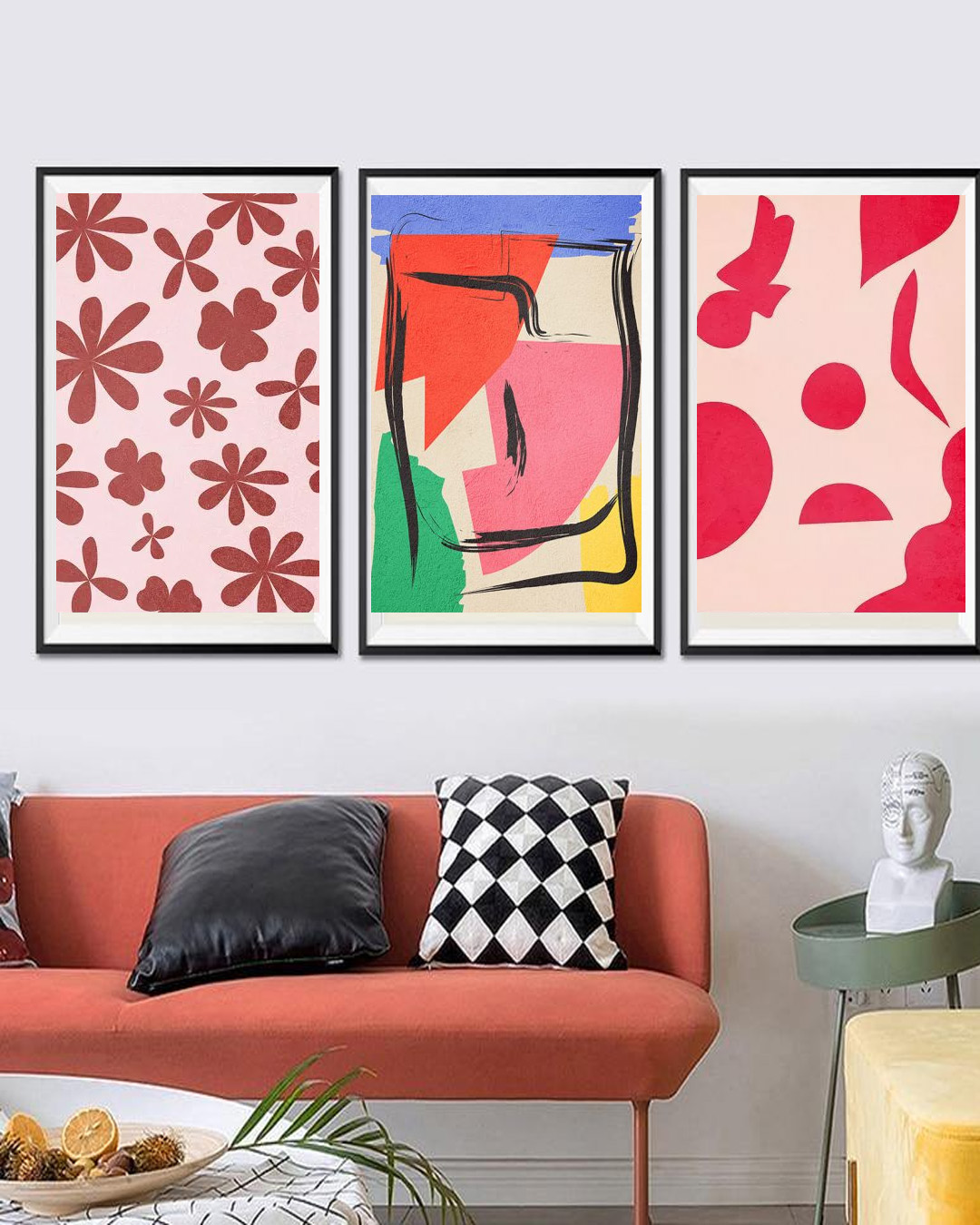
Shapes in posters are versatile as they add weight to the whole design. They also make any wall look more interesting that catch the attention of the viewers. 

A clever perspective for the viewer

Life is not only seen from one angle. Look for posters with images seen at different angles and points. These can add excitement to the overall effect of the prints. The textual content can be in diagonal instead of the traditional straight line. 

Use humor 

Use words and graphics to make the poster design appear fun and exciting. Unexpected imagery is recommended. Do not hesitate to use it so that the poster can grab the attention of its audience. Humor can likewise make the atmosphere light and lively.

A more personalized approach

With the technology that we have these days, designing a poster is easy as A-B-C. You can even make them even more attractive by personalizing them. With personalized posters, you will be able to create designs that will show who and what you are. You can even use personalized posters to create stories for a more appealing touch. 

Artsy Abstract no2 poster

Artsy Abstract no. 2 poster

Lines and shapes in abstract art. A simple and fantastic way to make a minimalist room appearance. Make your wall look fantastic with this poster and have a focal point that will be adored by your loved ones.

Artsy Abstract no1 poster

Artsy Abstract no. 1 poster

Lines and shapes in abstract art. A simple and fantastic way to make a minimalist room appearance. Make your wall look fantastic with this poster and have a focal point that will be adored by your loved ones.

Blue rounded arrow shape poster

Blue rounded arrow shape poster

Shapes in attractive abstract form. The blue color can likewise add a relaxing and calming vibe to the whole room. Beautify your walls with trendy and affordable art from Artdesign.

Vibrant pink shape abstract poster

Vibrant pink shape abstract poster

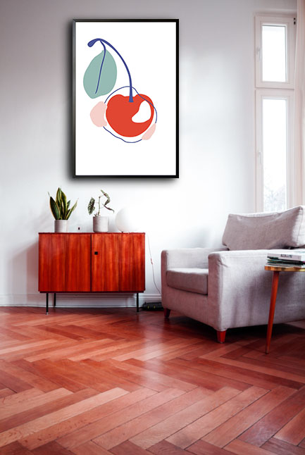
Simply beautiful art that can stimulate your senses. Abstract art of shapes can add life to any plain-colored walls. The display of this art is one of the fun and wonderful ways to boost the overall appearance of your room. A lovely art that is perfect in any room.

Easy Ways To Make Personalized Posters

Baby line art No1 personal poster

Posters are important as they are used for different functions. They need to be eye-catching and informative. Posters are also commonly used for promoting events, products, spreading information, and others. Posters these days are used for reproductions of famous artworks and in decorating any living space. 

How it all began

Over the years, people have used posters for different reasons. Most of the posters created are visually appealing since they intend to catch the attention of the public. Posters have been displayed in public places to make people aware of political viewpoints, an invitation to certain events, or as a marketing strategy to purchase a product or service. 

Posters these days are based on those that were created during the mid-19th century. During that period, the printing industry already has perfected color lithography and made mass production possible. Censorship of public spaces in certain countries like France has been lifted and advertisers began to market the mass-produced consumer goods to a growing population in urban areas. 

Eventually, after more than a hundred years, posters evolved when it has already been recognized as a vital art form that attracted artists. 

How to create posters

These days, posters come in many interesting and creative designs that serve their purpose. Not only that they are used the conventional way, but posters can also be a great accent to your walls. 

Know the appropriate size

Posters may have their standard sizes. But you can still create the size that you need and it greatly depends on how you are going to use your poster. 

Design the layout of the poster

Viewers must be able to easily grasp the message of the poster. Determine the right alignment and apply them to the headers, photos, text, and shapes. These must be unified and consolidated. With these, the poster and its elements will have coherence. It is also recommended to place the text at the center to create a sense of symmetry. 

Pick your choice of graphics

The good thing about posters is that a simple image can convey a message. In creating the design of the poster, bear in mind that there should be a balance between text and images. The design should also complement and blend. Larger posters must have an image that has the highest resolution. 

Make it colorful

The colors should be able to complement the photographs and the message. In color psychology, it has been documented that different colors can already convey a message. For instance, green can be translated to freshness and the natural environment. It is though recommended that the use of colors be limited. If the poster is bombarded with colors, it may be a distraction to the real message of the poster. 

Add text

Maintain the simplicity of the headers and titles. The headers must have a larger font size to show the viewers which one to first look at. Do not forget the contrasts in the sizes of the fonts, style, and color. These elements are the ones that catch the attention of the viewers. Do remember that do not use more than two faces in a document. Keep the message straightforward so that your audience will immediately know what the poster is all about.