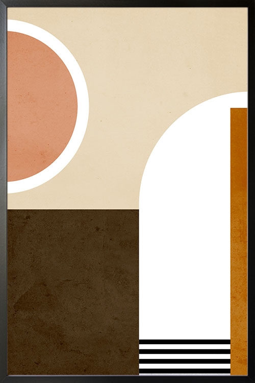
Abstract Minimal tone and shape no. 5 poster

Abstract Minimal tone and shape no. 5 poster

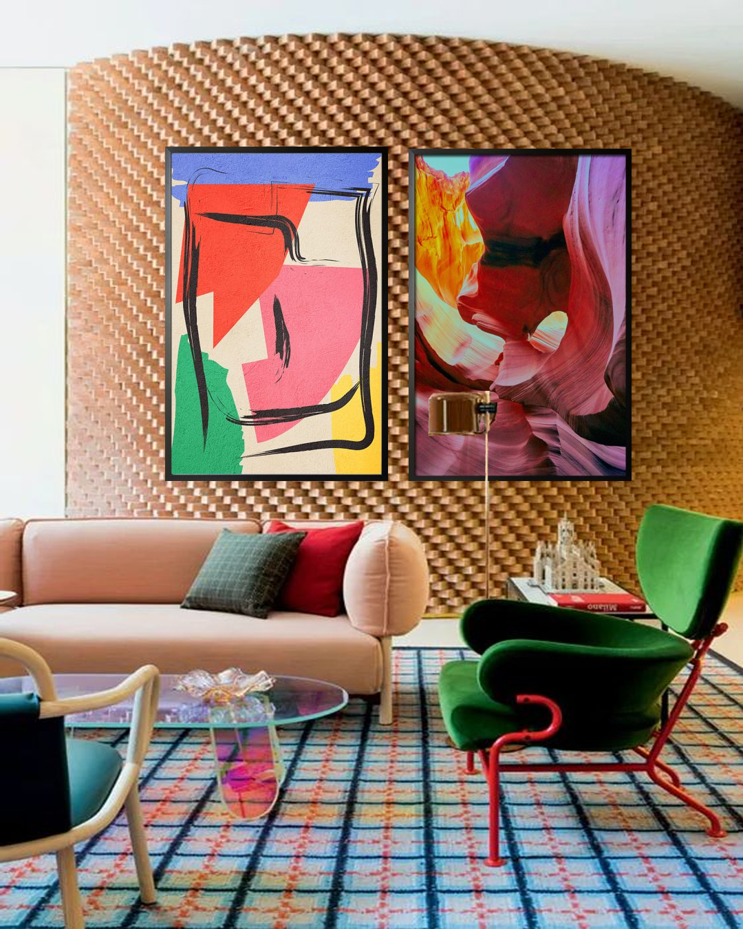
Trendy abstract art of shapes in subtle colors and appearance. The display of this art can easily add tone and texture to your walls. A design that can help you create a minimalist or Scandinavian-themed home. Make a comfortable and relaxing room ambiance with this art displayed in any room of your home.

Fun and Exciting Appearance of Modern Retro Design

Neon hello good times poster

Modern Retro is one of the classic styles that is again gaining popularity these days. Every decade has its own trend when it comes to fashion and design. There are also significant changes to the culture and practices. For instance, during the 70s, different events occurred such as women’s liberation, atomic awareness, environmental awareness, and music. Loud colors were also popular during the 70s as can be seen in clothing and interior decorations. 

Modern Retro design style is a combination of the trends in the 70s, 80s, and 90s. A design style that offers a nostalgic atmosphere. One of the cool design styles that features a fun and exciting room appearance that is adored by people of all ages. In addition to these, the design style also highlights having a light feeling.

Features of Modern Retro Design Style

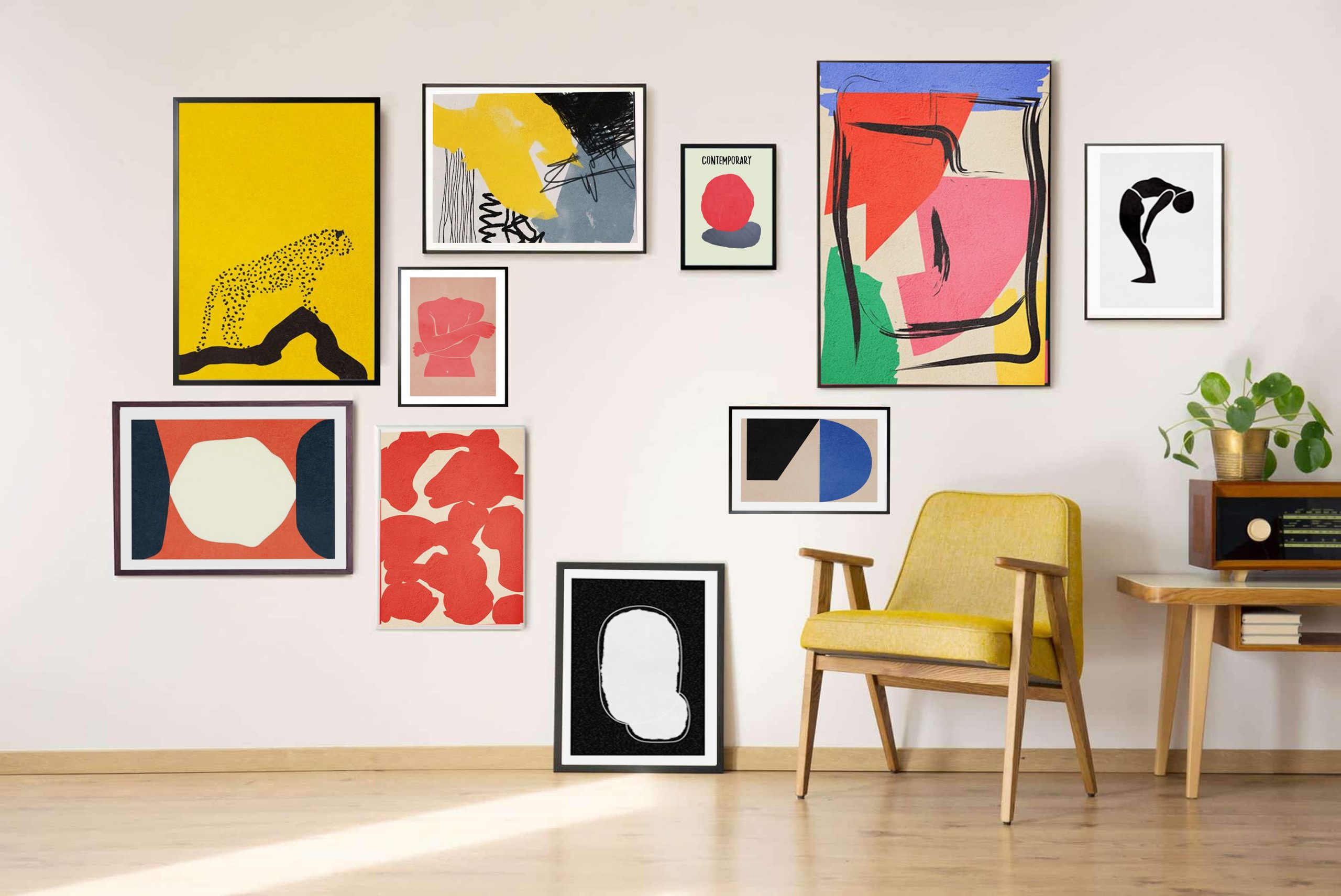
With the combination of the style from the past and the minimal appearance of the present, modern retro design style is gaining popularity. Many are impressed with the effects and beauty that the style gives any home. Here are some ideas that you can add to your home to achieve the design style: rich color palette with warm hues like red and yellow; neon colors and lights; flat elements from shapes to lines and icons; squiggles and line art with vibrant colors; music-themed items like cassette tapes and turntables. 

What’s good about the design style

Modern retro design is a fun and interesting style. With shapes and bright colors, you can create a nostalgic atmosphere that will captivate the attention of your family and friends. This style can be considered to be the link between the past and present as it features styles and appearances of the different decades. 

Though modern design style has its ups, there are still those who are not into the retro style it encompasses. Just like in any style, modern retro is not for all. It has unique features that appear unorganized as seen in the colors and shapes. 

The digital influences

The decades from the 70s to the 90s may be considered to be the digital era. A period of the boom of computers, computing, gaming, and computer graphics. These are seen in movies, television shows, and computer games. 

These styles evoke a nostalgic effect on the interior. Though the graphics are not that good, they have maintained that way to keep the authenticity of the period. These features are then used to create designs that will bring back the good old times. 

This style reflects the designers who grew up loving retro graphic appearances. As such, many individuals feel comfortable seeing them as compared with the more advanced digital graphics that we know these days. Though the design may be simple and laid back, it adds style and can personalize the rooms of your home. 

Final thoughts

Modern Retro is a fascinating design style that encompasses a lot of styles. This could truly create a nostalgic atmosphere. Combined with modern features, your home will have a unique and spectacular view that will be loved by anyone. 

Proportion and Balance in Interior Decorating

Rustic hues poster no. 2 poster interior

Proportion and balance in decorating any home are vital to creating an interior that is visually appealing. These can be achieved in different ways and the most common is through trial and error. This is to determine what suits best for your home as well as the taste of homeowners and designers. 

What is a proportion in interior decoration?

Proportion is the balance among the design elements such as shape, color, and texture. This element is often associated with scaling where sizes are compared between objects. Proportion is the smart judgment of whether the arrangement is right or wrong. Many successfully achieve the right proportion through trial and error. Experienced designers and homeowners usually achieve this in a shorter period of time. The right proportion can be achieved by repeating various elements like shapes, colors, and texture. 

Color proportion

This can be attained by repeating colors in different areas of the house or room. For example, shades of blue can be seen on a poster displayed on a wall, fabric and cushions, rugs, and other decorative items. In this way, you will have a harmonious blend of colors in the room.

Space proportion

This is the placement of objects within a space. This is when scaling comes in. The addition of chairs and furniture pieces needs scaling so that the pieces can blend with each other. A sofa that is too big may seem a little awkward when placed beside small furniture pieces. 

Proportion of light

Having the right design of light source is one of the critical ways to achieve harmony in your room. Light has a lot of effects and significance in a room. It affects how an individual perceives the overall appearance of the room. The exact amount of light can make any room look appealing in contrast with dim lights. Focus lights or pin lights may also be used to feature artwork in a room. This can therefore be the focal point of the room. 

Proportion is shape

Repetition of shapes in the room can provide harmony. For instance, quadrilateral decorative items can be placed in different areas of the room for a more impressive room appearance. 

Texture proportion

Texture can make any interior look rich. Paint and the display of posters add texture to the walls. Posters and other artworks can create a captivating focal point. You can also add carpets or rugs to add texture to a room. 

Balance in the interior

Balance keeps everything in place. The absence of it may put everything in chaos. In interior decoration, balance refers to visual balance to make the room appear comfortable and appealing. 

Symmetrical balance

This can be achieved if the decorative items are repeated along a central axis. This offers a feeling of stability and calmness and can be achieved through the proper arrangement of furniture pieces.

Radial balance

This type of balance refers to anything round or circular. Decorative items that are properly distributed along the central axis are one example. For instance, the arrangement of chairs around the dining table is important to achieve the desired look in the room. 

Asymmetrical balance

This is the visual weight of the different objects placed in the room. The use of different elements with the same weight added on the opposing axis can give the said type of balance. 

Earth minimal poster

Earth minimal poster

Simple and unique poster art of the planets. A cool and attractive poster design that will make any room calming and relaxing. The display of this art is also one of the ways to add patterns on your walls. With lines and shapes, you will have a unique and interesting room appearance.

Saturn minimal poster

Saturn minimal poster

Simple and unique poster art of the planets. A cool and attractive poster design that will make any room calming and relaxing. The display of this art is also one of the ways to add patterns on your walls. With lines and shapes, you will have a unique and interesting room appearance.

Mercury minimal poster

Mercury minimal poster

Simple and unique poster art of the planets. A cool and attractive poster design that will make any room calming and relaxing. The display of this art is also one of the ways to add patterns on your walls. With lines and shapes, you will have a unique and interesting room appearance.

Neptune minimal poster

Neptune minimal poster

Simple and unique poster art of the planets. A cool and attractive poster design that will make any room calming and relaxing. The display of this art is also one of the ways to add patterns on your walls. With lines and shapes, you will have a unique and interesting room appearance.

Jupiter minimal poster

Jupiter minimal poster

Simple and unique poster art of the planets. A cool and attractive poster design that will make any room calming and relaxing. The display of this art is also one of the ways to add patterns on your walls. With lines and shapes, you will have a unique and interesting room appearance.

Maximize Your Space With Modern Design Style

Art wall 85

The modern design style is the trend these days when it comes to styling your home. In fact, many public spaces and establishments prefer the design style over the others. It features clean lines and simplicity which are greatly influenced by the modern art movement of home interior. Moreover, there are no limitations to modern design style. It encompasses a lot of different embodiments.

The characteristics of modern design style

Modern design style has its strong influences from the modern art movement. In the field of art, modernism began with impressionists and abstraction. Art Deco also has strong influences on the design style and it gained popularity in the 1950s and 1960s. This is why the design style is often called mid century design. 

Shapes as a key element of modern design style

Shapes are one of the key elements in modern design style. It uses geometric shapes such as rigid squares and rectangles with smooth curves. In addition to these, circles and ovals add life to any room. The design style is also modest when it comes to the use of ornaments. Excessive use of ornaments is believed to interrupt the flat surface and clean lines. 

Preferred materials of the design style

When it comes to the materials often used and seen, wood and plastic are the best choices. Although other materials may be used, wood and plastic are the primary choices. Wood is usually painted with an opaque finish to cover the natural grain. Shiny or glossy metals boost the identity of the design style. Stainless steel, for instance, is common in the legs of chairs and the body of lamps. Plastics are often used for smoother and even surfaces. 

Modern design style – its development

Modern design style started its popularity during the World War 2 era. It has its influences on the decorative arts in the early 20th century, especially with the Art Deco period. The rise of new concepts and materials have contributed a lot to the development of modern design style. 

The 1940s

With different inspirations, the design style used a combination of different styles during the 1940s. Examples are Art Deco and Jazz where homes are usually seen with sunny, sentimental, and patriotic accents. The decorative items used are lighter and more affordable. Furniture pieces are simple and linear with the use of materials such as wood and chrome. Carpet, ruffled draperies, floral textiles, and colored tiles are also common.

Consumerism in the 1950s

During the 1950s, consumerism increased. As a result, the demand for decorative items and materials is also increasing. Mass production of different materials such as fabric, furniture pieces, and other decorative items was boosted to make them more affordable for the middle class. The design style focused on simplicity and functionality. The kitchen is considered to be the most important room during this period. 

More relaxed design during the 1960s

Colors and patterns eventually changed during the 1960s. These elements became loud and furniture pieces became less formal and more relaxed. The 1970s relied mostly on earth-colored tones. Hand-crafted furnishings also gained popularity during this decade. 

The new wave in the 80s

As the economy was booming in the 1980s, so was the demand to make bigger houses. Furniture pieces also need to be larger to make them proportionate with the houses built. Many homes tend to grab attention due to the extreme colors used. 

Functionality and style in the 90s

Modern design style eventually toned down during the 1990s. Furnishings are sleeker and more refined. Walk-in closets, kitchen islands, and home entertainment rooms are common. These are results of the emphasis on functionality and style. 

The 21st century

The 21st century focused more on functionality. The design style is not that loud as compared with the other decades. Modern design style during this decade has the combination of modern and eclectic elements with influences from the previous decades. 

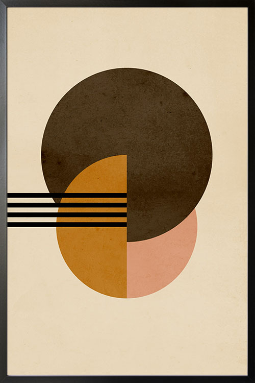
Half circle orange and green poster

Half circle orange and green poster

Poster that features attractive and colorful shapes. A poster design that will make your room look cute and lovely. The colors will also add a fun and exciting vibe that will surely be enjoyed by your family and friends.