Turning a house into a cozy home is all about personal touches, and trendy posters are one of the easiest and most affordable ways to make your space feel warm, inviting, and totally you. Whether decorating your first apartment or refreshing a tired room, posters offer endless opportunities to add style and comfort without a big commitment.
Pick the Right Vibe
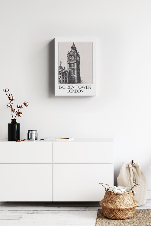
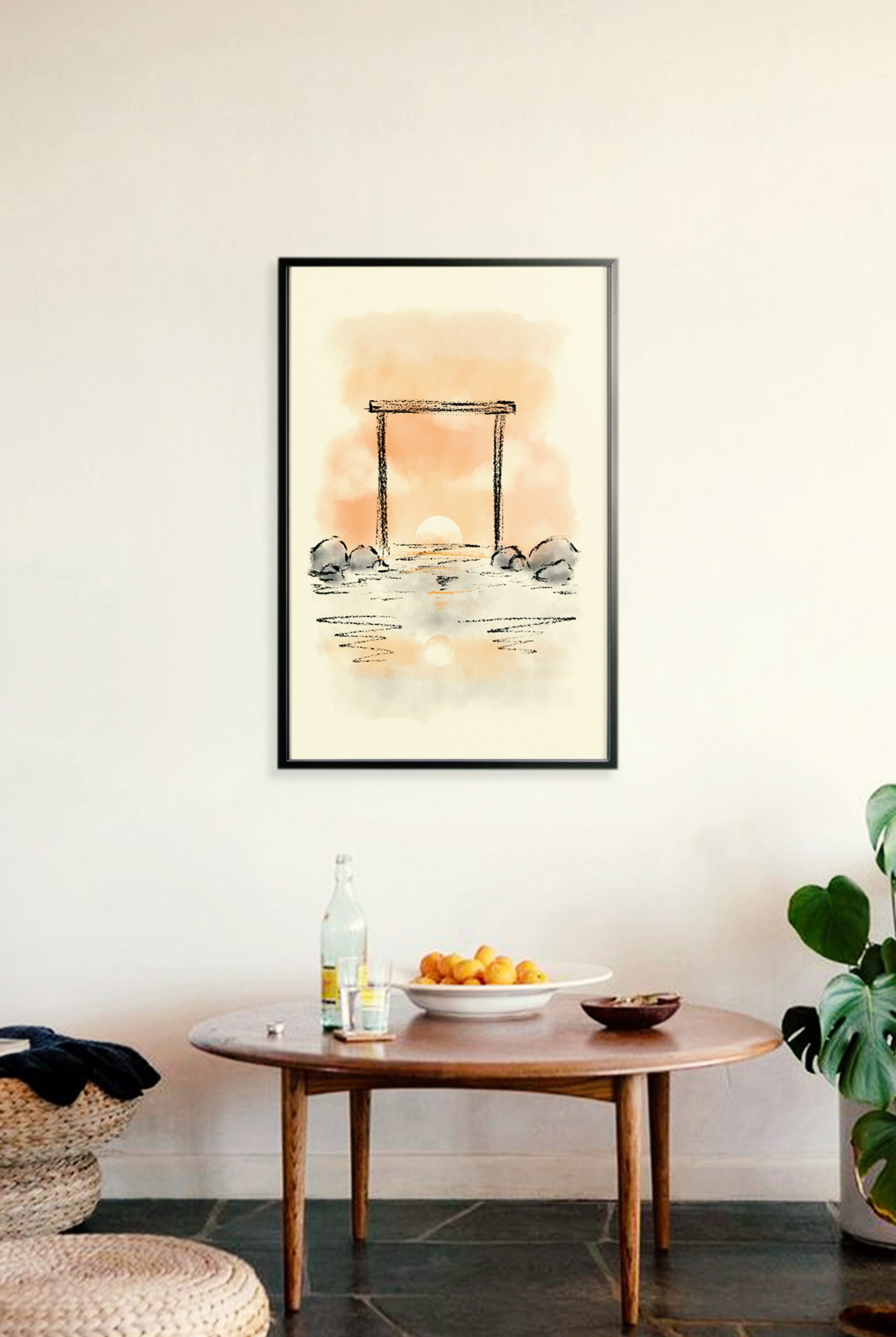
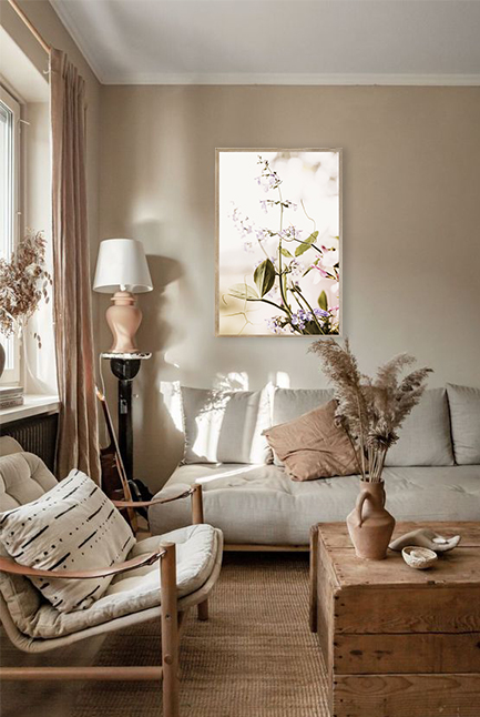
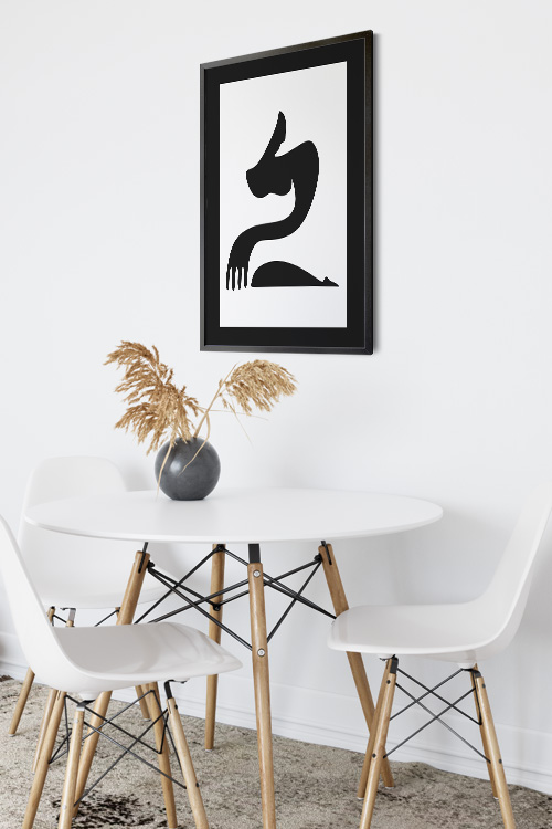
When choosing posters, consider the mood you want to create. Choose soft colors, warm tones, and calming designs for a cozy atmosphere. Earthy hues, vintage-style prints, and botanical illustrations instantly make a room more grounded and serene. Want a bit of modern flair? Go for minimalist line art, abstract shapes, or typography posters with positive affirmations.
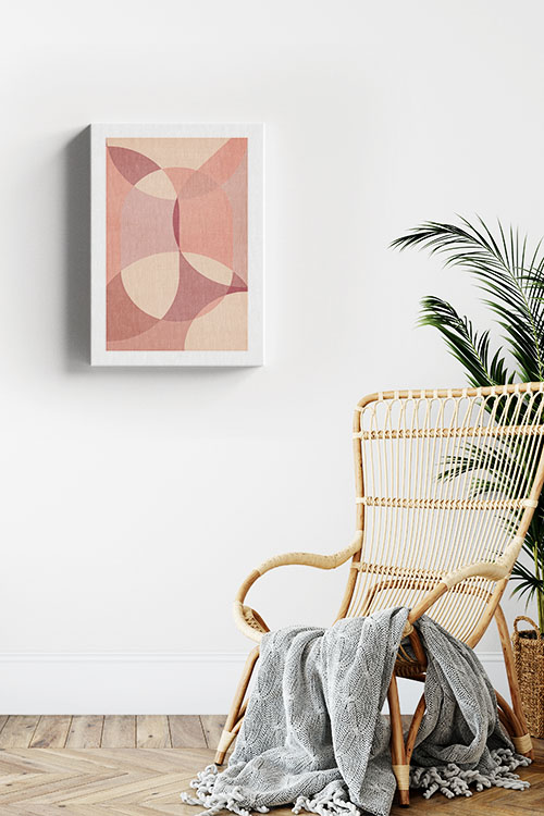
Mix Comfort with Style
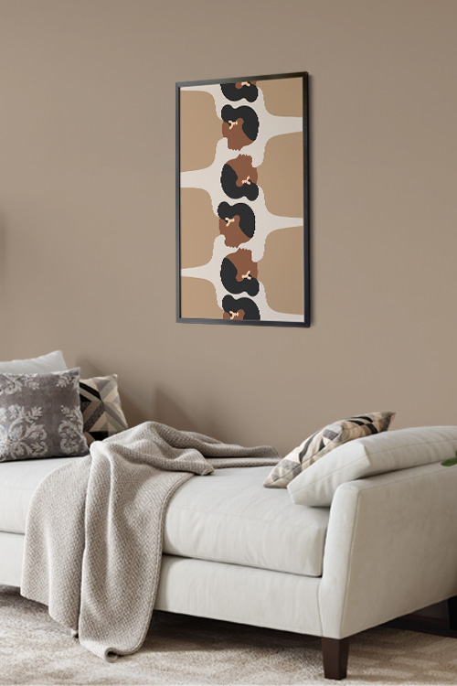
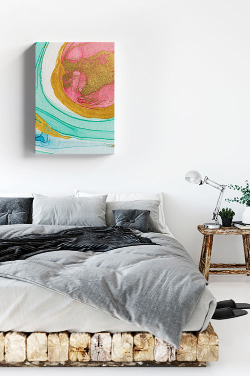
The secret to using trendy posters to make your home feel cozy is blending aesthetics with comfort. Pair your wall art with soft textures like plush cushions, warm throws, and layered rugs. Hang posters in areas where you naturally relax, like above your bed, by your reading nook, or near the sofa. This creates visual harmony and makes the whole space more put-together and intentional.
Create a Gallery Wall
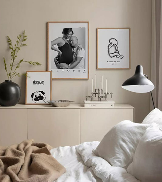
One of the most effective and fun ways to cozy a room is by curating a gallery wall. Mix different poster sizes and styles for an eclectic look, or stick with a theme, like nature, vintage art, or muted tones for a more cohesive feel. Use matching frames for a clean look or mix materials for something more bohemian.
Light It Right
Lighting plays a massive role in how cozy your space feels—place posters where they’ll catch soft, ambient lighting. Use fairy lights, wall sconces, or a nearby table lamp to create a warm glow that enhances your artwork. Backlit frames or poster hangers with LED strips are trendy options for a modern touch.
In a Nutshell
The beauty of posters is that they’re easy to switch out as your tastes or the seasons change. Swap in new prints for a fresh vibe without having to redecorate completely. With just a few well-placed trendy posters, you can turn any space into a cozy, stylish retreat that feels like home.