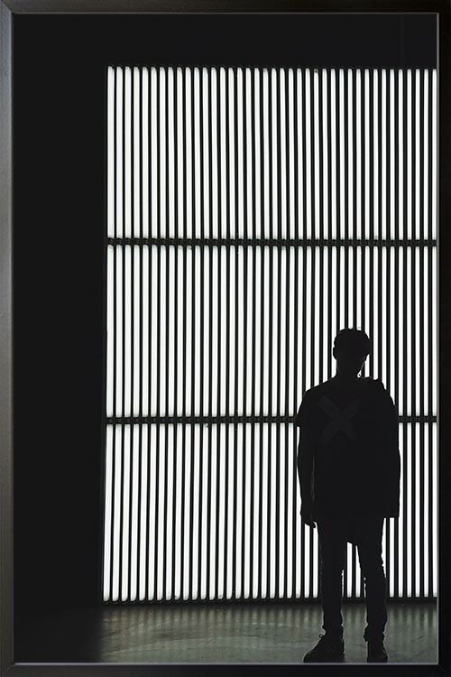
A lovely poster design that will make any room look unique and classic. Give your room a timeless beauty with black and white print and flaunt it to your family and friends.

A lovely poster design that will make any room look unique and classic. Give your room a timeless beauty with black and white print and flaunt it to your family and friends.
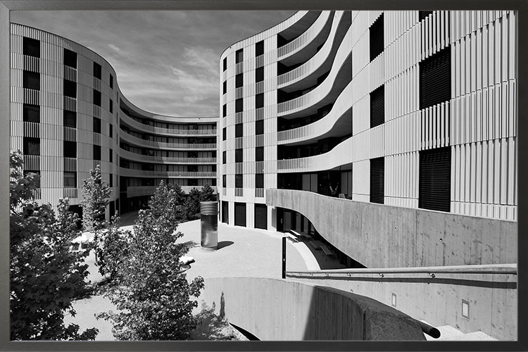
A black and white poster of a person with bars in the background. This classic-styled photo blends perfectly in any space and interior design style. Match with other themes for a a trendy wall gallery.
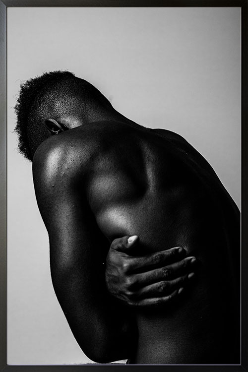
A black and white poster of a person with bars in the background. This classic-styled photo blends perfectly in any space and interior design style. Match with other themes for a a trendy wall gallery.
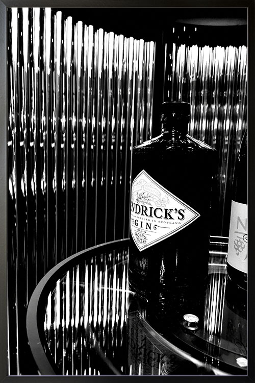
A lovely poster design that will make any room look unique and classic. Give your room a timeless beauty with black and white print and flaunt it to your family and friends.
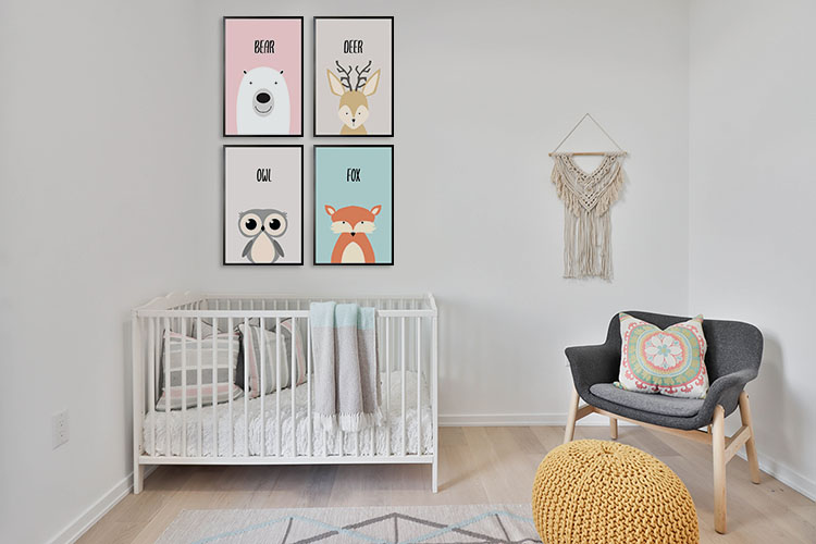
As expecting parents, preparing for your baby’s arrival needs a lot of preparation. You need to buy the necessary things as well as decorate the nursery. The baby room will be the unique haven for your little bundle of joy.
The room is also used for diaper changing, feeding, and sleeping. Decorating and adding necessary furnishings is crucial in making the baby’s room look attractive and comfy.
Other than the crib, other furnishings are needed so that you can cuddle your baby without any complications. In addition, colors play a significant role in your child’s development.
There are many factors to consider when decorating the baby’s room. It is important to consider convenience, functionality, safety, and aesthetics. Designing and decorating the baby room needs a holistic approach. The wall’s color must be quiet to protect your baby’s vision. Therefore it is crucial to choose the right design for the posters or prints. The lighting must not also be too bright to affect the baby’s sense of vision.
All the baby necessities should be within arm’s reach from the changing table, For instance, diapers, wet wipes, changing covers, diaper disposal system, burp clothes, and others. These items should be within easy reach every time you change your baby’s diaper. This is also for your baby’s safety to prevent them from rolling off trying to get something from the shelf or cabinet.
You will be carrying and cuddling your baby around the room most of the time. Certain items that are scattered on the floor or any part of the house may pose a threat to the safety of your baby. Scattered toys, books, and other baby items may cause you to trip or fall. Functional storage is needed to keep things when they are not required.
Curtains or window shades are recommended to simulate nighttime. Your baby will be trained in darkness means sleep time. Night lamps are also advised to add a little illumination.
There are many themes available to choose from. Posters can easily add a piece without any complications. Nursery-themed posters are more appropriate than others, with soft colors and cute designs. You can choose prints that feature animals, cartoon characters, plants, or natural scenery. Decorate the walls with framed posters.
White is not the only color available for the baby room. This is also not recommended in the room as there may be a time when things may be messy. Gray-colored paint on the walls is appropriate to add a minimalist effect. Choose posters that are dominated by the color gray for a more astounding room effect.
The baby room may be too large for a baby. The room can be divided so every part can have its specific function, like adding a reading nook, home office, or a small dining area. Some posters can help give the nursery a minimal look. Choose prints that have muted colors, and most nursery-themed posters have this appearance.
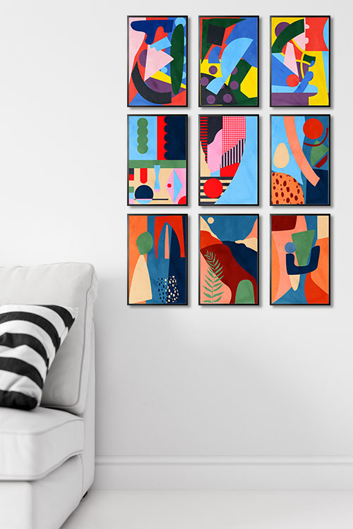
Color mixing is fun and interesting. It can stimulate your creativity and help you create color combinations for your home. We have some tips on color mixing and applying them in your homes. So the next time, you will feel like a pro in color combinations.
The color wheel is an abstract organization of the different hues of colors that are arranged in circles. It represents the science behind color and how colors relate to each other. The color wheel contains three primary colors, three secondary colors, and six tertiary colors. Understanding how colors affect each other will help you create suitable color schemes. The complementary color schemes are made up of colors that are opposite to each other on the wheel. As such, the colors reflect light differently, creating a dynamic appeal.
Color mixing, on the other hand, has two types: additive mixing and subtractive mixing. Additive mixing is when you add colors to create white light. The primary colors are the most commonly used. At the same time, subtractive mixing is the four-color printing process that uses cyan, magenta, black, and yellow.
If you know the fundamentals of the color wheel, then color mixing would be easy. Color mapping is the process when you pull the color throughout the space. It maps the color throughout the entire room. This method ensures that the three primary colors are repeated proportionally, thus making the room cohesive.
The use of black and white also creates variety. Adding white to a specific color makes a tint while adding black creates a shade. Both produce the same color but with different tones and can be used to add a vibe to your space. Colors with a higher value are more intense, while hues with a lower value are more mellow.
Still hesitant to start your decorating project? You may decide to begin with your favorite color. After which, you may determine the mood or atmosphere you want to incorporate into your rooms. Use the color wheel to help you choose the proper accent and tints. For sure, you will be awe-inspired when this project is completed.
The use of different wall decors helps in creating a remarkable room appearance. Posters have been used to complete the overall appearance of your walls. Artdesign.ph has a wide range of poster designs that will help you become successful.
Please choose from the different themes that we have. Vibrant posters are perfect for creating a fun and exciting interior. On the other hand, black and white prints can give you a classic and timeless appeal.
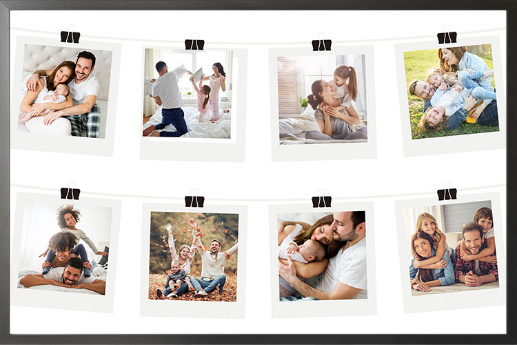
One way to customize your home is by displaying family posters. Showing them may be pretty easy, but you will create an eyesore instead of a compelling focal point when done differently. So, instead of keeping the photos in an album, be artistic and build a wall gallery for your family photos.
Some family photos may often be scattered in the bedroom. Collect them, even those already displayed, and group them in one area. The appearance of chaotic photos can be organized with excellent results.
The focal point’s or photo gallery’s appearance depends on framing. Small frames need to look more appealing. Replace them with larger ones; using the same frame for all family photos is better. Frames will help highlight posters displayed on walls. Large mats will enhance images.
Only have up to two areas in a room with family posters displayed. For instance, if you already have a feature wall with a gallery of family prints, you can still add another area for the posters to be displayed. Examples are the nightstand or console table. Choose the right place in the room to display them. Keep the whole room’s appearance manageable, with only a few areas shown in pictures.
A collection of family posters in a grid of frames with mats will top it all. Choose the right frame to highlight the display. Extra large mats can highlight the images instantly.
The display of family posters is not confined to the living room alone. Be creative and unique by creating a wall gallery in the kitchen. Pick a spot where the prints can give your wall a great appearance making the room look perfect.
The hallway may have various uses. Decorating the wall with a poster gallery will make the necessary transformation. Impress your friends by creating a gallery of special memories. With warm wood frames and clean white mats, you will have a wall that will look timeless, especially if the photos are in black and white.
What’s the best way to entertain guests while dining? A wall with framed prints will add life to the room. It will be a conversation starter, as the images can give a nostalgic vibe. The layout can be anything as long as they don’t overwhelm the room.
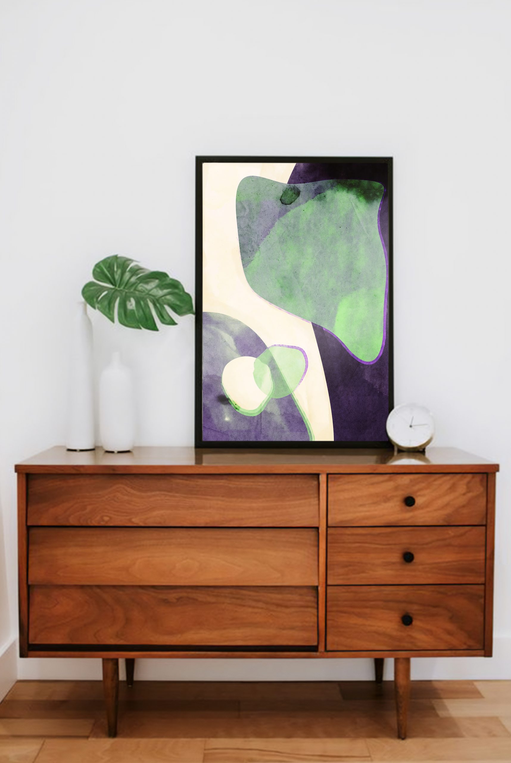
Posters are the favorite of many homeowners when decorating walls. They are chic, stylish, and creative. Some designs may also provide information about products or services. Knowing the audience will give you an idea of what poster design to get or make.
Color is one of the critical elements of interior design. Colors add energy, catch attention, and elicit a perspective. Colors can be bold, romantic, or subtle. The most important thing about colors is that they should blend well with each other to achieve an excellent background.
By definition, typography posters are filled with words that convey messages and information. If you plan to use this poster, ensure the fonts are clean and straightforward. Many typography prints may appear simple. Yet the message they contain has a significant impact on the viewer. Having them in the bedroom, kitchen, or office will constantly remind us. Some also have inspiring messages that will help us get through rough times.
Prints should have elements that make them easy to read and understand to catch the viewers’ attention. The letters should be bold, with simple graphics or photos. However, if you have many things to add, create a headline so the viewers will have a bird’s eye view of the poster’s content.
Black and white posters have never disappointed us. They are simple yet create a significant impact on the overall appearance of the room. What makes them more interesting is that they easily blend with any interior design style. Having a black-and-white print gallery is like creating a classic setting for a movie.
“Less is more” may sound like a cliche, but it’s true when creating a visually stunning interior. A single word or dramatic image can convey a poster’s message. Avoid extra graphics or words. Minimalism shows elegance that cannot be seen in other designs.
Shapes in prints are versatile as they add weight to the whole design. They also make any wall look more attractive, catching the viewers’ attention.
Look for posters with images seen from different angles and points. These can add excitement to the prints. The textual content can be diagonal.
With our technology these days, designing a poster is as easy as A-B-C. You can even make them even more attractive by personalizing them. With personalized posters, you can create designs to show who and what you are. You can even customize prints to develop stories for a more appealing touch.
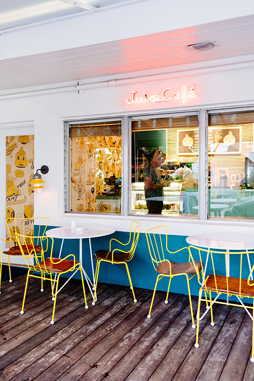
Are you planning to host a dinner for your friends? Or want to prepare a special meal for your family? Then the dining room should also be prepped before the big day. Starting with the color scheme, it should be appetizing and blend with the whole aesthetics of your home. Here are some recommendations that you can use for a more appealing dining room interior.
This color is one of the warm colors and is considered to stimulate appetite. It can also be an intimidating color that, when overused, can be too bright and overwhelming to the entire room design. Adding pastel shades of yellow is one of the ways to give it a splash. If you have a wooden dining set, the color can give it a summer vibe to make you feel like you are basking under the sun. Display posters with yellow as the dominant color to match white-painted walls or even those painted in dark colors.
If you are unsure what color scheme to use, go with neutrals and whites. These are the easiest, safest, and most common color schemes for the dining area. Working with these shades requires little effort, as any color can be paired with them. Create a wall gallery of black and white posters or any print in any shade. The dining room will have that minimalist and elegant feel that is perfect while dining with your family and guests.
Gray is commonly used in the dining room to give it a formal and sophisticated appearance. The color scheme can be sleek but sometimes can be dull when overused. Unlike white and neutrals, shades of gray are not easy to work around. Choose one or two walls to paint gray and have the other walls with neutrals or white. Hang posters in lighter shades to contrast the gray wall, and you will have a formal-looking dining area.
Red may not be the first choice of many homeowners, but this can stimulate the appetite. This is why many restaurants use color for their interior. Shades of red in posters can encourage conversation and give the room a dramatic statement. In addition, deeper shades of red do great in the dining room as it adds a cozy and luxurious appeal.
Over the years, brown has been the favorite color in the bedroom. Wooden walls, shelves, and furniture pieces give the room a retro and modern appearance. Posters or prints n shades of brown can likewise give the room an appearance that is warm and comfortable
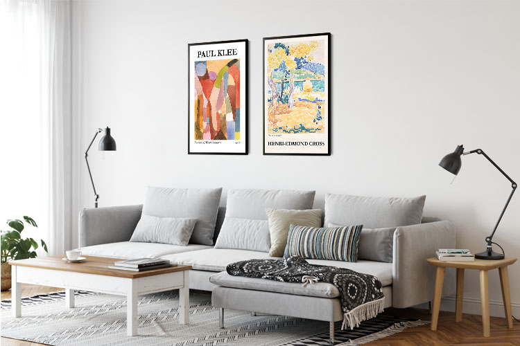
Choosing the appropriate decor for your home may be daunting. On the contrary, it is easy as you think. Decorating your home with posters will make a difference in how welcoming your living space looks and feels. Artdesign has a wide range of poster designs that will complete your wall decorating needs. Posters do not just add beauty. They likewise give any room the ambiance it needs.
Before buying a poster, think about the style of your home and how it will blend with it. Choose posters with bright colors and bold lines if you want to give your space a cheerful vibe. On the other hand, if you want to give your room an elegant and sophisticated touch, black and white and minimalist-themed posters will do the trick. Abstract posters add variety and inspire creativity in your home. Photography posters, on the other hand, give any space a sense of life and warmth.
Picking the right poster size is also a dilemma homeowners face. The size depends on where you want the prints displayed. Visualize your walls first, and see if any size will go well. Small-sized trendy posters are great for creating a gallery wall. While a single piece will be excellent as well. Whatever they may be, be sure not to overdo it to make an overwhelming wall decor. The standard sizes are 30×40 cm, 50×70 cm, and 70×100 cm. There are also sizes in between depending on the homeowner and poster shop.
Trendy and stylish posters or personalized prints can give your home a fun and exciting statement. Consider color, tone, and theme before choosing the poster. These must match and blend well with the other elements in the room. Once you are settled with the poster design, select the frame that will fit the poster and the room. Many variations are available, such as white, black, wood, and metallic.
A focal point is one of the essential components of interior design. This element is the first thing viewers will see when they enter a space. Anything can be a focal point, such as vases, paintings, sculptures, posters, personalized prints, etc. Adding a wall gallery of personalized posters or large-sized prints will instantly capture the attention of your guests.