Girls Just Wanna Have Fun

Girly face line art no. 4 poster

Posh, cozy, and appealing. These are what to expect in a girl’s room. Decorating their rooms is a cool bonding activity that you can do with your daughter. From the planning stage to the activity itself, your child will have a memorable experience that she can treasure forever.

Colors to consider for the bedroom

Looking for a fun and thrilling activity to do with your little girl? Then decorating their room is one of the perfect activities that you can do. There is a wide range of choices when it comes to this. The colors, for instance, may come in different appearances and are commonly adored by girls. Pink or any shade of pink is the most frequently used color for the bedroom.

Though it is the most preferred color, the room does not need to be overwhelmed by it. You can blend other colors to give the room some accent. You can also add purple as this is also a classic girl’s color. These colors can be romantic and may be considered to be a girlish territory. 

Try combining a bright shade of pink with yellow, lime green, and other bright colors as these will likewise help create a feminine and striking look in the room. Pink and orange are another powerful combination and will look impressive with white furnishings. Another interesting color combination is pink and black, especially with black furniture pieces as this combination can give a sophisticated appearance. 

For a peaceful and serene room atmosphere, it is recommended to have the walls with neutral colors. This may serve as a wonderful backdrop for the furnishings and decorative items that you will add. Neutral colors are also versatile as you can use different furnishings without changing the colors of the wall. 

A fairy tale in the bedroom

Every little girl dreams of being a princess. Becoming part of a fairy tale is one of the loveliest things that you can do to your little girl. This can be done by creating a fairy tale in their bedroom. Images, decors, and toys of castles, fairies, kings, queens, princes, and princesses will help in transforming their bedroom into a kingdom. 

Posters that feature different fairy tale characters can help you create stories for them and let them be part of the adventure. Nursery-themed prints can also make the room look adorable. Prints of cartoon-like animals can help them learn more about their nature. With a little creativity, you will bring the fantasy into the bedroom. 

Posters that can be displayed

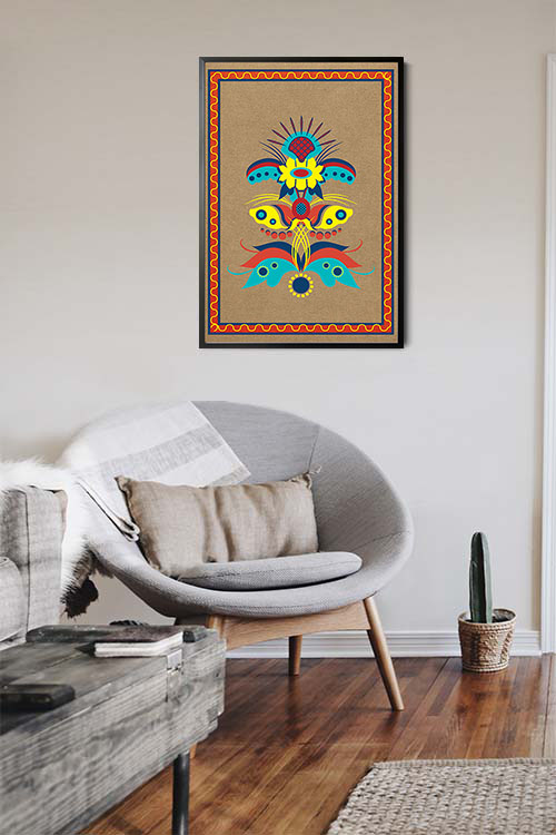
The display of posters is one of the easiest and cost-efficient ways to decorate the girls’ bedroom. There is a wide range of available designs that young girls will adore. Examples are prints that feature flowers, cartoon characters, nature, and typography. These posters are adorable and can instantly transform the overall appearance of their room. 

In addition to these, the frames of the prints add beauty to the walls. Neutral colored frames will enhance the appeal of the prints. They will likewise make the walls look more interesting and exciting.

Health Benefits of Wine

Wine and bread art print poster

Over the years, wine has been one of the most preferred alcoholic beverages of many individuals. It has a distinct taste that stimulates the palate. In addition to this, the list of benefits is long and becomes more interesting as you read more about them. We are not going to be too technical and medical about them, but it is fantastic to know that wine is not just your average alcoholic drink. Read on to learn more about the health benefits of drinking wine and why more people prefer it over other alcoholic beverages.

Red wine can protect your heart

Red wine has several heart-protecting benefits. Studies have shown that drinking red wine is associated with a lower risk of developing heart disease. The high concentration of polyphenol antioxidants can help reduce the risk of high blood pressure, high cholesterol, and metabolic diseases. 

Drinking wine can fight inflammation

Red wine is rich in polyphenols, including resveratrol, anthocyanins, catechins, and tannins. As such, red wine show antioxidant and anti-inflammatory properties. These chemicals likewise reduce insulin resistance and decrease stress. Resveratrol can be found in foods like grapes, peanuts, chocolate, and berries. 

Improve mood

Many individuals have associated drinking alcohol with better mood. This has been supported by several studies in which people who had a glass of wine in an unpleasant environment, experienced mood improvement. The result is the same with people who are in a more pleasant environment. Moderate intake of wine may also reduce the risk of depression. So now we know.

Boost the immune system

Studies about wine have revealed that a glass of wine a day reduces the risk of infection by Helicobacter pylori. This is a bacteria that causes gastritis, ulcers, and stomach cancers. Half a glass of wine may also guard your intestines against food poisoning caused by bacteria. 

Build better bones

Women who drink moderately have been found to have higher bone mass as compared to those who do not drink wine at all. The alcohol content has estrogen boosting ability and this hormone can prevent or slow down the destruction of old bones. 

Prevent the increase in blood sugar

The study was conducted with premenopausal women who drink one to two glasses of wine per day. It has been concluded that these women will be less likely to develop type 2 diabetes. It was also observed that wine can reduce resistance to insulin in diabetic patients. 

Are we going to take that leap of faith?

Actually, it’s not a leap of faith anymore. There are a lot of studies that support the medical benefit of wine. The next question is, what type of wine to drink. Red wine likely offers more health benefits than white wine. Although, white wine still needs further studies to identify the benefits they give. 

Now we are aware of the health benefits that wine gives. It is great to know that excessive alcohol intake can be harmful. As much as we want to have those benefits, binge drinking may result in negative health outcomes. In fact, thousands of people die every year because of excessive drinking of alcoholic beverages. 

Health-related concerns about excessive alcohol drinking include increased risk of certain cancers, diabetes, heart problems, liver diseases, and pancreatic diseases. So how much is enough? Daily intake of wine with the associated health benefits are 1 glass of wine for women and 2 glasses for men. 

Italian Restaurant Decorating Ideas

Italian cuisine themed posters banner

Pizza, Pasta, Tiramisu. These are just some of the Italian food that many of us love. If you are looking for an authentic Italian restaurant, then move around the Metro and you will surely find one that you will love. It is easy to spot one. In addition to the name of the restaurant and the menu they serve, it is also common to see checkered table cloth, grapevine images, and statues. If you are planning to start an Italian restaurant business, then decorating it would help boost your business. Here are some ideas that may help you.

Furniture pieces that will add style

Though there are different types of Italian restaurants, they have many similarities when it comes to their design. In most Italian restaurants, you will see button-tufted restaurant booths, restaurant wood chairs, and wooden tables that are adorned in white linen cloths with fancy china and glassware. Fine-dining Italian restaurants have cushion upholstered lounge chairs and sofas for a more comfortable dining experience. 

Wall art and other decorations

Designing an Italian restaurant can be challenging yet fun. Soon as you have accomplished the task, you will immediately be transported to Italy with the aroma of fresh herbs and spices. The wall can be transformed with the display of framed restaurant menu, or you may opt to display a poster advertising Italian food and drink, such as wine, bread, and olive oil. 

You can likewise add framed photos of famous Italian personalities and handwritten words like “dining” and “ristorante”. This can be done with the use of stencils or by projecting the word on the wall using a projector and tracing it with a brush and paint. 

Other items that can be displayed are Italian kitchen tools on the wall like paddles, cutting boards, and dough rollers. Before displaying these items, you can paint the walls with the colors yellow and orange.

Lighting the restaurant

Lighting is another crucial part of decorating an Italian restaurant. The use of ceiling lights is common along with captivating pendant lighting hanging over the tables. These types of lights add a statement and visual interest to the overall ambiance of the interior. 

Tables and seating arrangements

Plank wood tables are common in Italian restaurants. Upholstered vintage-styled chairs and cushioned playing-back restaurant booths are used to give the restaurant interior an artistic look with a touch of elegance and luxurious appeal. 

Food and service to complete the Italian dining experience

Make sure that the kitchen staff is well-trained in preparing Italian cuisine with efficiency and confidence. Good customer service is always expected from all the staff members. When it comes to food preparations, you may try using organic and locally sourced ingredients with vegan options for vegetarians. Never hesitate to use high-quality ingredients that adhere to tradition so that your customers will have loyalty to your brand. 

Final thoughts

Restaurants become great with the details that you add. The ambiance is as important as the food that you prepare and serve. As such, not only that the customers will enjoy authentic Italian cuisine, but they will likewise indulge themselves in the Italian ambiance that many people have adored over the years. May the restaurant interior be traditional or contemporary Italian, the most important thing is that the customers keep coming back to enjoy the dining experience.

DIY Projects to Improve Your Home Value

Art wall 241

It is a fact that home renovation projects can boost the value of your home. However, not all homeowners can upgrade their homes with a flick of their fingers. This is due to various reasons, especially when it comes to budget. We know that materials and labor costs these days are not a joke. Worry no more as there are many ways to upgrade your home without going into debt or breaking your savings. Read on to know some of the interesting ways to increase the home value with DIY projects.

Give your walls a new look

It is common to have scratches, dirty paint, outdated colors, and fading wallpaper. These can be remedied with a little style, creativity, and a few cans of paint. Choose a neutral color scheme such that it can unify the whole house. This scheme can likewise be appealing to potential buyers. 

Update your fixtures

Some fixtures need to be replaced or updated. Switch plates, outlet covers, curtain rods, light fixtures, and doorknobs. Old ones tend to be boring and with a little spending, the overall appearance of the room may be different and lively. Be smart in purchasing these items. No need to choose the expensive ones as they may have the same quality as those cheaper items. You still need to do some research, though, so that you may not end up buying the wrong items. 

Ceiling fans

Want to cut down on your electricity consumption? Install ceiling fans as these are good alternatives to air conditioners. Ceiling fans also reduce heating costs b circulating warm air await from the ceiling. 

Improve the window treatments

Replace vertical plastic blinds, paper shades, or horizontal aluminum blinds. These are no longer in trend and don’t add value to your homes. Use plantation shutters, wooden blinds, or drapes. Neutral colors are the best choice, especially if you are planning to sell your home.

Restore hardwood floors

In many instances, older homes have hardwood floors hidden underneath the carpet or any floor covering. If you have squeaky floors then you have wooden floors. If you are still not sure, pull up your carpet and check. Before revealing them, there is a good chance that you need to refinish them to restore them to their original state. This is cheaper than installing new flooring. 

Paint or stain kitchen cabinets

You could buy new cabinets and save money by purchasing prefabricated cabinets and installing them yourself. White cabinets tend to brighten the kitchen and never go out of style. To do this, you need to remove all the hardware from the cabinets, including the doors. Clean them so that dirt and grease will not ruin your work. In doing so, you may also want to upgrade the bathroom cabinets as well. 

Final Thoughts

Upgrading your home does not have to be expensive. It does not require hiring contractors or other experts. These days, there are many ingenious ways to boost your home without spending that much. As a result, the value of your home may likewise be improved for future buyers or even for your own satisfaction.

Picture Frames For A More Appealing Wall

Photos can be considered to be some of the most essential items. They capture memories and special events and these bring smiles to our faces. Picture frames are the best way to protect your photos from both natural and human damage. In addition to these, picture frames add more definition and color to the photos that do not have much brightness and vividness. It also elevates the picture through various settings that are provided by different custom photo framing services. Frames allow you to have your personalized and custom framing according to your preferences. It also makes your room look stylish by using different picture framing ideas. This may include dedicating a whole wall of one room to add style. 

How to hang small picture frames in the living room

Whether you are hanging photo frames or artworks on the walls, it is important to know how to hang them correctly. 

Decide first where to hang the picture frames. Select the frame which suits both the style and period of the picture. As a rule of thumb, the more contemporary the picture the simpler the frame.

People tend to hang pictures too high on the wall. Picture frames should be hung at eye level, which varies depending on whether the people in the room usually sit or stand and how old they are. For instance, in the living room, around the sitting area, hang for seated viewers. In the hallway, hang for standing viewers, in the kid’s room, hang pictures lower than in an adult’s room. Wires and hooks should not be seen. 

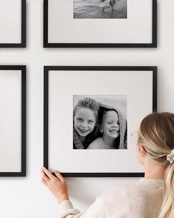
Small picture frames are best hung when grouped, especially in small rooms. Harmonize the grouping by keeping them within an imaginary rectangular or square. The spacing between frames is also important as too little space detracts from each picture and too much space loses the cohesion of the grouping. 

Personalized picture frames in the kid’s room

Framed art can seem a little stuffy for many designs in the kid’s room. With a little twist plus some display ideas, the picture frames you use can make the kid’s room into a dream space. 

Framing photos of your family or friends in the kid’s room is a simple process. Glue a fabric over a frame back, then add ribbons to hold photos, and print off photos so your child can stick them up as they see fit. 

When creating a gallery, add a heavy-duty clip to one of a few covered frame backs, hang, and instruct your child to clip the photo or artwork they wanted to be displayed.

Antique picture frames for a classic room look

Antique picture frames tend not to work with many photos due to a clash in time appearance. However, if they are paired with wedding photos, they may just work properly. The more ornate and elaborate the gold and silver frames, the more they tend to work better with prints and paintings. 

One tip for antique picture frames is to change the image to black and white. This will allow both the photo and the frame to retain their character. 

Antique picture frames are a statement in themselves. Hang them in areas that are relatively plain. 

Fine Dining Restaurant Atmosphere

Fine dining cuisine themed posters banner

What comes to your mind when it comes to eating in a fine dining restaurant? In general, fine dining refers to an experience of a customer in a restaurant with higher quality and greater formality as compared to a casual dining restaurant. A fine dining restaurant is more elegant and the food is served more formally. In terms of staff members, fine dining restaurants usually have more. Staff members have a higher level of training and expertise. 

In terms of food, the will be of the highest quality, made with luxurious ingredients, served in beautiful presentations. Expect that the quality of the dishware and cutlery are higher. Moreover, the decor and architecture are remarkable. With this said, expect the prices to be higher as compared to any casual dining restaurant. You are paying for the higher quality of food, the ambiance, and the highly trained staff. 

The atmosphere

The atmosphere in any fine dining restaurant is created to give its customers a certain type of dining experience. Fine dining restaurants evoke a formal and a high class and can be found in beautiful buildings with beautiful natural surroundings. Although not all have a view of the natural surroundings, it is ensured that customers will have a wonderful view. 

The furniture pieces are classy-looking and of high quality with some antique pieces in the mix. The walls may likewise have high-quality artwork arranged gorgeously. Customers are given more privacy with the spacing between tables. Do not be surprised if tablecloths are placed on tables along with cloth napkins and higher quality silverware and glassware. 

Many fine dining restaurants do not play any background music. However, if they do, it is usually classical played at low volumes so as not to distract the customers. The staff members are usually in uniforms or in dress in black, or black and white colors. They are trained and experienced in providing the appropriate level of personalization and attention to every table. As such, customers receive a great dining experience. 

The size

FIne dining restaurants are somehow smaller in size as compared to casual restaurants. They usually have fewer locations so that the owners and chefs can deliver the best level of quality. With the size in consideration, the works of the chef can take the center stage and staff members can give guests more personal attention. 

The Beauty of Minimalist Art

Leaf Line art minimalist poster

Minimalist art can be anything that is simple or lacks variation. These are commonly seen in both residential and commercial areas. When it comes to minimalist art, it may not be as simple as many think. It was developed based on history where outstanding examples can be seen. 

Minimalism vs simplicity

Simplicity and minimalism are completely different from each other. Though both terms may coincide with each other but there are differences in terms of their characteristics and elements. By definition, simplicity is the state or quality of being simple. While minimalism is any design or style in which the simplest and fewest elements are used to give a maximum effect. 

Minimalist art can have several elements and traits that are utilized and loved by many homeowners and designers. It encompasses a variety of geometric shapes and patterns. The colors and shapes seen in the art are few. It is likewise common to see monochromatism, such as the use of the colors black, white, or gray. 

A brief history of minimalism

The minimalism movement started in the 1950s in New York during the time of resistance to abstract expressionism. The abstract is known to be filled with intense emotion and expressive feelings. Minimalism reached its peak during the 1960s. Just like any new item, minimalism has received a lot of criticism from the art community. However, the unique style was supported by many curators, collectors, and corporate purchasers. This is one of the main reasons why minimalism grew to what we know these days. 

Minimalist art as a decorative element

In decorating any space, minimalist art brings balance that allows each piece to shine. Minimalist artists focus more on the work itself without any complications or obstacles. Through time, designers and art enthusiasts began to experience artwork on new levels where material, light, and scale became part of its creative nature. 

Minimalism today

These days, minimalism is usually associated with the type of lifestyle where clutter is reduced. The movement to minimize clutter which transcends art and streamlined, bold and monochromatic art fits perfectly with this trendy approach. Pairing minimalist art with minimal architecture and furniture pieces is one of the best ways to enhance the design style. 

Why use a minimalist style

Artists who support and employ minimalism in their projects only have one thing in mind. They want their viewers to have an immediate, absolute, and purely visual response to their work. These would come from personal connections and experiences with their works. As such viewers engage with the color, form, space, and medium. 

Minimalist art and its influences

Minimalism has had a great impact on the history of modernism as it introduced a new way of looking, creating, and experiencing works of art. The style that focused more on simple and essential lines and forms is used in different fields, like graphic design, architecture, and interior design. 

Minimalist art for your home

The addition of minimalist art is one of the best ways to beautify them. These forms of art add color and life to any room. This art creates a fluid motion in any space. Minimalist art also adds a sense of calmness and serenity to every living space. 

Minimalist-themed Restaurant? Why Not!

If you are planning to open a new restaurant or rebrand what you already have, then think of a style that will make your establishment lovely but still boost the business. At this point, you may be confused about what theme or style to choose. If you are up for the challenge, then go for a minimalist-themed restaurant interior. There are advantages that this style can do to your business. The minimalist design removes anything that will cause customer distractions. As a result, they would be more focused on your products and services. In fact, this concept is in high demand in the hospitality industry. Read on to learn some interesting ways to incorporate minimalism into your business.

Add neutral palette

Incorporating a white or neutral palette in the restaurant to the different areas of your restaurant encourages guests to focus on the food coming from the kitchen. In addition to these, customers will have more quality time with their companion/s. 

Simplify the layout of the menu

Attracting customers to your restaurant takes more than just cooking sumptuous dishes. Once you have encouraged them to take a seat, then it is time to show them your menu. It is inappropriate to show them a cluttered menu as this can draw their attention away from the dishes that you are selling. Using the concept of minimalism in your menu is a great way to avoid any distractions. Using different kinds of fonts, pictures, and colors may make the menu look attractive. However, this can be counterproductive since the customers may not be able to focus on the dishes and beverages you are offering. 

The Point of Sale Hardware

Over the years, technology has drastically changed, meeting the needs of the consumers and making life more convenient. This is also true with cash registers. The device has been invented in 1879 and since then, many companies have manufactured devices that took over the restaurant point-of-sale market. There are many hardware that continues to become smaller in size but with more processing power. 

Simple and clean restaurant design

The design of many restaurants can be complicated, but with a minimalist design, the overall appearance can be cozy and refreshing. This design does not distract the customers from the dining experience. In addition to these, customers will also have a memorable experience since a minimalist design style offers many positive effects to the customer and to the business. 

Cool wall decors

When it comes to wall decors, there are many ways to spruce up the wall while still maintaining the minimalist appearance. Various wall coverings, like wallpaper, wall murals, and posters can make your restaurant look fantastic. You can choose from hundreds or even thousands of designs available. Black and white prints, line art, and certain graphical arts are recommended to give an accent to the walls while still maintaining their simplicity. 

Personalizing the walls is also a trend these days since you will be able to show who and what you are in a different way. If you are planning to display posters, then have them in frames as these can add beauty to the art. 

Design Tips That Will Boost Your Restaurant Business

First jesus then coffee poster

While the food that you serve is the main attraction of your restaurant, the design will give a welcoming ambiance that will help boost your business. The overall appearance of your restaurant is of utmost importance to attract more customers and ensure their loyalty. Here are some tips on how to transform the appearance of your restaurant and increase your revenue.

Define your style, concept, and theme

There is a big difference between entrepreneurs who are starting with their restaurant business and those who already have one. Start with an idea and work your way through to the decoration. For, instance, a Japanese-themed restaurant focuses more on simplicity, minimalism, and traditional accents. You may want to add natural elements, such as wood, bamboo, and plants will enhance the theme and design. Italian restaurants are bolder with red and white checkered tablecloths and rustic walls.

Captivating entrance

If your restaurant is located in an area with heavy foot traffic, then you need to do something to invite them. In addition to the impressive interior, decorating the entrance is vital to increase the number of your customers. Make the entrance pop with murals or neon signages. Use glass so that passers-by can take a peek at the interior. Bold colors can catch the attention of the neighborhood, especially those who are looking for a place to dine. 

Choose the right colors

Colors are known to convey messages and emotions. In color psychology, various colors have their effects on room atmosphere and overall design. Ask experts for their recommended colors according to the theme and concept. The best colors for the walls of the restaurants are shades of red, brown, green, orange, yellow, blue, and purple. Be strategic in adding them so that they will not become an eye-sore. You may have seen that fast food restaurants use shades of red or orange as these hues can stimulate the appetite and make food look more sumptuous. Fine dining restaurants are quite different and the use of earth tones like browns promotes a relaxing and calming vibe. 

Focus on the design layout

The layout of the restaurant is important to create the right ambiance. Start with the layout of tables and chairs as this can help create a cozy and welcoming vibe. If you have a bar, check out the stools and bar table that you will add. The colors and style must blend with the overall theme and concept. If you are planning to create a sports bar or already have one, make the television the center of attention. Add sports memorabilia and posters to enhance the restaurant theme. Add games like football, darts, or pool to attract more customers. 

Use the right lighting

Light can set a mood that cannot be achieved by any other decor. When designing restaurants, properly plan the lighting so that you will successfully achieve the perfect atmosphere. Red lighting can attract more customers and stimulate hunger. Adding candles and diffuse lighting can add a romantic and intimate vibe. 

Good aroma, good vibe

The smell also has a great impact on the restaurant atmosphere. Invest in scented candles as these may have dual purposes. In addition to making the room smell enticing, candles can add a romantic vibe. The smell of freshly ground coffee beans can likewise be a huge come-on to customers, especially if you have a coffee shop. 

Use music and ambient sounds

A restaurant is not just about the taste and smell of food. You may want to create a more comfortable and inviting mood with music and ambient sounds. You may choose from a wide range of music and sound genre depending on the concept and theme of your restaurant. 

Focus on details

A good restaurant interior focus on the importance of details. If you are short on space, add elements that will create a visually larger room. Examples are mirrors, indoor plants, folding tables, and bar stools.

Interior Design Trends in 2022

Limestone and Crystal Seas poster in interior

Over the years, interior design trends have been used to help designers and homeowners in upgrading their homes. Once the interior appearance has been achieved then people find some sort of inner peace. Think about the ancient Chinese art of feng shui where the arrangement and positioning of furniture pieces and even the whole house correspond with energy flow. The use of colors and geometric patterns, for instance, helps in mimicking the harmony of nature. There are even several studies conducted that show the significance of interior appearance to the total well-being of the homeowners.

This year, experts have predicted some of the design trends. For example, many have seen the rise of earthy colors, such as brown, as well as nature-inspired accents and surfaces. While others long for a cozy and warm room interior. Whatever, the trends are this year, the most important thing is that homeowners are able to enjoy staying in their homes. 

Shades of brown

If you will check the color wheel or other color references, you will notice that there are different shades of brown. But what shade is the most appropriate to use? Many experts say that chocolate browns, camels, and caramels are back. We have seen them in the 70s and this time there won’t be any mixing with orange. These shades of brown were chosen as they are close to the hues found in nature. Try to experiment with neutral colors so that your home will have that look that is close to the environment. 

Nature-inspired objects and surfaces

Since the start of the COVID 19 pandemic, most people preferred staying indoors. Being exposed to nature eventually diminished. Unless you have your own garden or nature-inspired rooms. Think stoneware, marble, terracotta, and travertine to be used in furniture pieces and decorative objects. 

Sculptures and Curved furniture pieces

Many experts believe that a curved form is safe, friendly, and welcoming. As such, furniture pieces with softer shapes and angles are still in this year. This is also true when it comes to architecture. 

Elevated outdoor furniture

With the COVID 19 alert level lowering in the whole Metro and even the whole country, many are now going out of their sanctuaries to enjoy the outdoors. The best way to enjoy this opportunity is to decorate the patio, backyard, or garage with sophisticated and refined furniture pieces. 

Multi-purpose rooms

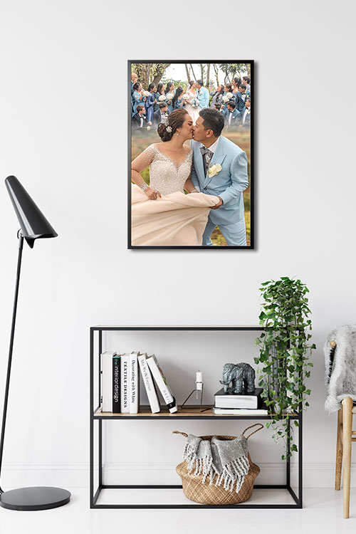
While many have received COVID 19 vaccines, we should not be too complacent as the threat is still at large. Our living spaces continue to be used for various reasons. Many are still working at home and certain rooms may need to be transformed as the need arises. For instance, the dining room can be used as a conference room, the living room as the home office, and the bedroom as a private meeting room. Decorate them in such a way that they will be conducive to whatever purpose they may serve. Personalize them if you can with wall decors like personalized framed posters

Vintage-themed rooms

Just hearing the word vintage means a lot of things. It may mean something classic, old, nostalgic, and others. From the point of view of design, vintage items influence the direction of the room. You can choose any decorative item that will bring back memories. Classic art, for instance, can tell stories of the past and of the artist. Black and white photos arranged on the walls in any layout can tell stories about yourself, family, or friends.